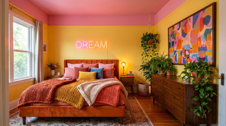
22 Butter Yellow Bedroom Designs That Feel Like A Warm Hug
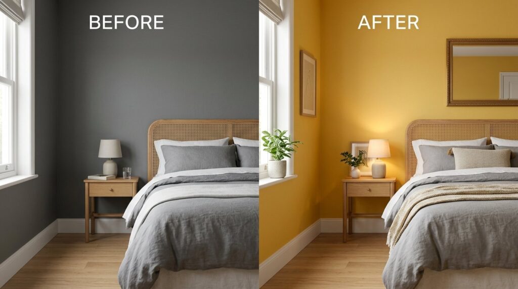
Last April, I walked into a client’s spare room that felt like a cold, gray box. The walls were a flat, dusty slate, and the light from the north-facing window made everything look blue and sad. My friend Sarah spent three thousand dollars on high-end furniture, yet she couldn’t stand being in there for more than five minutes. She asked me if we should paint it white, but white in a dark room often just looks like dirty dishwater. I suggested a butter yellow bedroom instead. She was terrified. People think yellow is loud, neon, or childish. But when we rolled on that first coat of soft, creamy pigment, the space changed. The room felt five degrees warmer instantly. Have you ever wondered why some rooms feel like a sanctuary while others feel like a waiting room? Is it possible that we have moved too far into the world of cold neutrals? What if the secret to a better night’s sleep isn’t a more expensive mattress, but a color that mimics a gentle morning sun? In my experience, this specific shade is the most underrated tool in home design. If you are still comparing warm, cool, and neutral palettes, my full guide to bedroom color combination ideas can help you choose the right shade for your room’s light, size, and sleep style.
Executive Summary
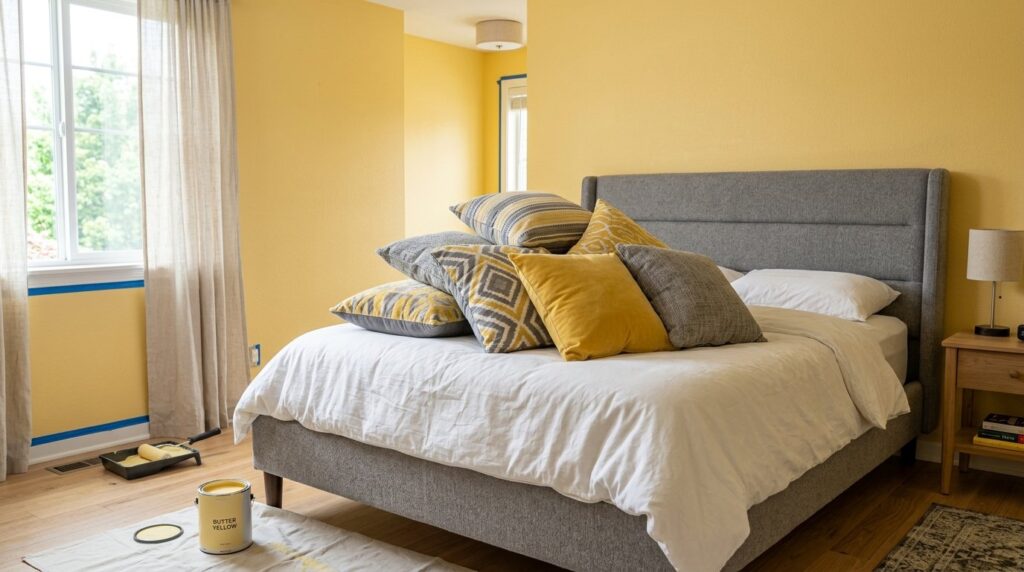
This guide provides a roadmap for creating a butter yellow bedroom that balances warmth with modern style. You can expect to see a full room change in about forty-eight hours if you are just painting, or two weeks if you are sourcing new textiles. I will cover how to use this shade in a minimal bedroom, a neutral bedroom, and even a kids interior room without making it look like a nursery. We will look at twenty-two distinct ways to style a yellow bedroom, from paint choices to fabric textures. You will find price breakdowns for paints like Farrow & Ball and budget options from Behr. I have intentionally left out bright neon yellows or heavy gold tones to focus purely on that soft, buttery cream aesthetic. My goal is to show you how to move past the fear of “too much color” and create a space that feels quiet, expensive, and incredibly cozy. By the end, you will know exactly which undertones to avoid and how to pair your yellow room with existing furniture to save money.
1. Why should you choose a butter yellow bedroom over a plain white one?
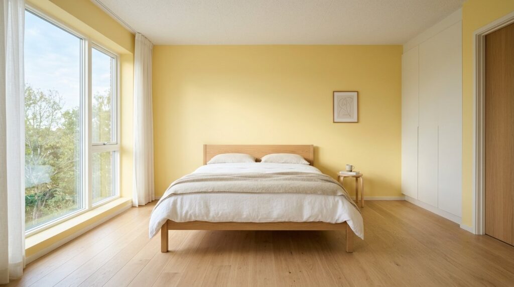
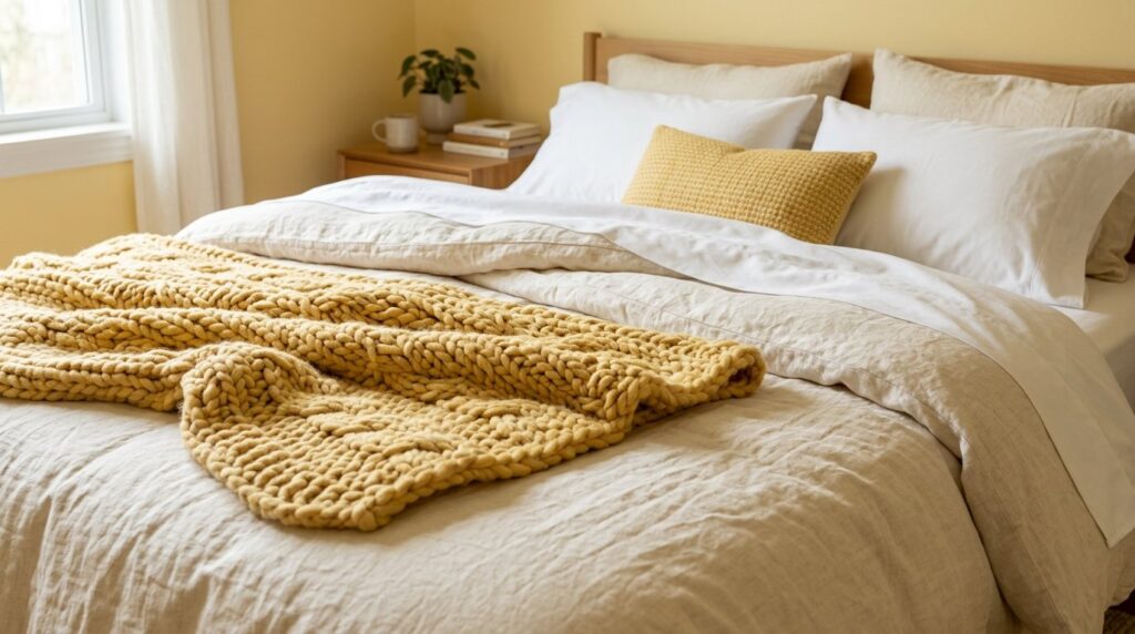
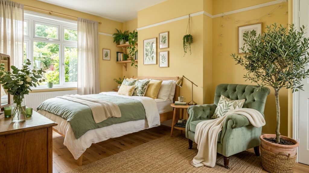
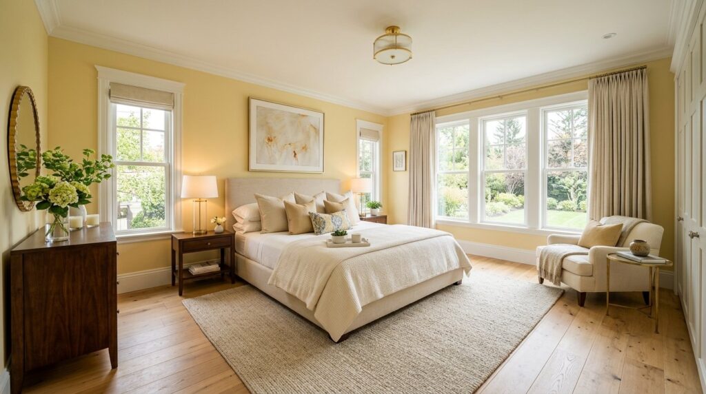
A butter yellow bedroom offers a level of warmth that white paint simply cannot provide, especially in rooms with low natural light. It acts as a permanent golden hour for your walls, making the space feel inhabited and soft rather than sterile. While white can feel cold and sharp, this pale yellow shade softens the corners of a room and makes your bedding look crisp and invited.
In my experience, white walls in a minimal bedroom often feel unfinished. Last year, I worked on a neutral bedroom project in Seattle where the sky is gray for months. We tried three different whites, and they all looked depressing. If your goal is to make the room feel softer and more inviting, a warm bedroom aesthetic can help you layer yellow, wood, cream textiles, and gentle lighting without making the space look too bright. When we switched to a soft yellow room palette, the client stopped complaining about the weather. It was a psychological shift. Yellow is associated with joy, but in this muted, buttery form, it stays calm enough for sleep.
I’ve seen this work best when you treat yellow as a neutral. Think of it as “cream with a soul.” I once used a shade called “Man on the Moon” by Clare Paint in a small guest space. The cost was about sixty dollars for a gallon, and it did more for the room than the five-hundred-dollar rug we bought later.
Beginner vs. Advanced Color Theory
For beginners, start with one accent wall or yellow bedding. This allows you to test the light. If you are more advanced, try a “color drench.” This involves painting the walls, baseboards, and even the ceiling in the same butter yellow. This creates a cocoon effect that is very popular in European design right now.
Use Cases for Small vs. Large Spaces
In a tiny yellow room, a pale butter shade can actually make the walls recede, making the space feel larger. In a massive room, you might need a bit more saturation so the color doesn’t get lost. I’ve noticed that in large master suites, a very pale yellow can sometimes look like an accidental “off-white” rather than an intentional choice.
2. How can you make a minimal bedroom feel warm with yellow?
You make a minimal bedroom feel warm by focusing on texture over patterns and using a butter yellow bedroom base to provide depth. Minimal design often fails because it feels “flat.” For a quieter version of this look, a modern neutral bedroom uses the same clean lines and soft textures while keeping the palette calm and easy to style. By using a soft yellow on the walls, you create a backdrop that makes simple wood furniture and white linens pop. It adds a layer of visual interest without adding clutter.
I remember a project three years ago where a client wanted a strictly minimal bedroom. No art, no extra pillows, just a bed and a lamp. We used a very pale butter yellow and paired it with a raw oak bed frame. The result was stunning. The yellow pulled out the honey tones in the wood. If we had gone with gray, the wood would have looked orange and cheap.
One failure point I often see is people adding too many “warm” wood tones. If your floor is cherry wood and your walls are butter yellow, the room might feel like it is vibrating. Stick to light oak, birch, or even painted black furniture to ground the space.
Modern vs. Traditional Minimalist
A modern approach uses sharp lines and metal accents. Think of a black metal bed frame against a butter yellow bedroom wall. A traditional minimalist approach uses soft linens, wool throws, and ceramics. I prefer the traditional route because it feels more “human.”
Troubleshooting “Yellow Fatigue”
If you feel the yellow is becoming too much, break it up with oversized white matte frames. A large piece of white negative space on a yellow wall acts as a “reset button” for your eyes.
| Item | Budget Option | Premium Option | Expected Result |
| Paint | Behr “Creamy Mushroom” | Farrow & Ball “Pale Hound” | Soft, velvety finish |
| Bedding | Target Threshold Linen | Brooklinen Washed Linen | Breathable comfort |
| Lighting | IKEA Sinnerlig Lamp | West Elm Bamboo Pendant | Warm, diffused glow |
| Rug | Jute Rug from Amazon | Revival Hand-Knotted Wool | Grounded, organic feel |
3. Does a butter yellow bedroom work for a kids interior room?
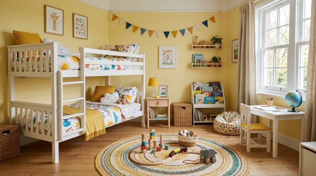
Yes, a butter yellow bedroom is an excellent choice for a kids interior room because it is gender-neutral and grows with the child. Unlike bright primary colors that kids outgrow by age seven, a soft yellow room feels sophisticated enough for a teenager but sunny enough for a toddler. It creates a cheerful environment that isn’t overstimulating.
When I designed my niece’s room, we went with a butter yellow bedroom theme. We spent about four hundred dollars on paint and basic shelving. Four years later, her tastes changed from dolls to books, and we didn’t have to repaint once. We just swapped the curtains.
In my experience, parents often make the mistake of choosing a yellow that is too “lemon.” This can lead to kids feeling restless. You want a yellow that has a hint of brown or green in the base. This keeps it grounded. I’ve tried using “Butter” by Benjamin Moore in several nurseries, and it always hits that perfect note of “sunshine in a bottle.”
Using Yellow in Shared Rooms
If you have a brother and sister sharing a space, a yellow room is the perfect middle ground. Pair it with navy blue for a classic look or sage green for a forest theme. It avoids the “pink vs. blue” debate entirely.
Safety and Longevity
When painting a kids interior room, always choose a Zero-VOC paint. Brands like Sherwin Williams offer “Harmony” which is great for air quality. It costs about seventy dollars a gallon but is worth it for a child’s health.
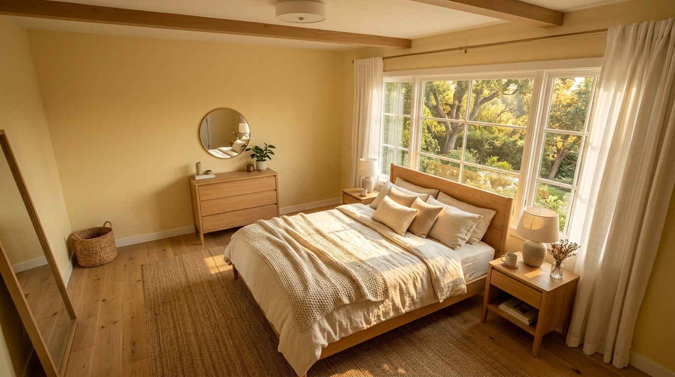
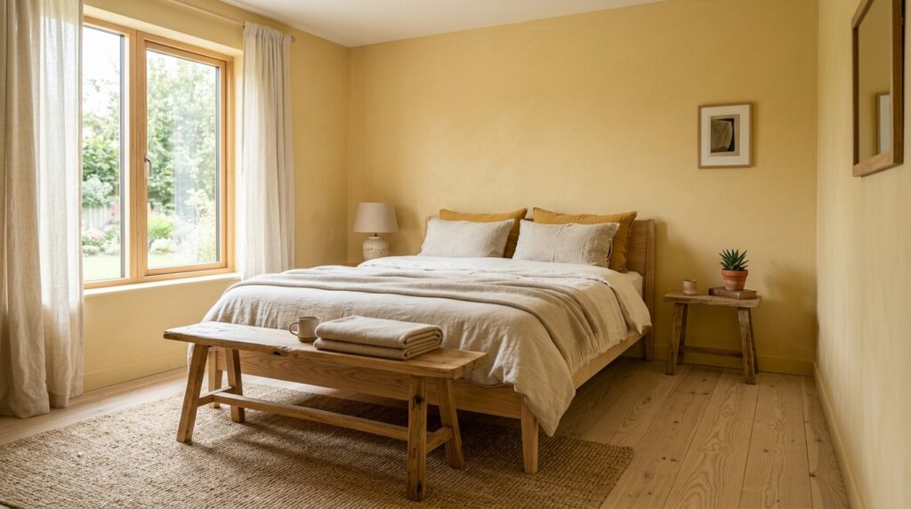
4. What are the best paint shades for a neutral bedroom look?
The best paint shades for a neutral bedroom look are those that lean into “greige-yellow” or “cream.” You are looking for a butter yellow bedroom color that looks yellow on the swatch but almost like a warm candlelit white on the walls. Look for names like “Tallow,” “Hay,” or “Clotted Cream” to find the right depth.
I once spent an entire Saturday swatching twelve different yellows on a single wall. What I learned is that the light at 4 PM is the most important. Some yellows look beautiful at noon but turn a sickly neon green as the sun goes down. To achieve a truly neutral bedroom, you need a shade that stays “quiet” in all lighting.
A personal favorite is “Daylight” by Magnolia Home. It has a very high light reflectance value (LRV), meaning it bounces light around the room. This is a secret weapon for dark apartments. It costs roughly fifty dollars a gallon and covers incredibly well.
Comparing High-End vs. Big Box Paints
Farrow & Ball paints have a higher pigment density, which means the yellow looks “deeper” and more like a real object rather than a flat plastic coating. However, Behr or Valspar can get you 90% of the way there for half the price. If you are on a budget, take a Farrow & Ball swatch to a local hardware store and ask for a color match in a high-quality base.
The Ceiling Secret
In a neutral bedroom, don’t just paint the walls yellow and leave the ceiling “stark white.” This creates a hard line that stops the eye. Instead, mix your yellow paint with 50% white paint for the ceiling. It makes the transition look like a soft shadow.
5. How do you style furniture in a yellow bedroom?
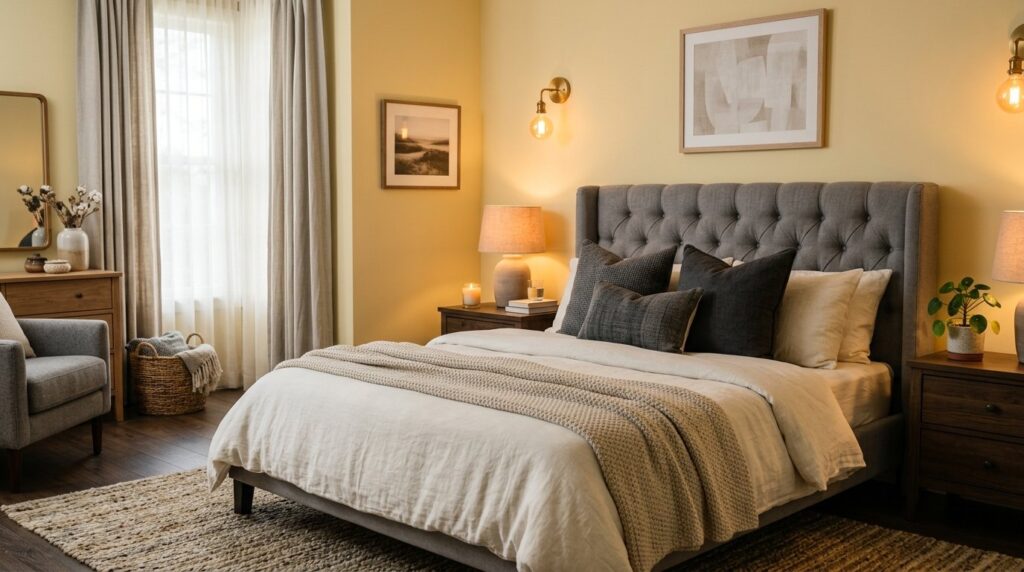
To style furniture in a yellow bedroom, you should aim for a mix of “cool” and “warm” elements to create balance. Dark wood like walnut provides a beautiful contrast against butter yellow bedroom walls, while white furniture keeps things light and airy. Use brass or gold hardware to lean into the warmth, or black iron for a modern edge.
I’ve seen a lot of people try to match their yellow walls with yellow pillows and yellow rugs. This is a mistake. It makes the room look like a bowl of lemons. Last summer, I helped a friend style her yellow room using a “rule of three.” We used three different textures: a chunky wool knit, a smooth linen, and a velvet accent. None of them were yellow. They were all shades of cream, oat, and charcoal.
The charcoal accents were the game changer. A dark gray bed frame against a butter yellow wall looks intentional and high-design. You can find affordable dark frames at IKEA for under three hundred dollars that look like custom steel.
Case Study: The “Sunlight” Studio
A client in Chicago had a 300-square-foot studio. We used a butter yellow bedroom scheme to make it feel less like a basement.
- Timeline: 3 days.
- Total Cost: $850.
- Key Move: We used a massive floor-to-ceiling mirror to double the yellow walls.
- Result: The room felt three times brighter. The client reported feeling less “stuck” during the winter months.
Tool Recommendation: The Color Wheel
Use a digital tool like Adobe Color to find “complementary” colors. For a butter yellow bedroom, you will find that soft lavenders and muted blues sit opposite on the wheel. Adding a single lavender candle or a blue book on the nightstand will make the yellow look even better.
6. What fabrics work best with a butter yellow bedroom?
Linen and cotton are the best fabrics for a butter yellow bedroom because their natural, slightly imperfect textures mimic the softness of the color. Avoid shiny satins or heavy polyesters, which can make yellow look dated or cheap. Focus on “breathable” materials that look good even when they are a bit wrinkled.
In my experience, a yellow room needs to feel “touchable.” I love using a heavy waffle-knit throw in a cream color over butter yellow sheets. It creates a tactile experience that makes you want to dive into bed. I recently bought a set of linen sheets from Parachute Home in a shade called “Bone.” Putting those against my butter yellow walls felt like staying in a boutique hotel in Provence.
If you are designing a kids interior room, stick to organic cotton. It’s durable and washes well. I’ve seen parents try to use velvet in kid spaces, but it traps dust and starts to look matted. A simple cotton quilt in a neutral bedroom tone is much more practical.
Fabric Trade-offs
- Linen: Pros – looks expensive, stays cool. Cons – wrinkles easily.
- Cotton: Pros – affordable, easy to wash. Cons – can look “basic” without layering.
- Wool: Pros – adds great texture. Cons – can be scratchy for sensitive skin.
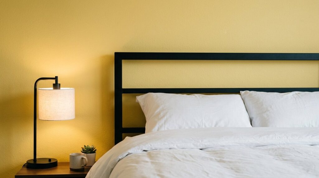
7. How does lighting change a butter yellow bedroom?
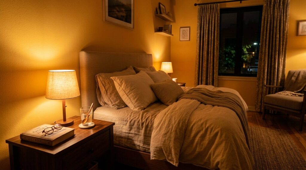
Lighting changes a butter yellow bedroom by either “washing out” the color or “activating” it. Cool-toned LED bulbs (5000K) will make your yellow room look green and sickly. Warm-toned bulbs (2700K to 3000K) are a necessity because they mimic the natural warmth of the sun and make the butter yellow bedroom feel glowy and rich.
I once visited a home where the owner complained her yellow bedroom looked “radioactive.” We realized she was using “daylight” bulbs that were far too blue. We swapped them for “soft white” bulbs from Phillips Hue, which cost about fifteen dollars each. The change was instant. The walls went from neon to a soft, creamy custard.
Think about “layered lighting.” Don’t just use the big light on the ceiling. Use a floor lamp in the corner and a small lamp on each nightstand. This creates shadows and highlights on the yellow walls, giving the room more dimension.
The Role of Natural Light
North-facing rooms get blue, cool light. These need a “warmer” yellow to compensate. South-facing rooms get golden light, which will make even a pale yellow look very bright. If your room faces south, choose the palest yellow you can find, or it might become overwhelming by mid-afternoon.
8. Can you use a butter yellow bedroom in a rental apartment?
Yes, you can use a butter yellow bedroom in a rental by utilizing peel-and-stick wallpaper or high-quality yellow textiles. If you aren’t allowed to paint, focusing on “yellow room accessories” like oversized curtains, large area rugs, and bedding can transform the space without losing your security deposit.
I lived in a rental for five years where I couldn’t touch the white walls. I bought two huge butter yellow velvet curtains from West Elm. They covered almost an entire wall. I paired them with a neutral bedroom rug that had yellow accents. Even without paint, everyone who walked in called it my “yellow room.”
Another trick is to use “Washi tape” or temporary decals. I’ve seen people create a “scalloped” border of butter yellow at the top of their walls using temporary vinyl. It’s a cheap way to add personality.
Rental-Friendly Tool List
- Command Hooks: Use these to hang yellow-framed art.
- Tempaper: A brand of high-quality peel-and-stick wallpaper. A roll usually costs around thirty-five dollars.
- Ruggable: They offer washable rugs in butter yellow patterns that are great for renters with pets.
9. How to design a yellow room that doesn’t feel dated?
To design a yellow room that doesn’t feel dated, avoid pairing it with “shabby chic” ruffles or heavy floral patterns from the 1990s. Instead, use clean lines, mid-century modern furniture, and contemporary art. A butter yellow bedroom looks modern when it is treated as a backdrop for bold, simple shapes.
In my experience, the “dated” look comes from too much coordination. If you have yellow walls, yellow curtains, and a yellow floral bedspread, it looks like a grandma’s guest room. I’ve noticed that adding a “shock” of an unexpected color—like a forest green lamp or a terracotta vase—brings the room into the current year.
I once saw a stunning yellow room that used a large, abstract black-and-white painting. The contrast between the soft yellow and the sharp black lines felt very “New York Gallery.” It cost the owner about twenty dollars for the canvas and some acrylic paint to do it herself.
Evolution of the Yellow Trend
In the 70s, yellow was “harvest gold.” In the 90s, it was “tuscan sun.” Today, it is “butter.” The difference is the amount of white in the paint. Modern butter yellow is much lighter and more “airy” than previous versions.
10. What are the best accent colors for a butter yellow bedroom?
The best accent colors for a butter yellow bedroom are sage green, terracotta, navy blue, and charcoal gray. Sage green creates a “garden” feel that is very calming, while navy blue provides a crisp, preppy contrast. If you want to use navy or denim accents confidently, this blue and yellow bedroom guide shows how to balance cool blue tones with warm yellow walls. Terracotta adds an earthy heat that makes a neutral bedroom feel like a Mediterranean escape.
I’ve tried a lot of combinations, and my personal favorite is butter yellow with a deep, mossy green. I once styled a minimal bedroom where the only color was the yellow walls and a single velvet green chair. It felt incredibly lush.
Avoid using bright red or purple with yellow unless you want it to look like a fast-food restaurant or a circus. Stick to “muted” or “dusty” versions of these colors. Instead of bright blue, go for a dusty denim. Instead of bright green, go for a gray-green.
Seasonal Accent Swaps
- Spring: Add pale blue pillows and fresh eucalyptus. If you want a softer garden-inspired palette, a sage green and pink bedroom can give you another gentle color direction that still feels warm, romantic, and restful.
- Summer: Use white linen curtains and woven baskets.
- Autumn: Bring in terracotta throws and brass candle holders.
- Winter: Use charcoal wool blankets and dark wood accents.
11. Is a butter yellow bedroom good for sleep quality?

A butter yellow bedroom is excellent for sleep quality because it creates a warm, secure environment that reduces anxiety. Unlike blue, which can sometimes feel “cold” or “lonely,” a soft yellow room feels like being wrapped in a blanket. The key is to keep the saturation low so the brain doesn’t find the color too stimulating at night.
There is a common myth that yellow keeps you awake. This is only true for “high-vis” or neon yellows. In my experience, a pale, creamy yellow actually lowers the heart rate because it mimics natural evening light. I’ve seen this work wonders for people who struggle with “Sunday Scaries” or night-time anxiety.
One client of mine, a nurse who worked night shifts, used a butter yellow bedroom to help her sleep during the day. We used heavy blackout curtains in a matching yellow shade. She said the room felt “warm and protected,” making it easier to drift off even when the sun was high.
Sleep Environment Checklist
- Paint: Low-saturation butter yellow.
- Curtains: Blackout lined but in a soft fabric.
- Sound: A white noise machine to block out the world.
- Scent: Lavender or sandalwood to ground the warmth of the color.
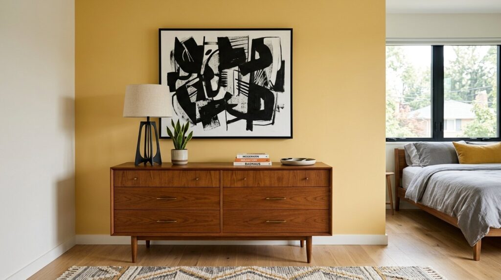
12. How do you incorporate wood tones into a yellow room?
You incorporate wood tones into a yellow room by choosing woods with “cool” or “neutral” undertones to prevent the space from looking too “orange.” Light oak, walnut, and ash are perfect companions for a butter yellow bedroom. These woods provide a natural, organic feel that grounds the light color of the walls.
I once made the mistake of putting a red-toned mahogany dresser in a butter yellow bedroom. It was a disaster. The red and the yellow fought each other, and the whole room felt “angry.” We ended up sanding the dresser down and giving it a clear coat, which revealed a lighter, more neutral wood. It looked ten times better.
If you have dark floors, use a large cream-colored rug to create a “buffer” between the dark wood and the yellow walls. This prevents the room from feeling too heavy at the bottom.
Matching Wood to Lifestyle
- Light Oak: Great for a minimal bedroom; feels modern and clean. If you love pale wood, simple bedding, and airy styling, a Scandinavian bedroom pairs beautifully with butter yellow because both styles feel light, warm, and uncluttered.
- Walnut: Best for a sophisticated, “grown-up” yellow room; feels expensive.
- Painted Wood (White/Black): Ideal for a kids interior room; easy to clean and very versatile.
13. What are common mistakes when designing a yellow bedroom?
Common mistakes include choosing a paint that is too bright, forgetting about the “reflection” effect, and using too many matching accessories. A butter yellow bedroom should be subtle. If you can “smell” the yellow the moment you walk in, it’s probably too strong. Also, remember that yellow walls will reflect onto your skin, making you look slightly warmer in the mirror.
I’ve seen people paint a room yellow and then get confused why their white sheets look “yellowed” or “dirty.” This happens because the light bounces off the walls and carries the pigment onto every other surface. To fix this, use high-wattage, “pure white” bulbs in your vanity area so you can see your true skin tone when doing makeup.
Another failure I see is “color clashing” with the floor. If you have gray “luxury vinyl plank” (LVP) floors, a butter yellow can look a bit “off.” Gray floors are very cool, while yellow is very warm. In this case, you need a yellow with a lot of gray in the base to bridge the gap.
How to Fix a “Too Bright” Room
If you’ve already painted and it’s too bright, don’t panic. You don’t have to repaint everything. Try adding a “limewash” over the top. Limewash is a chalky paint that adds texture and dulls down the brightness. It costs about sixty dollars for a small tub and creates a beautiful, old-world look.
14. How can you use yellow in a guest room?
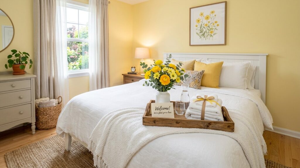
In a guest room, a butter yellow bedroom serves as a universal “welcome.” It is a color that most people find pleasant and non-threatening. It makes a guest space feel “prepared” and “sunny,” even if your guest room is just a corner of your home office. It provides a cheery vibe that helps guests feel at home immediately.
I recently helped a client set up a guest space in her basement. It had one tiny window. We used a butter yellow bedroom palette and added a lot of white “negative space” through art and bedding. Every guest who has stayed there has commented on how “happy” the room feels.
A guest room is also a great place to experiment with a “yellow room” theme because you don’t have to live in it every day. You can be a bit bolder with a yellow-patterned wallpaper or a bright yellow bedside lamp.
Guest Room Essentials
- Fresh Linens: Crisp white or pale cream.
- Small Details: A yellow ceramic carafe for water.
- Reading Material: Books with yellow spines to match the theme.
15. What are the best “butter” paint colors by brand?
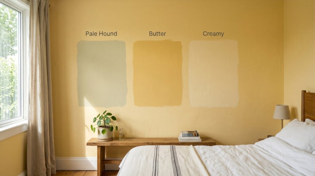
The best butter paint colors include “Pale Hound” by Farrow & Ball, “Butter” by Benjamin Moore, and “Creamy” by Sherwin Williams. These shades have been tested by designers for years and are known for their ability to look sophisticated rather than “cheap.” Each brand offers a different finish and price point to suit your project.
I’ve used “Pale Hound” in high-end renovations where the client wanted a “historic” feel. It has a slight green undertone that makes it look like it’s been there for a hundred years. It is expensive—about one hundred and ten dollars a gallon—but the way it catches the light is unmatched.
For a more “modern” and “clean” butter yellow bedroom, I suggest “Morning Sun” by Behr. It’s a very honest, simple yellow that works perfectly in a kids interior room or a neutral bedroom. It’s also much more affordable at around thirty-five dollars a gallon.
Comparison of Popular “Butter” Shades
| Brand | Color Name | Best For | Price |
| Farrow & Ball | Tallow | High-end Master Suites | $$$ |
| Benjamin Moore | Windham Cream | Traditional Guest Rooms | $$ |
| Sherwin Williams | Butter Up | Sunny Kitchen-to-Bedroom | $$ |
| Clare Paint | Golden Hour | Modern Apartments | $$ |
| Behr | Lemon Glow (Muted) | Budget Makoevers | $ |
16. How to transition from a gray bedroom to a yellow one?
Transitioning from a gray bedroom to a yellow one requires changing your light bulbs first and then slowly introducing “warm” textures. Don’t throw away all your gray furniture; butter yellow bedroom walls actually look great with light gray bedding. The gray “cools down” the yellow, making the transition feel natural and not too jarring.
I had a client who was moving away from the “millennial gray” trend. We kept her gray upholstered bed but painted the walls a soft butter yellow. We then added a few “bridge” items—pillows that had both gray and yellow in the pattern. This made the room feel cohesive rather than like a construction zone.
In my experience, the biggest hurdle is the “visual shock.” You are used to a cold room, so a warm room will feel “wrong” for the first forty-eight hours. Give yourself a week to adjust to the new glow before you decide if you like it.
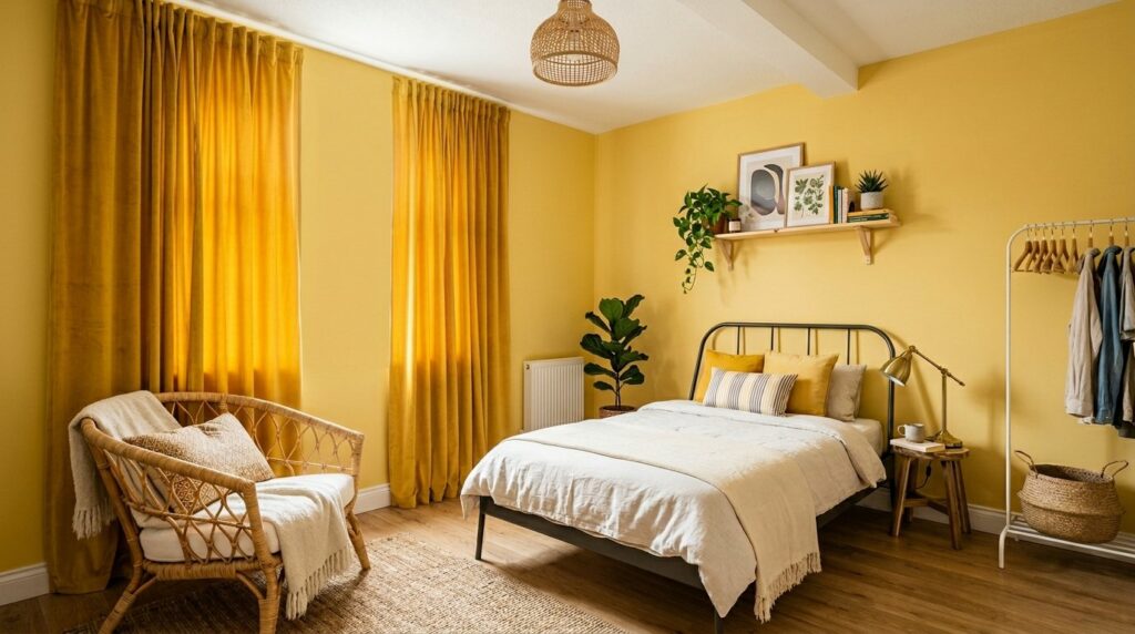
17. Can butter yellow work in a “maximalist” bedroom?
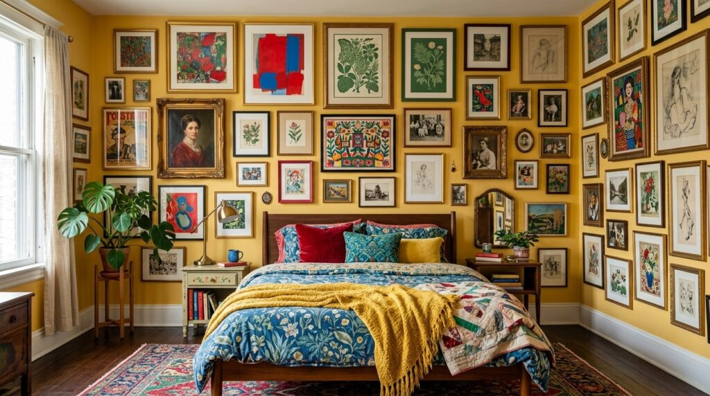
Yes, butter yellow works perfectly in a maximalist bedroom as a “neutral” base that allows other colors to shine. Instead of a white wall that might look too stark against a collection of art and textiles, a butter yellow bedroom provides a soft, “gallery” feel that ties mismatched items together. It acts as a golden thread through the chaos.
I love seeing a yellow room filled with vintage rugs, mismatched frames, and plants. The green of the plants against the yellow walls is a classic color combination found in nature. It feels intentional and “collected” rather than just messy.
In maximalism, you can use a more saturated yellow. Think of a “mustard-butter” hybrid. This can stand up to heavy patterns like leopard print or bold florals. I saw a designer use this in a boutique hotel in London, and it was the most shared room on social media that year.
18. How to use yellow in a windowless room?
In a windowless room, a butter yellow bedroom is a lifesaver because it creates the “illusion” of sunlight. By using a pale yellow paint and high-quality “warm” artificial lighting, you can trick the brain into thinking the room is brighter than it actually is. This is a common strategy for basement bedrooms or interior “flex” spaces.
I once worked on a “cloffice” (closet-office) that a client also used as a guest sleeping nook. It had zero windows. We painted it a glowing butter yellow and used a “circadian lighting” system that changed from bright white during the day to warm amber at night. The yellow walls made the small space feel like a cozy lantern rather than a cave.
Windowless Room Tips
- Mirrors: Place a large mirror opposite the door to reflect light back into the room.
- High Gloss: Use a “satin” or “semi-gloss” finish on the paint. It reflects more light than a “flat” or “matte” finish.
- Light Colors: Keep the floor and ceiling as light as possible.
19. What is the “ROI” of a yellow bedroom makeover?
The “ROI” (Return on Investment) of a yellow bedroom makeover is high because paint is the cheapest way to change the “feeling” of a home. For under two hundred dollars in supplies, you can make a room feel “renovated.” While it might not add ten thousand dollars to your home’s value, it makes the house much more “shoppable” and memorable to potential buyers.
I’ve seen houses sit on the market for months because they felt “cold” and “empty.” A quick coat of butter yellow in a small bedroom makes it feel “lived-in” and “charming.” In my experience, buyers respond emotionally to “warmth.” A yellow room sticks in their mind more than the tenth white bedroom they saw that day.
Cost-Benefit Breakdown
- Paint & Supplies: $150 – $250.
- Time: 1-2 weekends.
- Psychological ROI: Better sleep, improved mood, and a “finished” feeling home.
- Resale Factor: Unique but still neutral enough for most tastes.
20. How do you clean and maintain yellow walls?
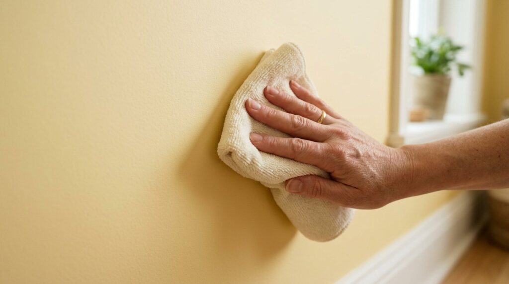
Cleaning yellow walls requires a gentle touch to avoid “burnishing” or rubbing off the finish. Use a soft microfiber cloth and a mixture of warm water and a drop of dish soap. A butter yellow bedroom shows less “scuffing” than a stark white wall, but it can show “fingerprints” more easily in high-traffic areas.
I always recommend using a “washable matte” paint. Brands like Benjamin Moore “Regal Select” are great for this. You get the soft look of a matte finish but can still wipe away a coffee spill or a kid’s crayon mark. It costs about eighty dollars a gallon but saves you from repainting in two years.
Maintenance Schedule
- Monthly: Dust the baseboards and corners where “cobwebs” show up against the yellow.
- Yearly: Do a “spot check” with a magic eraser for any dark scuffs.
- Every 5 Years: Consider a “freshen up” coat to keep the color looking bright and not “muddy.”
21. Can you use butter yellow in a “manly” bedroom?
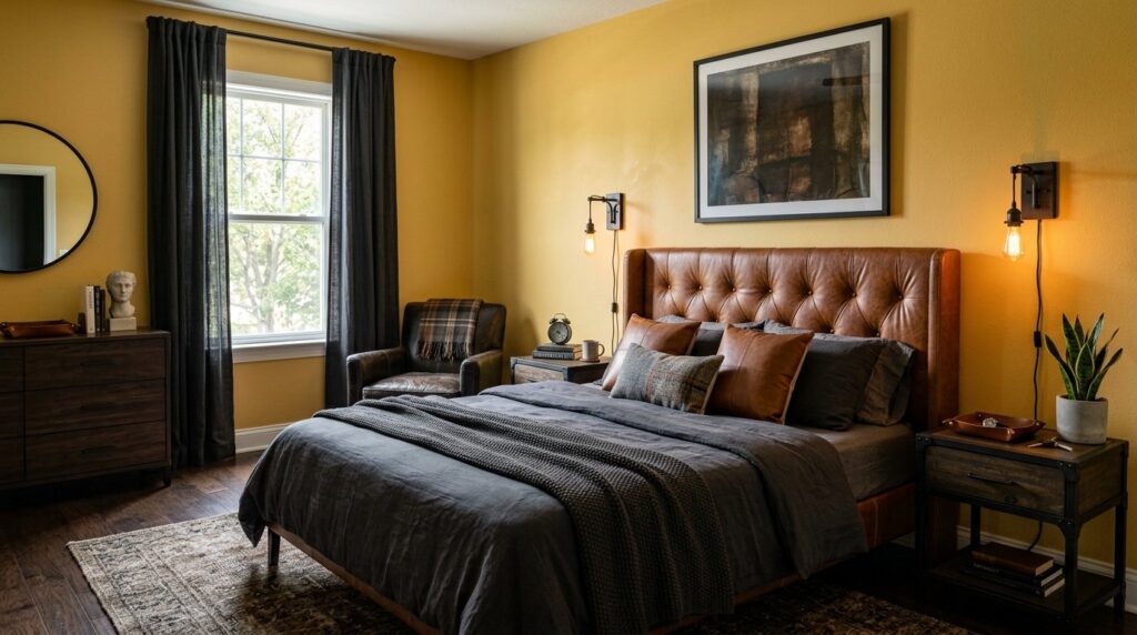
Yes, butter yellow can look very “masculine” when paired with “heavy” materials like leather, iron, and dark wood. A butter yellow bedroom doesn’t have to be “frilly.” When you use it as a backdrop for a cognac leather headboard and navy blue bedding, it feels like a high-end “gentleman’s club” or a classic library.
I worked with a bachelor who wanted his room to feel “warm” but not “feminine.” We used a yellow with a lot of tan in it—almost a “chamois” color. We added black metal bedside lamps and a large architectural print in a black frame. He loved it. He said it felt “solid” and “calm.”
The trick here is to avoid “curvy” furniture. Stick to square lines and “rough” textures like burlap, canvas, or distressed wood. This balances the softness of the yellow.
22. How to “test” the color before you commit?
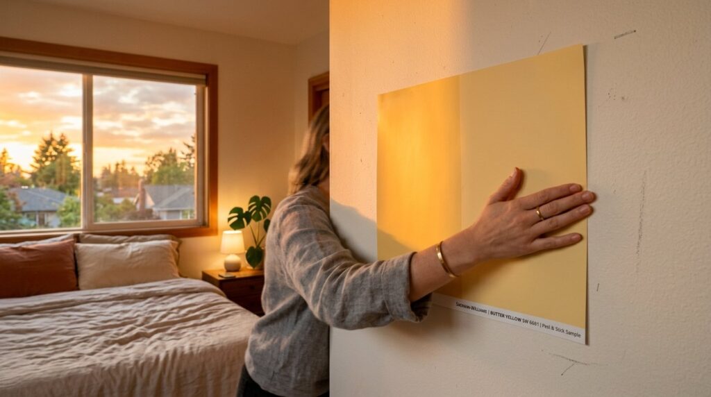
To test the color, you should use “peel-and-stick” samples like Samplize rather than painting small squares on your wall. Move the sample to different walls throughout the day to see how the butter yellow bedroom color changes in various lights. This prevents the “patchwork” look of paint testers and gives you a better sense of the final result.
I never let a client choose a color based on a 2-inch paper swatch. I’ve seen too many people cry when the “pale cream” they chose turned into “school bus yellow” once it covered all four walls. Spending thirty dollars on three or four large Samplize sheets is the best insurance policy you can buy.
Check the color at 8 AM, 1 PM, and 8 PM. If you still like it at night under your bedside lamp, you’ve found your winner.
FAQ
Is butter yellow out of style in 2026?
No, butter yellow is actually seeing a massive resurgence as people move away from “all-gray” interiors. It is part of a larger trend toward “warm minimalism” and “organic modern” design. It feels fresh because it hasn’t been overused in the last decade. It offers a nostalgic but clean look that fits perfectly with current furniture styles.
What is the difference between butter yellow and cream?
Cream is a white with a hint of yellow, while butter yellow is a yellow with a hint of white. Butter yellow has more “pigment” and “warmth.” In a butter yellow bedroom, the walls will clearly look yellow, whereas in a cream room, the walls might just look like an “off-white.” Butter yellow is more of a deliberate color choice.
Does yellow paint make a room feel smaller?
Light shades like butter yellow actually make a room feel larger because they have a high Light Reflectance Value (LRV). They bounce light into the corners of the room, which erases shadows that usually make a space feel cramped. Only dark, muddy yellows will make a room feel smaller.
What color flooring goes with yellow walls?
Medium to light wood floors are the best match. Oak, maple, and light walnut all look beautiful in a yellow room. If you have gray or very dark floors, use a large light-colored rug to bridge the gap. Avoid “red” wood floors like cherry or mahogany, as they can clash with the yellow.
Can I use yellow in a very sunny room?
Yes, but you should choose an even “paler” version than you think you need. Direct sunlight will “amplify” the yellow. A color that looks like a subtle cream in the store will look like a bright lemon in a sun-drenched, south-facing bedroom. Always test a large sample in that specific room.
How do I stop my yellow room from looking like a nursery?
Avoid pairing it with “pastel” blues or pinks. Use “adult” colors like black, navy, charcoal, or forest green. Also, choose furniture with sharp, clean lines rather than “distressed” or “shabby chic” styles. Large-scale art and high-end textiles like linen will also keep the room feeling sophisticated.
Is yellow a good color for a master bedroom?
It is excellent for a master bedroom if you want to wake up feeling energized and “sun-kissed.” It creates a cheerful start to the day. However, if you prefer a “cave-like” environment for sleeping, you might find it too bright. In that case, use yellow as an accent color through pillows and throws instead of on the walls.
What are the best “neutral” yellows?
Look for yellows that have a bit of gray or “umber” in the base. These are often called “straw,” “hay,” “tallow,” or “parchment.” These shades are grounded and don’t feel “saccharine” or too sweet. They act more like a neutral than a “color.”
Can I paint my ceiling yellow?
Yes! A butter yellow ceiling can create a very cozy, “canopy” effect. If you do this, make sure the walls are a slightly different shade or a crisp white to provide some contrast. It’s a bold move that works well in rooms with very high ceilings.
How do I choose curtains for a yellow room?
White linen curtains are the safest and most beautiful choice. They allow light to filter through, which makes the yellow walls “glow.” If you want more drama, try a navy blue or a deep sage green curtain. Avoid yellow curtains, as it’s too much of the same tone.
Does butter yellow work with “boho” style?
It is perfect for “boho” style. It pairs beautifully with rattan, jute, and plenty of green houseplants. The warmth of the yellow enhances the “earthy” feel of boho decor. It’s a great alternative to the standard “all-white” boho look.
What if I hate the color after painting?
If it’s too bright, you can use a “glaze” to tone it down. If it’s too dark, you can add more white art and mirrors to break up the color. Most people who “hate” their paint just haven’t finished the room yet. Once you add furniture, rugs, and art, the paint color will “settle” and look much better.
Move Toward a Warmer Morning
Choosing a butter yellow bedroom is about more than just a paint color; it is a choice to prioritize warmth and joy in your private space. We have spent years living in “safe” grays and whites, but those colors often leave our homes feeling a bit hollow. By embracing a soft, buttery tone, you are inviting a permanent sense of spring into your life. Whether you are designing a kids interior room or a minimal bedroom for yourself, this shade offers a level of comfort that is hard to match. Remember my friend Sarah? A year later, her “yellow room” is her favorite place in the house. She says it feels like the room is “smiling” at her. I predict we will see a huge move toward these “edible” colors—butters, creams, and honeys—as we all look for more “human” environments. Why settle for a room that feels like an office when you can have one that feels like a hug? What is stopping you from trying just one sample sheet on your wall this weekend?