
Green Bedroom Ideas: 12 Calming Looks to Copy
Green is my favorite color to decorate a bedroom with, because it does the one thing every bedroom needs: it makes you exhale the second you walk in. From the softest sage to a deep forest you could sink into, there is a green for every room and mood. Below are the looks I come back to again and again, each one a recipe you can copy, plus a simple way to pick the shade that will actually work in your space.
Quick answer: The most loved green bedroom looks are soft sage with light wood and linen for a calm, airy feel, and deep forest or olive with brass for a cozy retreat. Pick a warm-toned green for north-facing rooms and keep the palette to green plus two supporting colors.
Here are my twelve favorite green bedroom looks. Steal the whole formula or swap a single piece.
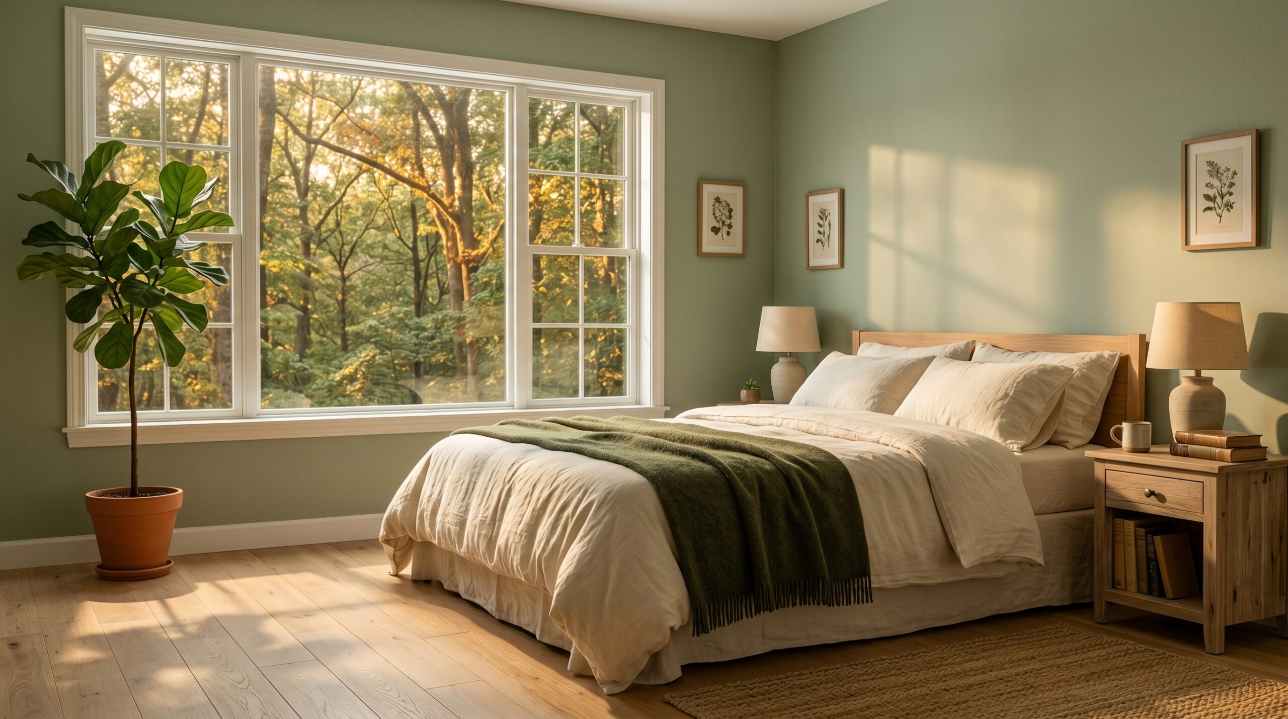
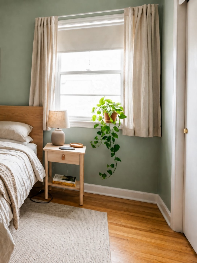
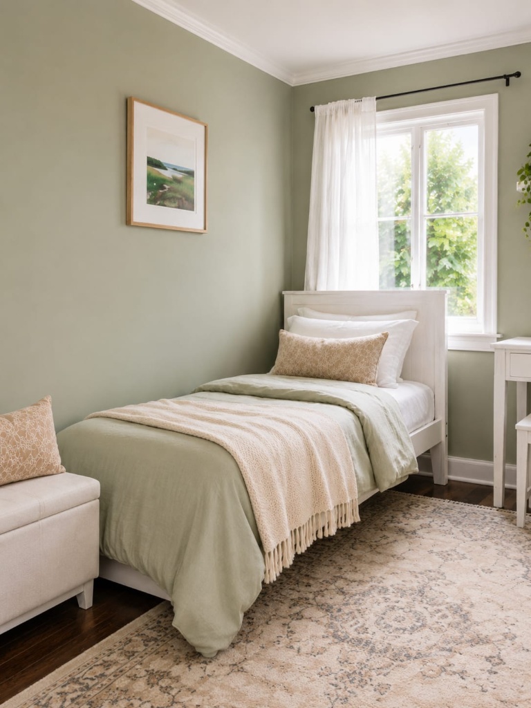
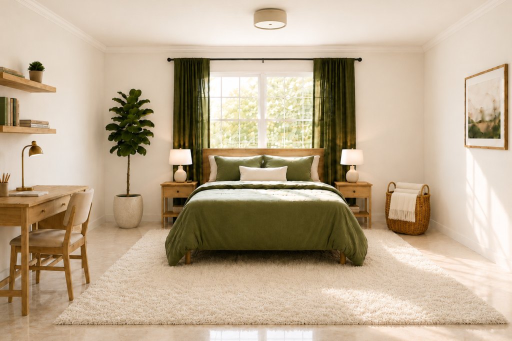
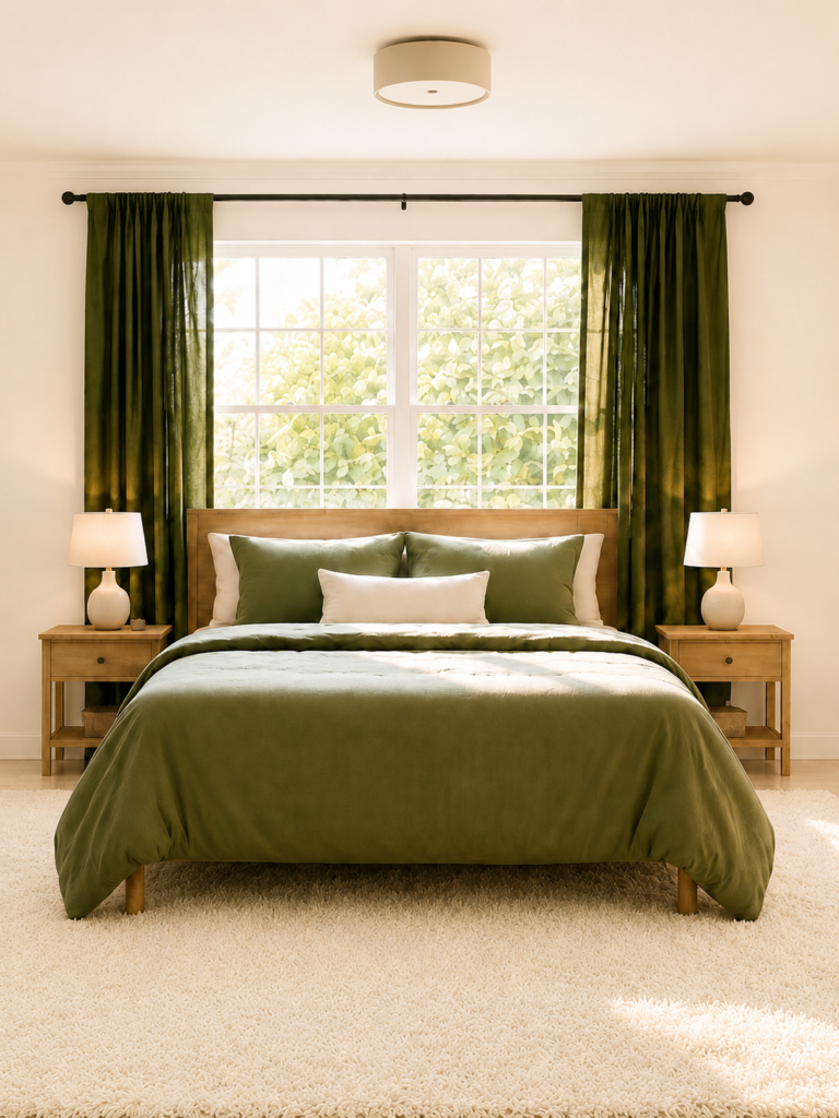
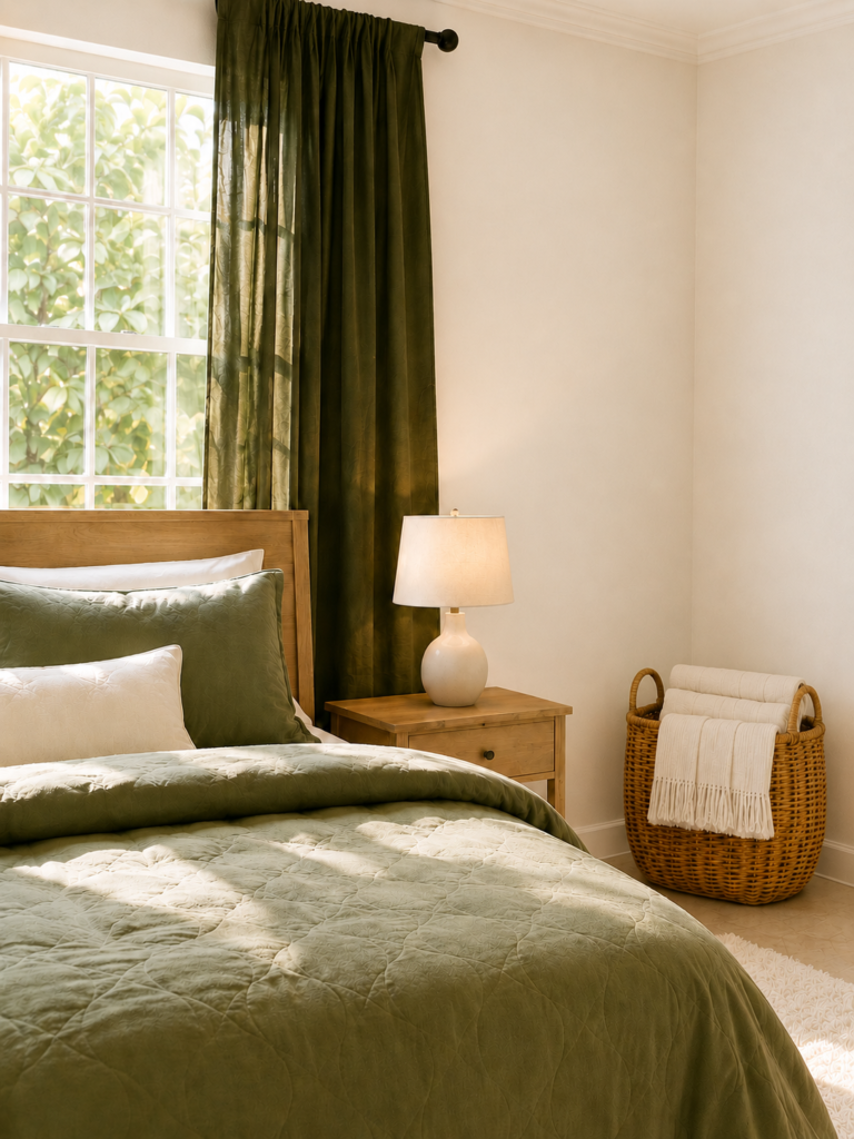
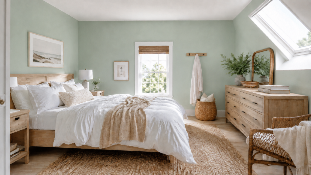
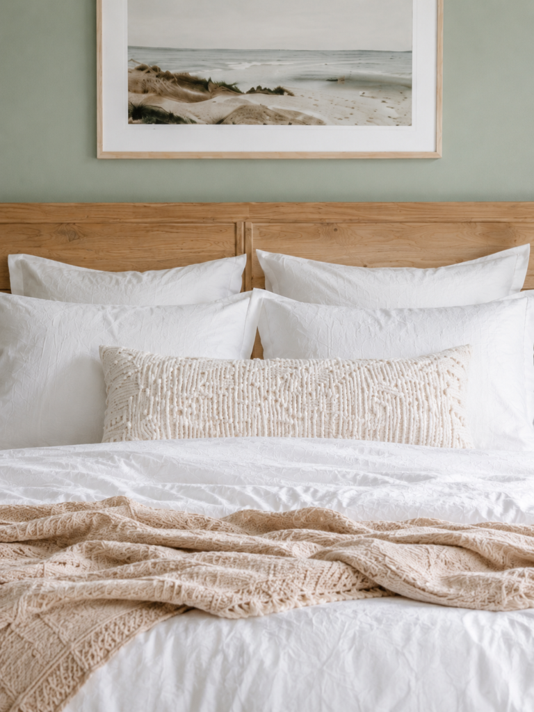
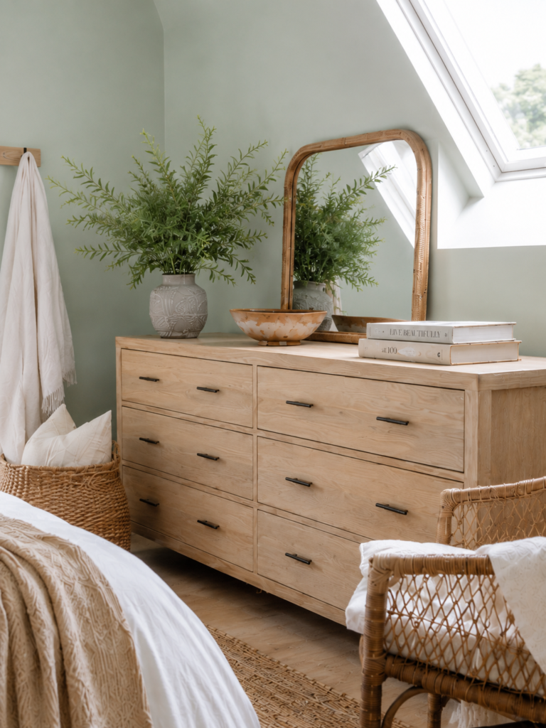
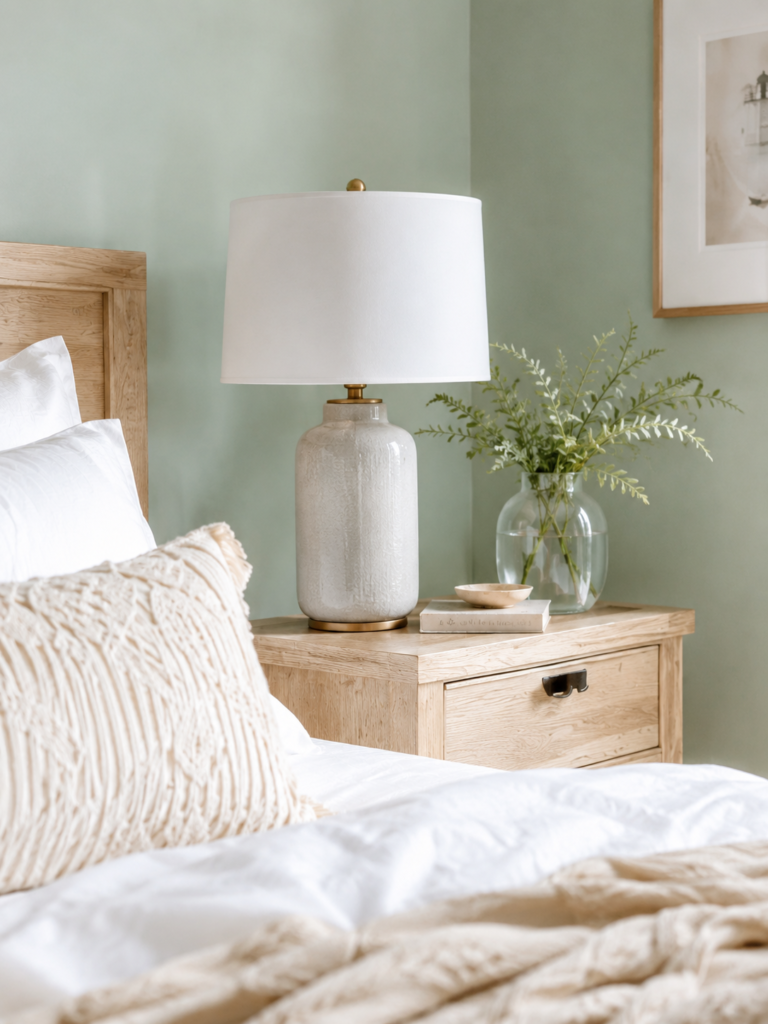
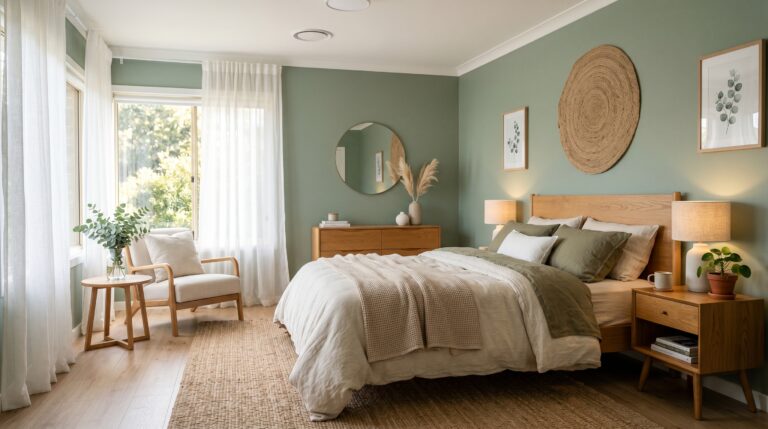
1. Sage Green Bedroom With Light Oak
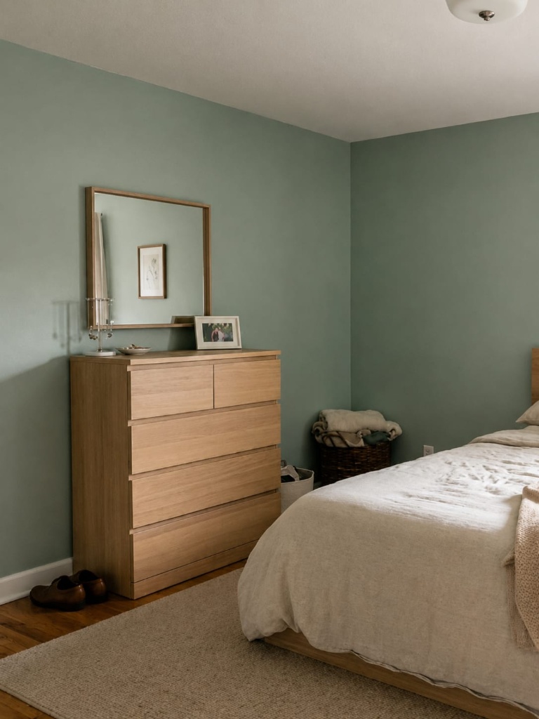
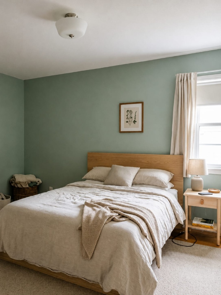
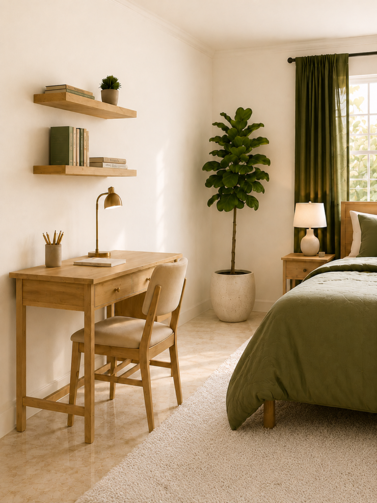
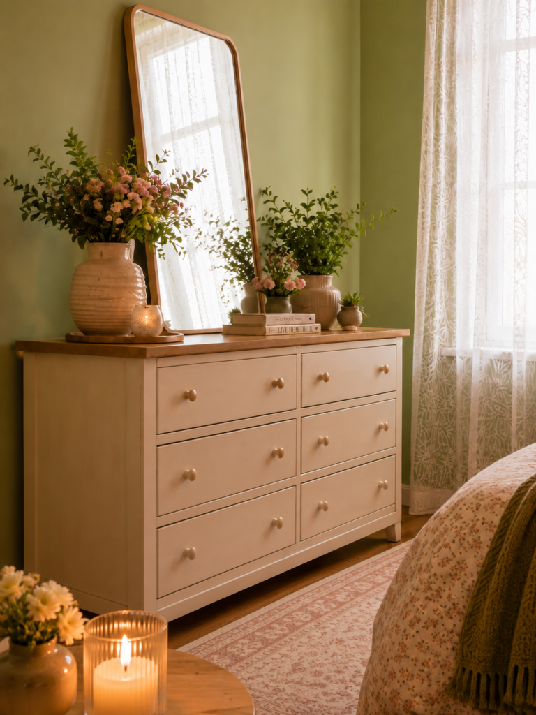
Recipe: soft sage walls, light oak bed, oatmeal linen bedding, one trailing plant. Sage is the green I recommend most often, because it behaves almost like a warm neutral. It pairs with nearly everything and keeps a room soft and restful rather than loud, which makes it the easiest green to start with.
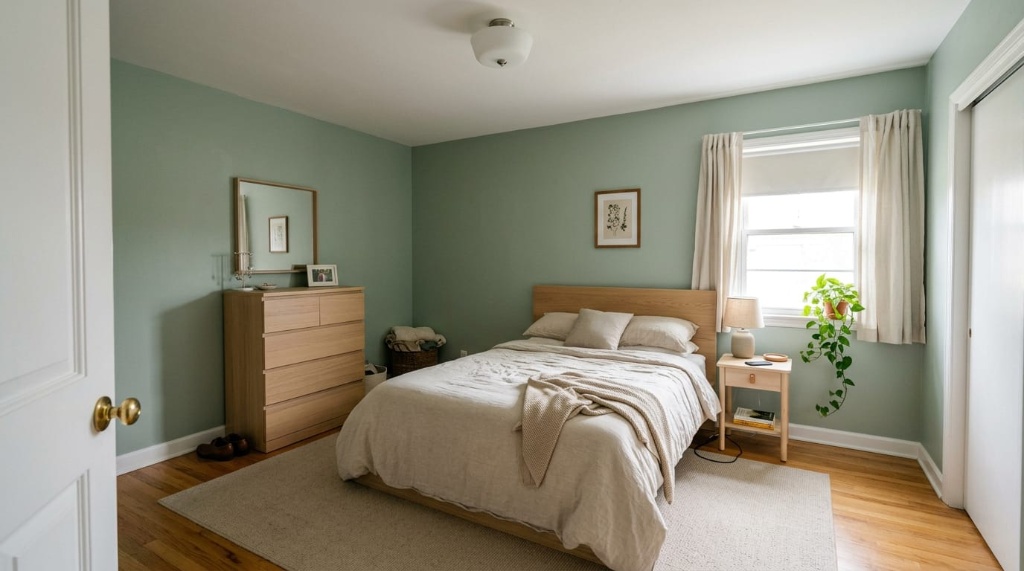
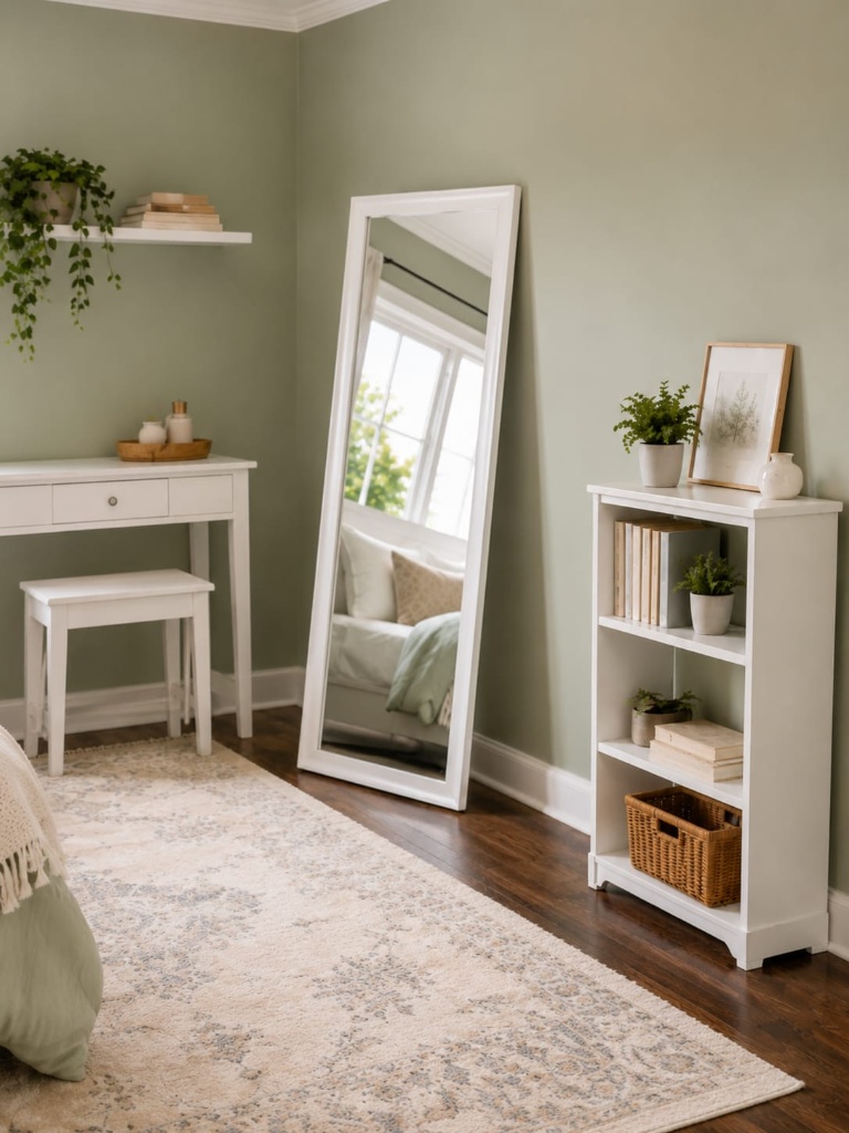
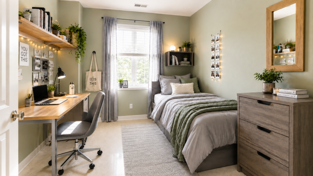
2. Small Sage Green Bedroom
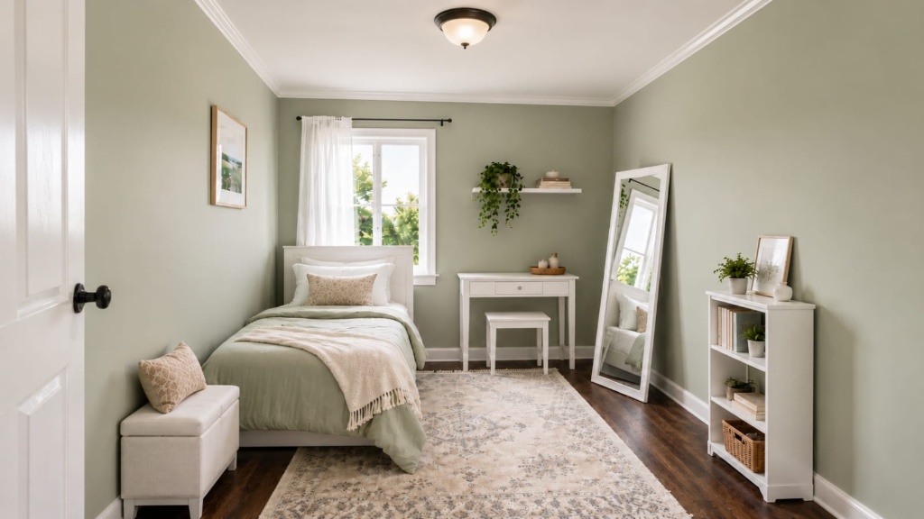
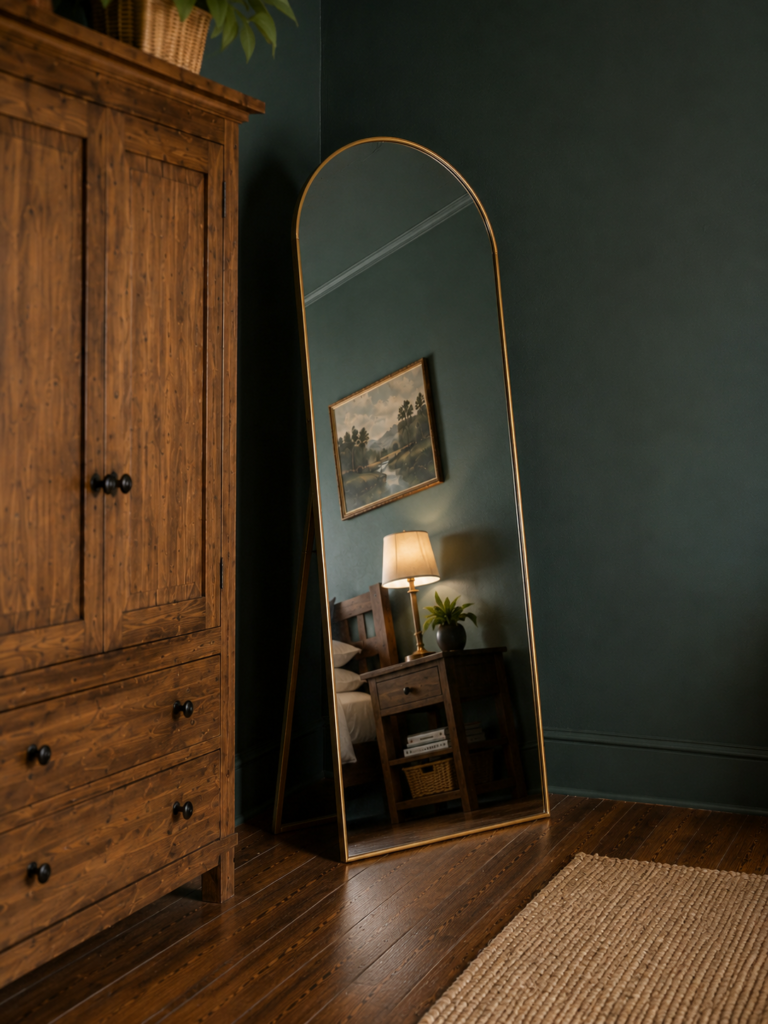
Recipe: sage on all four walls, white bedding, one wood piece, a large mirror. Sage keeps a small room feeling open instead of closed in, which is why it is my go-to for tight spaces. Because it reads almost like a pale neutral, the color calms the room without ever crowding it. If you want color but worry about losing brightness, paint just the headboard wall sage and leave the rest soft white.
3. Green and Off-White Bedroom
Recipe: off-white walls, green duvet and curtains, woven basket, one leafy plant. If you want the easiest, brightest version of a green bedroom, pair it with white. The high contrast keeps everything feeling clean and timeless, and it is the most rental-friendly route there is, since you commit to nothing permanent and can refresh the whole look in an afternoon.
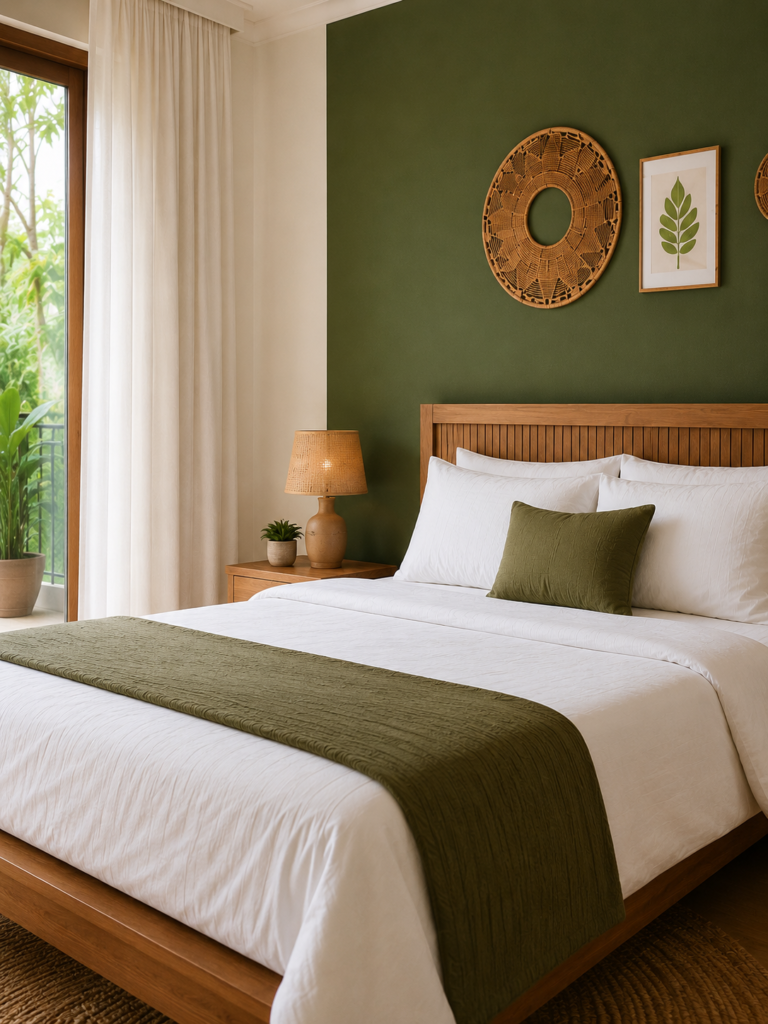
4. Green Accent Wall Bedroom
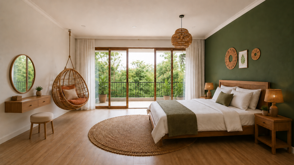
Recipe: olive or forest accent wall behind the bed, white side walls, one matching pillow. Not ready to commit to a whole room? An accent wall gives you a designer focal point while the rest of the space stays light and bright. The trick is to echo that green somewhere small elsewhere, a piece of art or a lampshade, so the wall reads intentional rather than like an afterthought.
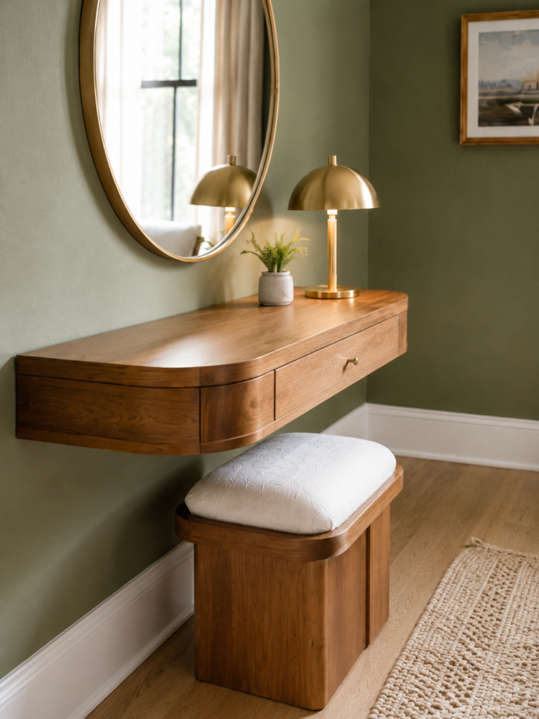
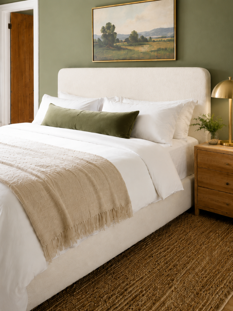
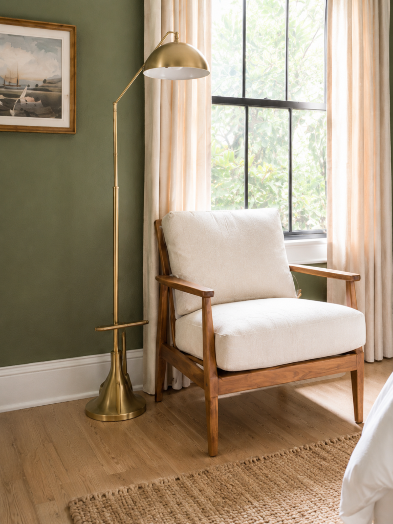
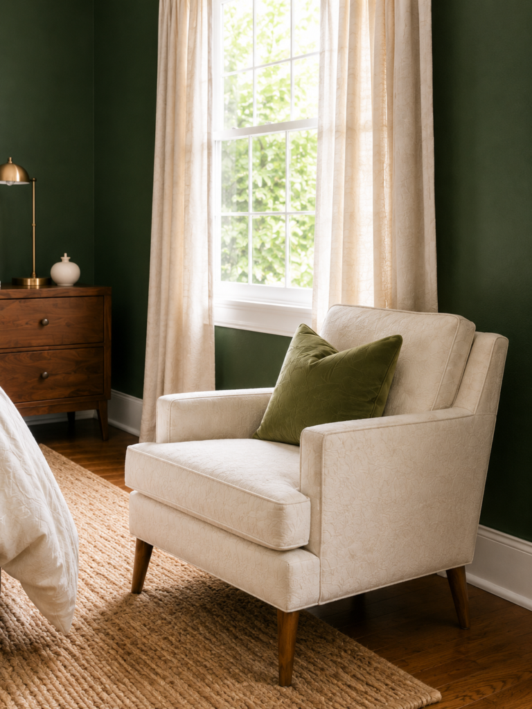
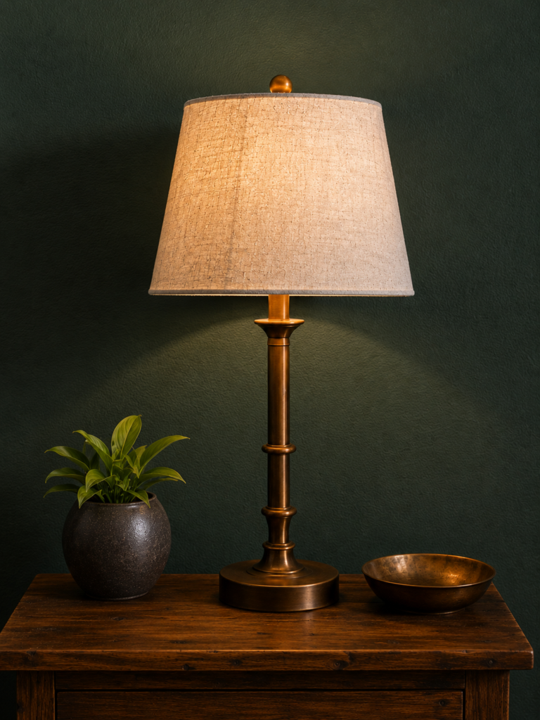
5. Olive Green Bedroom With Walnut and Brass
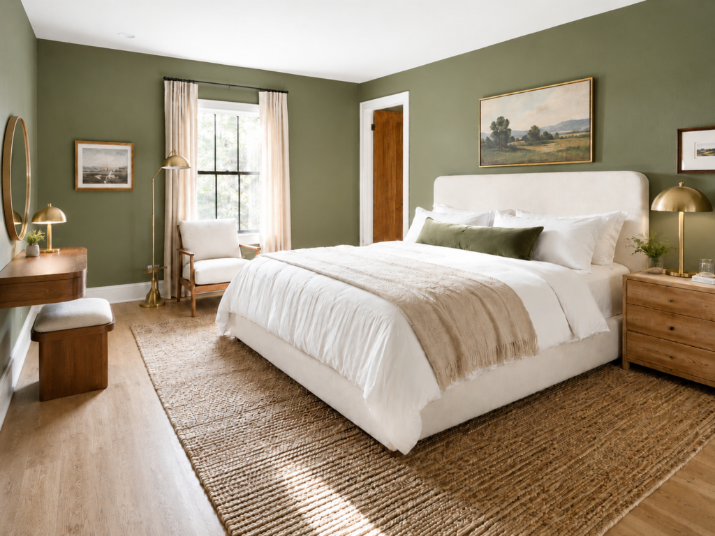
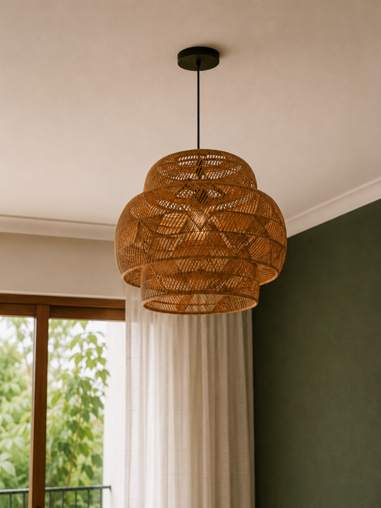
Recipe: olive walls, boucle or linen headboard, jute rug, brass lamp. Olive is the warm, earthy member of the green family, and it leans yellow, so it needs warm light to glow. In a cool north-facing room it can flatten and turn drab, but give it sunlight or warm bulbs and it reads rich and grounded. It is the most modern-organic green you can choose right now.
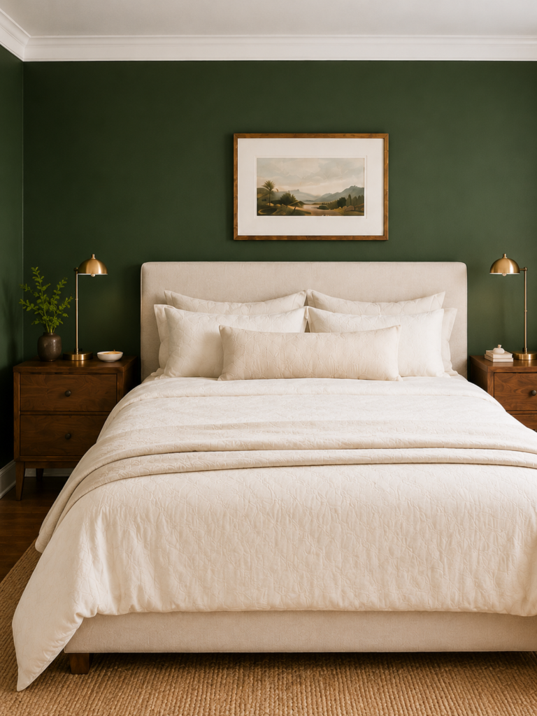
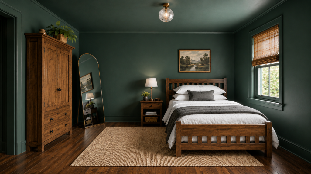
6. Forest Green Bedroom With White Trim
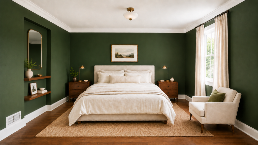
Recipe: deep forest walls, cream bedding, walnut nightstands, a small brass lamp. Deep green is for the reader who wants their bedroom to feel like a hideaway. Here the green stays on the walls while the trim and ceiling stay crisp white, which keeps the look sharp and tailored instead of heavy. With warm, dimmable lighting, it reads like a quiet hotel room.
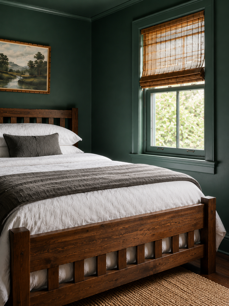
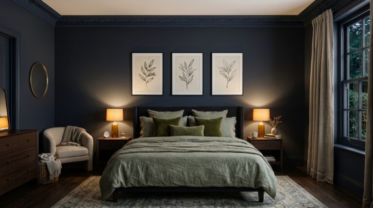
7. Color-Drenched Dark Green Bedroom
Recipe: dark green on the walls, trim and ceiling, one large mirror, a warm bedside lamp. This is the opposite of the forest green with white trim look above. Instead of green walls with white trim, the same dark green wraps every surface, so the room loses its hard edges and turns into a true cocoon. Drenching it this way is also why dark green does not automatically shrink a small room: with no contrast marking the corners, the space reads deeper rather than smaller. A mirror and a warm lamp keep it cozy rather than cavelike. For more on the moody, enveloping look, see my dark and cozy bedroom guide.
8. Mint Green Bedroom
Recipe: mint or eucalyptus walls, crisp white bedding, pale wood, fresh greenery. Mint and eucalyptus are the freshest, most airy greens, lovely in a bright room or for a coastal feel. They need good natural light to stay crisp rather than washed out. One caution: cool mint can read a little cold, so balance it with warm, natural materials and plenty of soft texture.
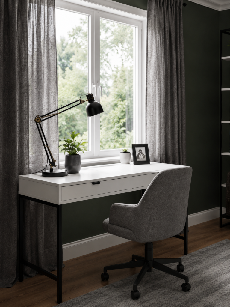
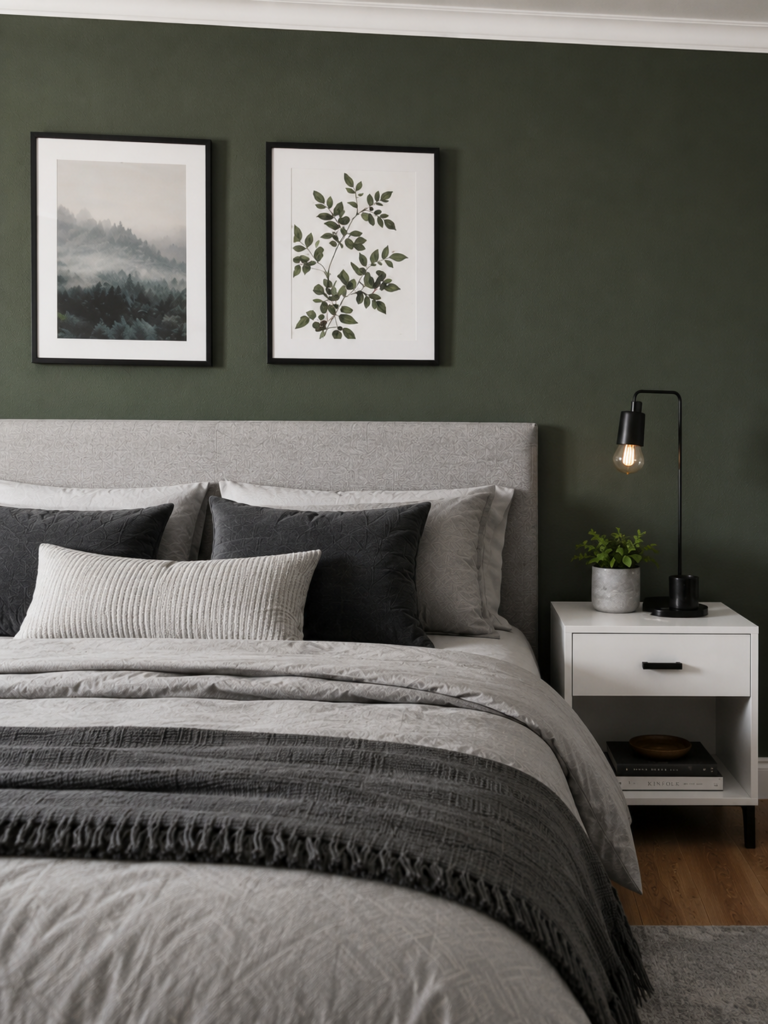
9. Forest Green and Gray Bedroom
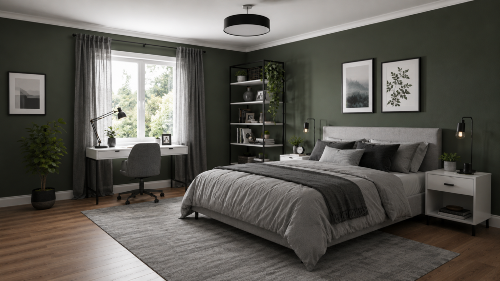
Recipe: forest green walls, charcoal and dove-gray textiles, white trim, a few black metal accents. Pairing a deep forest green with gray gives you a moody room that still feels modern, not heavy. The gray cools the green’s depth so it reads sophisticated and a little masculine, not dramatic. Mix charcoal with a softer dove gray for contrast.
10. Sage Green and Grey Bedroom
If you love sage but want something a little cooler and more modern, sage and grey is a beautiful pairing. The grey grounds the green and gives the room a calm, contemporary edge that works especially well with modern furniture.
I have a full breakdown of how to balance the two tones, which grey shades flatter sage, and the exact pieces that pull the look together. See the complete guide to sage green and grey bedroom ideas.

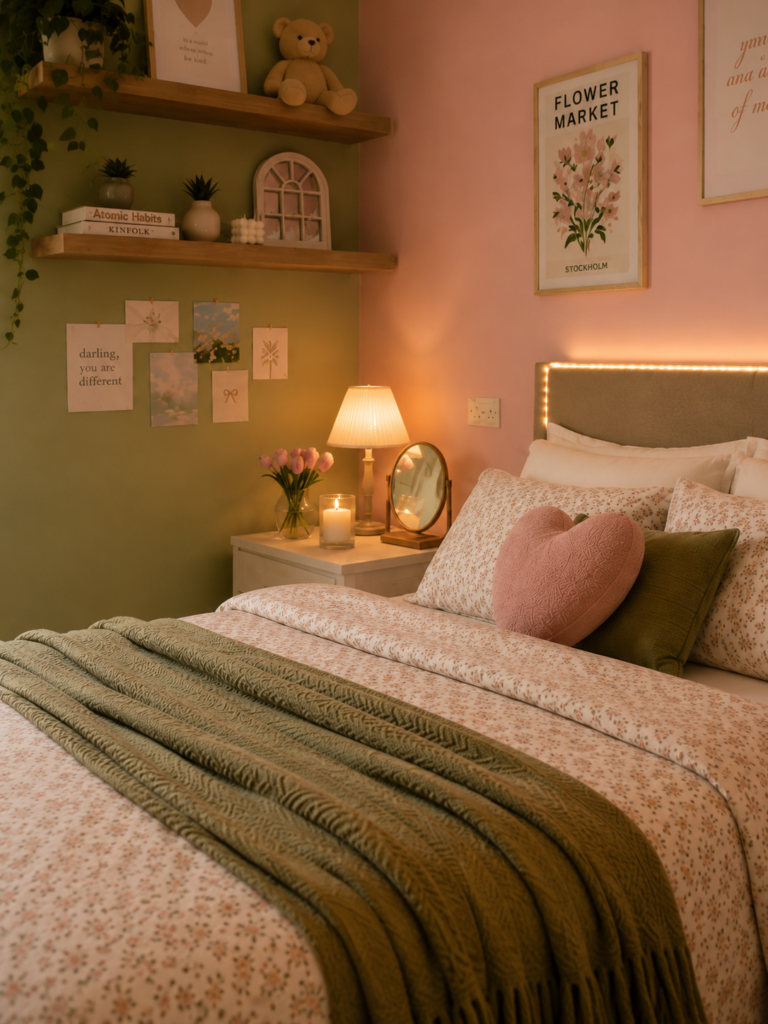
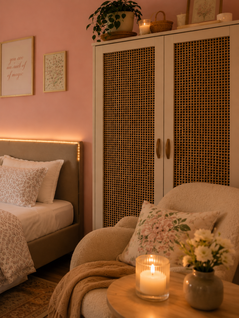
11. Sage Green and Pink Bedroom
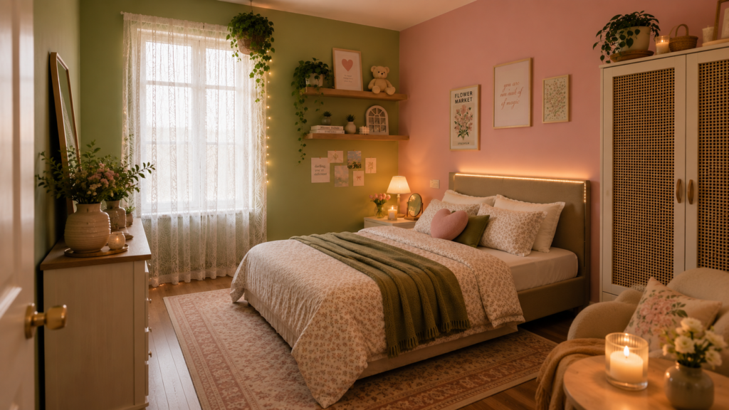
For something softer and a touch romantic, sage and blush pink is the combination I reach for. The warmth of pink keeps sage from feeling cold, and together they read gentle and welcoming without being sweet.
It is a lovely look for a guest room or a feminine primary bedroom. The full styling formula, including how much pink to use so it stays grown-up, is in my guide to sage green and pink bedroom ideas.
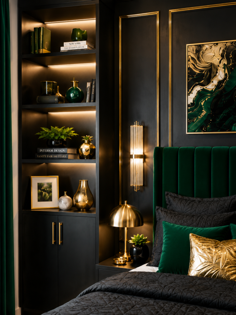
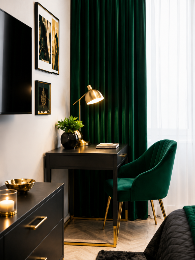
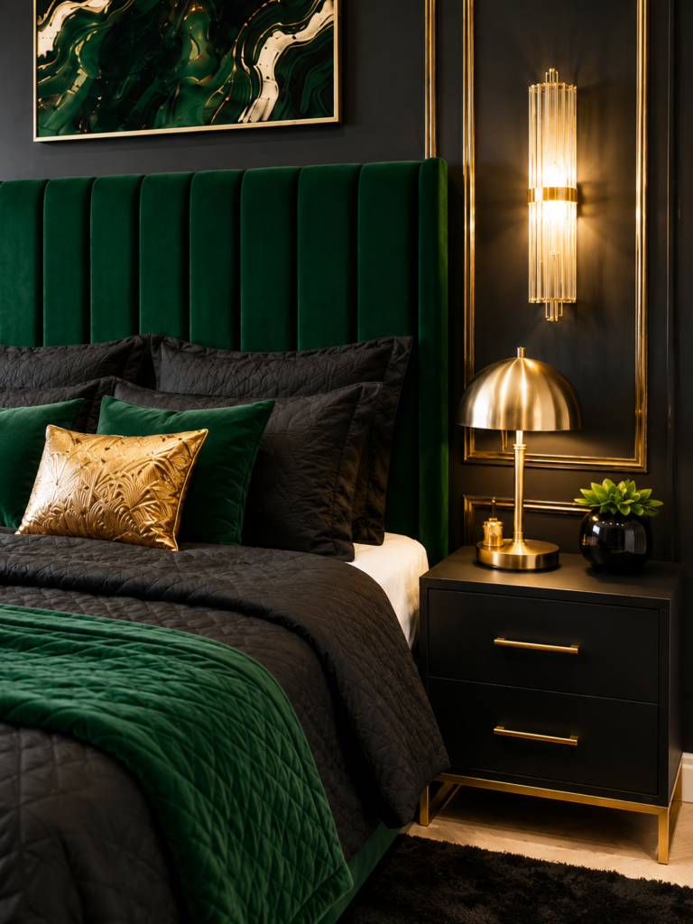
12. Emerald Green, Black and Gold Bedroom
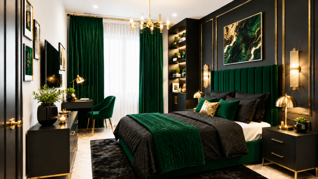
When you want drama instead of calm, emerald with black and gold is pure glamour. Emerald brings richness, black adds contrast, and gold makes the whole thing feel luxe. This is the boldest green look in the cluster and it photographs beautifully.
It deserves its own playbook, from how much black to use to where the gold belongs. Get the full look in my guide to emerald green, black and gold bedroom ideas.
How to choose the right green for your room
Green shifts more than almost any color depending on light, so run your shade through these filters before you commit.
Match the green to your light
| Room faces | Light quality | Best green choice |
| North | Cooler, bluer | Warm-toned greens (warm sage, olive) so it doesn’t go gray |
| South | Warm, bright | Almost anything, including cool and deep greens |
| East | Bright mornings, cooler later | Sample and check morning and evening |
| West | Cool mornings, warm evenings | Greens that can handle a warm glow at sunset |
Tape large swatches to two walls and look at them morning, midday, and night under your real bulbs. Warm soft-white bulbs around 2700K make greens cozier, while cooler bulbs push them toward gray.
Match the green to your furniture
Pull the green toward what you already own. Warm wood like oak and walnut loves olive, moss, and warmer sages. Cool tones like gray, black, and chrome look sharp with crisp or blue-leaning greens and deep forest. White and cream pieces work with almost any green, which is why an all-white room is the easiest base to add green to.
Common green bedroom mistakes
A few quick missteps I see most often, and how to avoid them:
- A cool, blue-leaning green in a north-facing room. It turns gray and gloomy. Choose a warm-toned green instead.
- Deep green in a small room with no light textures or mirror. It reads heavy instead of cozy. Add a mirror and two soft textures.
- Forgetting the floor and the big furniture. A green that looks perfect on the wall can clash with an orange-toned wood floor or a cool gray bed. Hold your sample next to your largest pieces before deciding.
- Too many colors. Green plus more than two supporting colors stops feeling restful fast. Keep the palette tight.
Does a green bedroom really help you sleep?
You will see claims online that a green wall lowers your heart rate or boosts deep sleep by some exact percentage. I want to be honest with you: there is no solid evidence that wall color changes sleep that way, and I am not going to pretend otherwise.
What is fair to say is that green is widely experienced as restful and easy on the eyes, and it sets a calm tone. The things that genuinely help you sleep are blackout curtains, warm dimmable lighting, and a low-clutter palette of green plus two supporting colors.
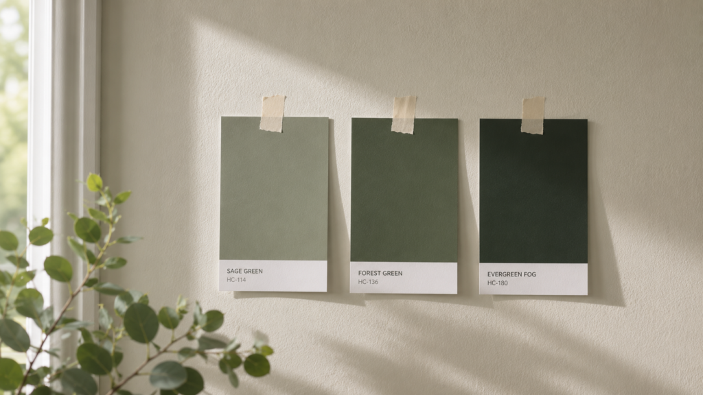
Best green paint colors for a bedroom
Treat these popular US shades as starting points, then sample on your own wall, because your light decides the result.
| Look you want | Shade family | Worth sampling |
| Soft, neutral calm | Pale sage | Sherwin-Williams Clary Sage, Sagey |
| Spa-like and fresh | Soft sea-glass green | Sherwin-Williams Sea Salt |
| Grounded and earthy | Olive / moss | Sherwin-Williams Oak Moss, Benjamin Moore Saybrook Sage |
| Moody retreat | Forest / hunter | A deep forest green (sample several, they vary) |
Budget note: you do not need a premium brand for a great green. Big-box store paints carry excellent shades, and a peel-and-stick swatch or a sample pot is the cheapest way to test before you buy gallons.
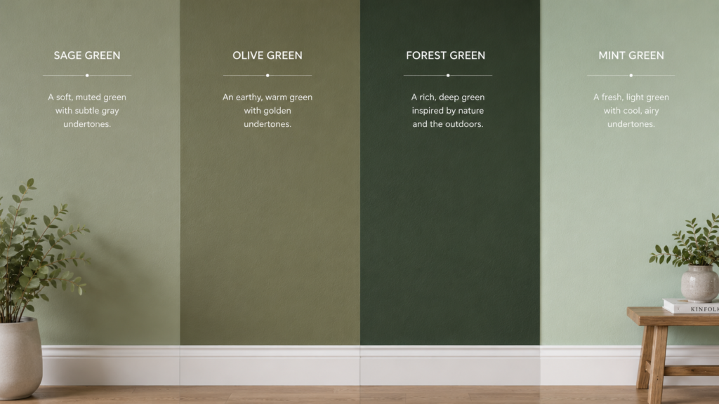
Green shade comparison at a glance
| Shade | Feel | Pairs best with | Watch out for |
| Sage | Soft, neutral, calm | White, light wood, blush | Can go gray in cool north light |
| Mint / eucalyptus | Fresh, light, airy | White, pale wood | Can feel cold if overused |
| Olive | Earthy, warm, grounded | Walnut, brass, cream | Needs warm light to glow |
| Forest / hunter | Moody, rich, cozy | Brass, navy, white trim | Sample several, they vary widely |
Looking for other colors entirely? Start at my bedroom color combination ideas hub for the full palette.
FAQ
Is green a good color for a bedroom?
Yes. Green is restful, easy on the eyes, and tied to nature, and it ranges from near-neutral sage to dramatic forest, so it suits almost any room and style.
What colors go with a green bedroom?
Cream, beige, and warm white for a bright base; natural wood and brass to warm it up; terracotta, rust, or blush for energy; and charcoal or navy for a modern, high-contrast look. Wood and warm white are the safest choices.
Does dark green make a small room look smaller?
Not necessarily. A deep green on all walls can blur the corners and make a small room feel deeper and more enveloping. Keep the trim and ceiling light, add a mirror, and layer soft textures so it reads cozy and intentional.
Does a green bedroom help you sleep?
It can help set a calm mood, but there is no solid proof that wall color changes how you sleep. Pair your green with blackout curtains and warm, dimmable lighting for results you will actually feel.
What is the best green paint for a bedroom?
There is no single best green, because your light decides the outcome. Popular shades to sample include soft sages like Clary Sage, fresh greens like Sea Salt, and earthy options like Oak Moss or a deep forest green. Always test a real sample on your wall first.
How do I choose between sage and olive?
Look at your light and wood tones. Sage is softer and more neutral and suits cool light and light wood, though it can turn gray in north-facing rooms. Olive is warmer, glows in warm light, and pairs beautifully with walnut and brass.
Matte or satin finish for a green bedroom?
Matte is usually best for bedroom walls. It softens the color, hides small flaws, and gives green a richer, velvety look. Save satin or eggshell for trim and high-touch areas.


3 Comments