
Professional Tips For A Pastel Bedroom That Feels High End
Last Tuesday, I sat in a room that felt like a giant bowl of melted sherbet. My friend Sarah had spent three weeks and over two thousand dollars trying to create a serene sanctuary. Instead, she ended up with a space that looked like a nursery for a very confused toddler. The walls were a loud bubblegum pink. The curtains were a heavy lilac that blocked every ounce of natural light. Her face showed the exact moment she realized her Pinterest dream had become a neon nightmare. Have you ever felt that sinking feeling after a DIY project goes wrong? Why does a soft palette seem so easy in photos but feel so messy in real life? Can you actually create a sophisticated adult space using colors traditionally reserved for birthday cakes? I promised Sarah we would fix it by Friday. We did, and the result was a room that felt like a luxury hotel suite in Paris. This guide shares every lesson I learned during that frantic week of repainting and restyling. If you are still comparing soft, warm, and cool palettes, my full guide to bedroom color combination ideas can help you choose shades that work with your room’s light, size, and sleep mood.
Executive Summary
This guide provides a clear path to achieving a mature, calm, and expensive-looking space. You will learn how to balance soft hues with earthy tones to avoid the common “baby room” trap. We cover specific cost ranges from fifty-dollar lighting fixes to three-thousand-dollar furniture overhauls. I share three specific case studies, including a small studio transformation that took only forty-eight hours. You will find honest assessments of brands like Sherwin-Williams and IKEA. I also explain why most people fail by choosing the wrong light bulbs. We intentionally exclude dark, moody color schemes or heavy industrial styles to stay focused on the light and airy aesthetic. By the end of this reading, you will have a step-by-step plan to turn any dull room into a masterpiece of soft design. Expect to see a total change in how you perceive color saturation and texture.
1. How Do You Choose The Right Paint For A Pastel Bedroom?
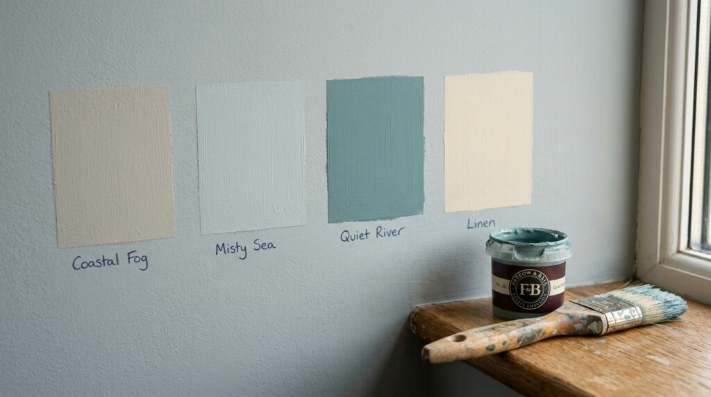
Choosing the right paint for a pastel bedroom requires looking for “muddy” or gray-toned versions of your favorite colors. Pure pastels often look too bright on four walls. Pick shades with a high LRV (Light Reflectance Value) above sixty to keep the space airy. Always test a large swatch at three different times of day before buying a full gallon.
In my experience, the biggest mistake people make is picking a paint color from a tiny paper swatch. I saw this go wrong with a client in Seattle who wanted a soft mint green. On the card, it looked like a dream. On the walls, it looked like a hospital hallway from the seventies. We had to spend an extra four hundred dollars on labor to repaint the entire thing. Now, I always tell people to buy a sample pot and paint a two-foot square. Observe it at 8:00 AM, noon, and 8:00 PM. The shifting light changes how the pigment reacts.
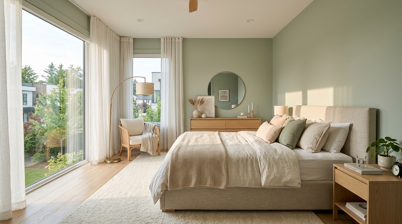
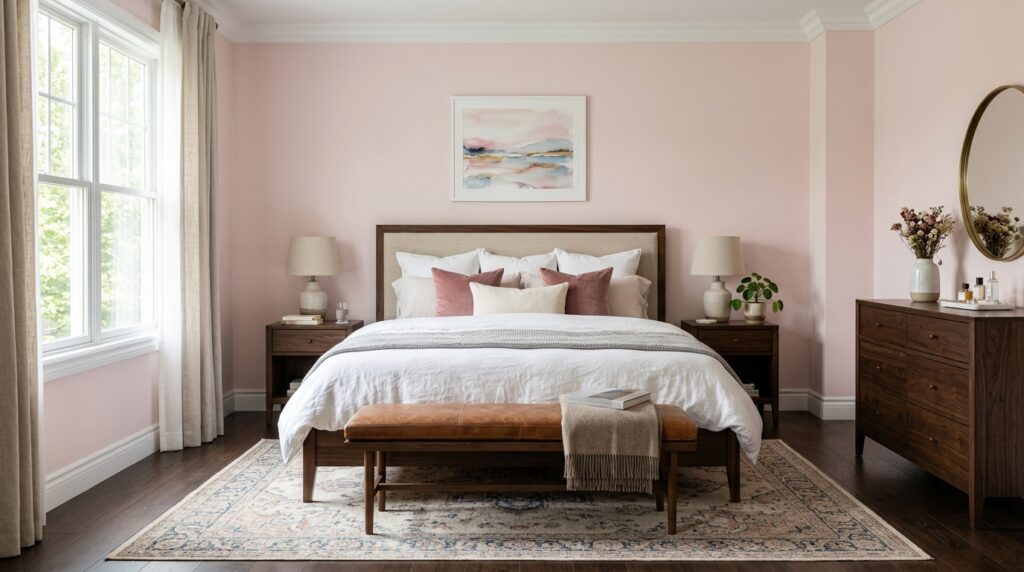
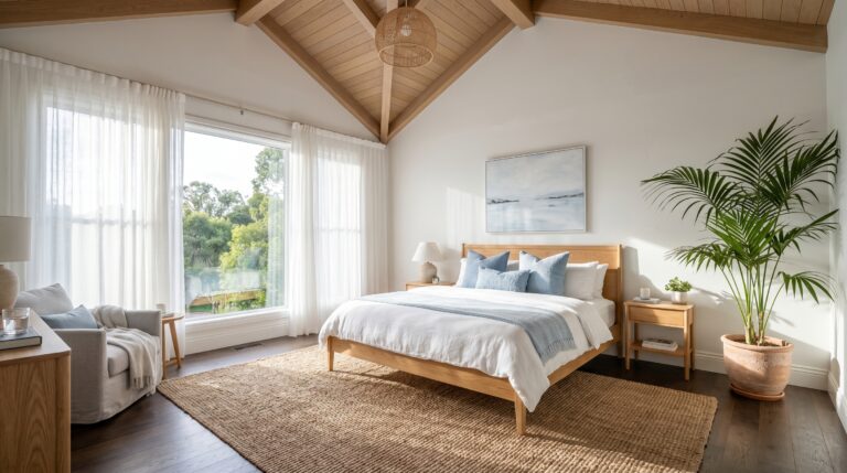
I’ve seen this work best when you lean into “greige” undertones. For a recent project, we used Sherwin-Williams Sea Salt. It is a classic for a reason. If you want a soft palette that still feels romantic and grown-up, a sage green and pink bedroom is one of the safest ways to use pastels without making the room feel childish. It looks blue in some lights, green in others, and gray when it’s cloudy. This versatility is what makes a room feel high-end. For a cooler muted version of this look, these sage green and grey bedroom ideas show how to keep the room calm, soft, and sophisticated. If you choose a “flat” pastel with no gray, it lacks depth. It feels one-dimensional. To avoid this, look for colors that people describe as “dusty” or “muted.” These tones act as a neutral background rather than a loud statement.
If you are a beginner, start with one accent wall. This takes about four hours and costs under sixty dollars for paint and brushes. For intermediate designers, try a lime wash. This adds a chalky, ancient texture that makes even a cheap drywall look like a Tuscan villa. Advanced DIYers might want to try a two-tone ombre effect. This requires blending wet paint on the wall. It takes a full weekend but creates a stunning sunset effect. I’ve noticed that people who skip the primer usually regret it. Pastels are notorious for letting the old wall color bleed through.
A common failure point is ignoring the ceiling. Most people leave it stark white. This creates a harsh line that makes the room feel shorter. I’ve tried painting the ceiling a shade fifty percent lighter than the walls. This makes the boundaries of the room disappear. It creates a “cloud” effect that is incredibly relaxing. I once saw a designer use a soft peach on the ceiling with white walls. It felt like the room was constantly bathed in a warm glow.
| Paint Brand | Suggested Color | Tone | Estimated Cost | Pros | Cons |
| Benjamin Moore | Palladian Blue | Airy/Fresh | $75/gal | High coverage | Pricey |
| Sherwin-Williams | Sea Salt | Earthy/Muted | $65/gal | Very versatile | Can look gray |
| Farrow & Ball | Pink Ground | Dusty/Chalky | $120/gal | Beautiful finish | Very expensive |
| Behr | Breezeway | Crisp/Modern | $45/gal | Affordable | Needs 3 coats |
| Magnolia Home | Rainy Day | Soft/Moody | $55/gal | Great pigment | Limited stores |
2. What Bed Backside Design Works Best With Soft Tones?
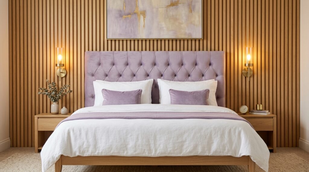
The best bed backside design for a soft room involves using tall, textured headboards or architectural elements like wood slats. Instead of a flat wall, create depth with a velvet tufted board or a large arched mural. This draws the eye to the center of the room and makes the pastel bedroom feel intentional and grounded.
I once worked with a homeowner who had a beautiful light lavender room, but it felt “hollow.” The bed was just a frame against a flat wall. We added a custom bed backside design using three large arched panels covered in a linen fabric. The cost was about three hundred dollars in materials. The result was instant. It gave the room a soul. Without a strong focal point behind the head, the soft colors just float away. You need a “weighty” element to anchor the space.
In my experience, wood is the best friend of a soft palette. I’ve seen this work with light oak slats. They add a vertical line that makes the ceiling feel taller. I tried this in a small guest room last year. We used peel-and-stick wood planks behind the bed. It took five hours and cost two hundred dollars. The warmth of the wood balanced the coolness of the light blue walls perfectly. If you don’t have the budget for wood, a large piece of art works wonders. Look for something with gold or brass frames to add a touch of luxury.
Beginners should look at simple fabric headboards. Brands like Wayfair or Target offer these for under one hundred and fifty dollars. An intermediate project would be a “painted arch.” You use a piece of string and a pencil to draw a perfect curve behind the bed and paint it two shades darker than the wall. This is a twenty-dollar fix that looks like it cost a thousand. For an advanced look, consider a full-wall upholstered panel. This involves foam, fabric, and a lot of staples. It creates a sound-dampening effect that makes the bedroom feel like a quiet cocoon.
One failure point I often see is a headboard that is too short. If the pillows cover the entire thing, what is the point? Ensure your bed backside design stands at least thirty inches above the mattress. I’ve noticed that velvet is particularly effective in these spaces. It catches the light and creates shadows. This prevents the pastel bedroom from looking washed out in photos. If you are on a budget, an old door can be sanded and painted a soft sage green to serve as a vintage headboard. It is a classic “normal room decor” trick that adds tons of character.
3. How Can Bedroom Design Ideas Modern Homes Use Stay Trendy?
Bedroom design ideas modern homes favor currently focus on “monochromatic layering” and organic shapes. Instead of mixing many colors, use different shades of the same pastel. Incorporate curved furniture, matte black accents, and large-scale minimalist art. This creates a sophisticated look that avoids the clutter often found in traditional decor styles.
I’ve noticed that the most successful modern rooms skip the “shabby chic” look entirely. Ten years ago, pastels meant distressed white furniture and floral prints. Today, modern style means clean lines. I once visited a home in Austin where the owner used a single shade of “millennial pink” for everything. The walls, the bedding, and the rug were all the same hue but different textures. It was bold and incredibly chic. It felt like a high-end fashion boutique rather than a sleeping area.
The secret to a modern feel is the “Rule of Three.” Use three distinct textures in every corner. If you prefer a quieter version of this modern approach, a modern neutral bedroom uses soft tones, clean lines, and natural textures without looking plain. For example, a boucle chair, a glass side table, and a wool rug. This keeps the eye moving. I’ve seen this work brilliantly in studio apartments. When space is tight, a light color palette prevents the room from feeling cramped. I recently helped a friend style a three-hundred-square-foot space. We used a very light lemon yellow on the walls. By adding chrome lamps and a glass desk, we made the room feel double its actual size.
For a beginner, modernizing is as simple as changing your hardware. Swap old wooden knobs for sleek brass or matte black pulls. This costs about forty dollars and takes twenty minutes. Intermediate decorators can try “liminal lighting.” This involves hidden LED strips behind the bed or under the nightstand. It creates a soft glow that feels very futuristic. Advanced designers should look into “color drenching.” This means painting the walls, trim, doors, and even the radiators the exact same pastel shade. It is a daring move that pays off in architectural drama.
A common mistake is using too many “cute” accessories. If every item has a ruffle or a bow, the modern edge is lost. I always suggest at least one “hard” element. A concrete planter or a sharp-edged metal mirror provides the necessary contrast. In my experience, Article or West Elm are great brands for finding these modern pieces. They offer mid-century shapes that look amazing against a soft backdrop. Remember, modern design is about what you leave out. Clear the clutter and let the colors breathe.
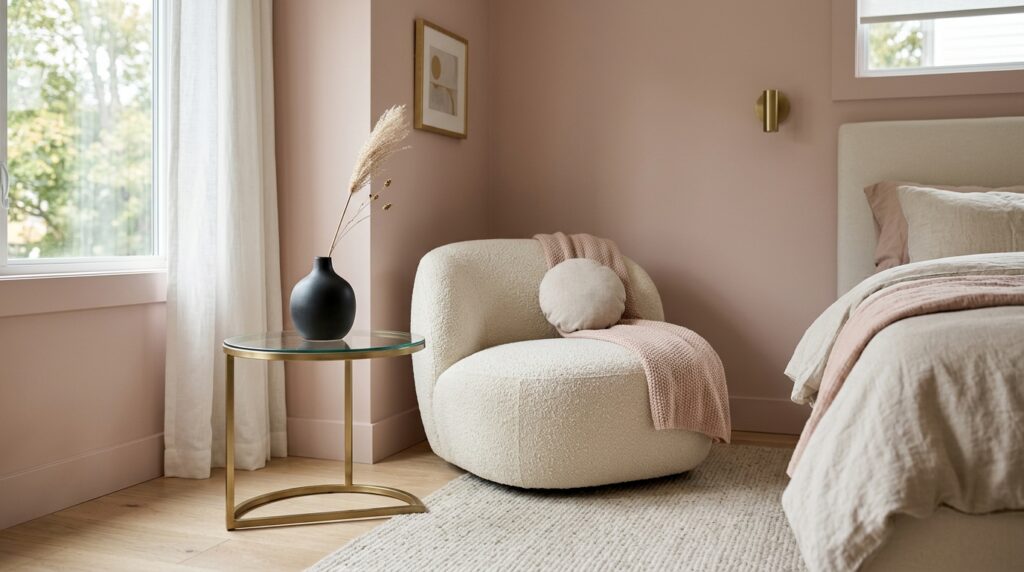
4. Why Do Certain Room Setting Ideas Fail To Feel Cozy?
Room setting ideas often fail because they lack “visual weight” or proper layering. A room with only light colors and thin fabrics feels cold and sterile. To create coziness, you must add heavy textures like chunky knits, velvet cushions, and plush rugs. Proper lighting at different heights is also a key step in building warmth.
I’ll never forget a client who called me crying because her “dream room” felt like a refrigerator. She had white walls, light blue bedding, and a tile floor. It was beautiful but physically uncomfortable to be in. We fixed it by adding a large jute rug over the tile and layering three different blankets on the bed. Coziness is a sensory experience, not just a visual one. You need to think about how things feel against your skin.
In my experience, “normal room decor” can be the secret weapon here. You don’t need expensive items. A few well-placed candles and a stack of books can make a space feel lived-in. I’ve seen this work in dorm rooms and mansions alike. The goal is to avoid “showroom syndrome” where everything looks too perfect to touch. I like to add at least one vintage item that shows a bit of wear. A thrifted wooden stool or an old brass lamp adds a sense of history. This prevents the pastel bedroom from feeling like a plastic dollhouse.
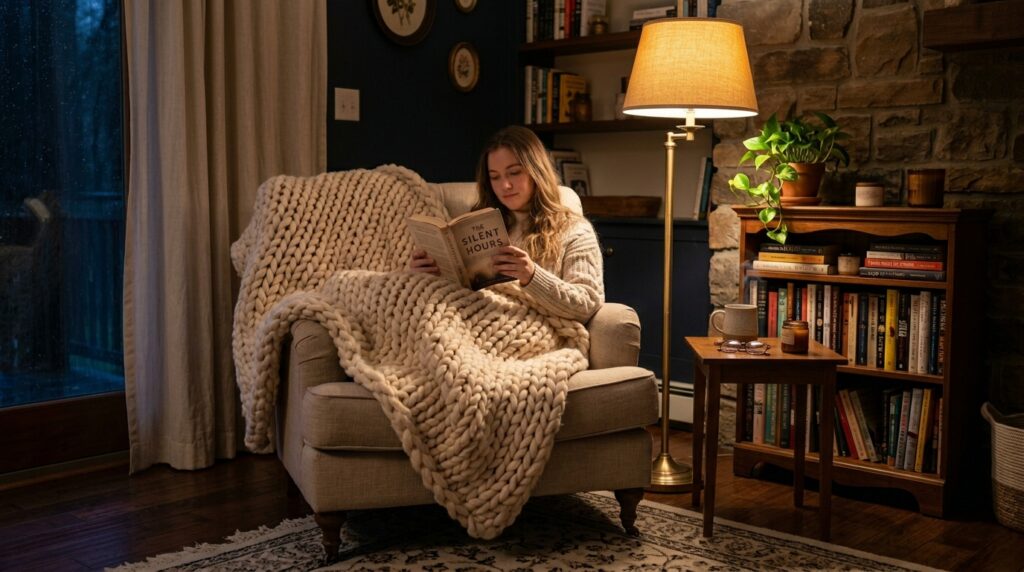
If you are just starting, focus on the “Floor Up” rule. Start with a rug that is soft on your feet. A high-pile Moroccan rug in a cream or light gray is perfect. For an intermediate project, look at your window treatments. Ditch the plastic blinds and install floor-to-ceiling linen curtains. This costs about one hundred dollars but makes the room feel like a sanctuary. Advanced stylists can look into “sensory zones.” Create a dedicated reading nook with a high-back chair and a focused floor lamp. This gives the room a purpose beyond just sleeping.
A major failure point is the “Big Light.” Never use the overhead ceiling light if you want a cozy vibe. It flattens everything and makes pastels look sickly. I’ve tried using four to five different light sources at eye level. Use table lamps, floor lamps, and even battery-operated sconces. This creates pockets of light and shadow. It makes the room feel intimate. I once saw a room where the only light came from a neon sign in a soft peach color. It was surprisingly cozy and very modern.
5. Can You Use Normal Room Decor To Save Money On Style?
You can absolutely use normal room decor to create a high-end look by using the “Spray Paint and Swap” method. Take affordable items from big-box stores and change their color or finish. By coordinating the tones of your budget finds with your pastel bedroom palette, you create a cohesive look that masks the low price tag of the individual pieces.
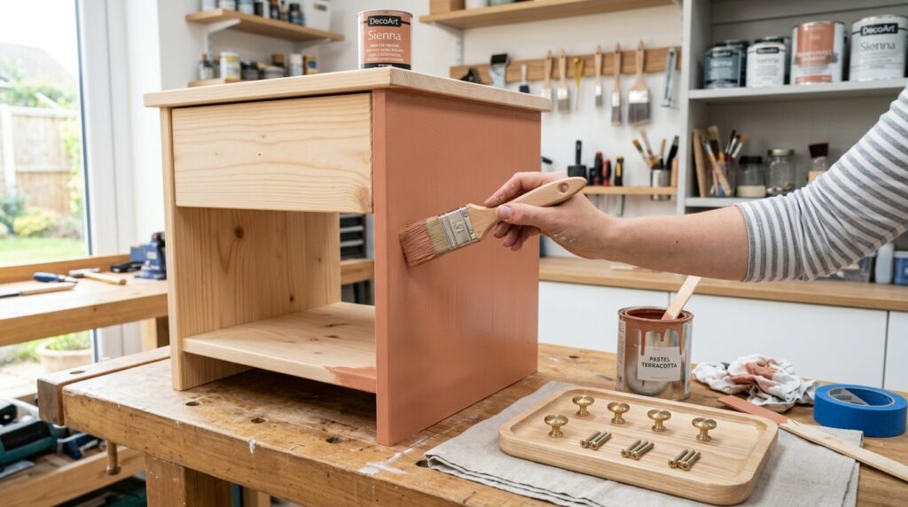
I’m a huge fan of the IKEA Malm series. On its own, it looks a bit basic. However, I’ve seen people take a sixty-dollar Malm nightstand and paint it a soft terracotta. Add some leather pulls, and suddenly it looks like a four-hundred-dollar piece from a boutique. This is how you win at design without breaking the bank. In my experience, the secret is in the details. People don’t notice the price of the furniture if the styling is top-notch.
I once did a “Five Hundred Dollar Challenge” for a local blog. We had to decorate an empty room using only “normal room decor” from places like Target and thrift stores. We found a great old dresser for twenty dollars. After a light sanding and a coat of “Dusty Rose” paint, it became the centerpiece of the room. We spent the rest of the budget on high-quality bedding and a nice rug. The lesson? Spend your money on things you touch, like sheets, and save money on things you just look at, like side tables.
Beginners should start with “Tray Styling.” Take a simple wooden tray, paint it a pastel color, and use it to organize your perfume bottles or jewelry. It creates a “moment” of luxury for five dollars. Intermediate DIYers can try “Frame Gallery” walls. Buy cheap frames from a dollar store, paint them all white or gold, and fill them with dried flowers or fabric scraps. For an advanced project, try “Furniture Hacking.” Take a standard bookshelf and add crown molding to the top before painting it. It creates a built-in look for a fraction of the cost.
One failure point I see is people buying everything at once from the same store. This makes the room look like a catalog page. I’ve noticed that the best rooms have a “curated” feel. This means mixing a new lamp from Target with a vintage vase from a garage sale. I’ve seen this work in my own home. I have a very expensive velvet bed paired with twenty-dollar nightstands I found on the curb. Because I painted the nightstands to match the wall, nobody ever guesses they were free.
6. What Is The Best Room Decor For Girls Bedrooms Right Now?
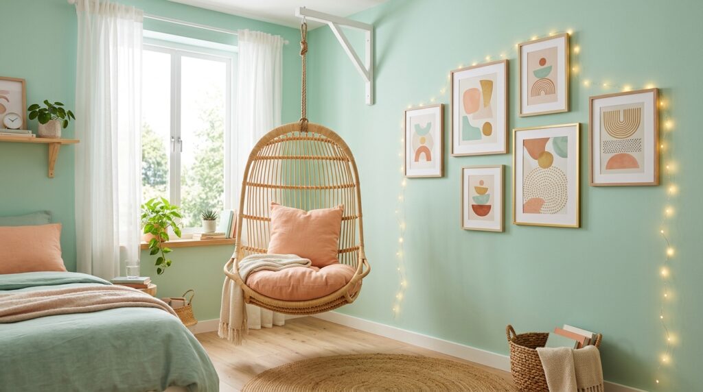
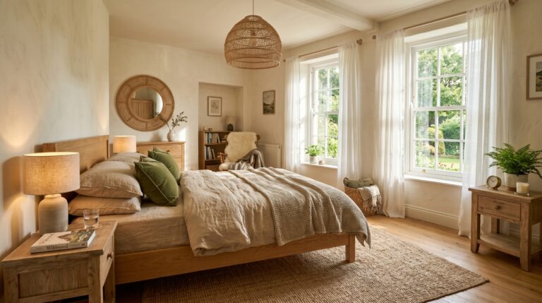
The best room decor for girls bedrooms currently moves away from bright pink and toward “Earthly Pastels” like sage green, dusty gold, and muted clay. This palette grows with the child and feels more sophisticated. Incorporate natural materials like rattan, cotton, and light wood to create a space that is both playful and peaceful.
I remember a project for a ten-year-old girl named Maya. Her parents wanted “typical” girl decor—everything pink and sparkly. Maya, however, wanted something that felt more “grown-up.” We settled on a sage green and lavender theme. We used “room decor for girls bedrooms” that focused on texture rather than characters. We added a hanging rattan chair and a wall of fairy lights behind a sheer curtain. Three years later, she still loves the room because it doesn’t feel like a “little kid” space.
In my experience, the “Gallery Wall” is a winner for kids and teens. It allows them to express themselves without ruining the walls. Use removable tape to hang posters, drawings, and photos. This is a great way to incorporate room setting ideas that are flexible. I’ve seen this work with a “Theme of the Month.” One month it’s all about horses, the next it’s space. Because the background walls are a soft pastel, any color they add through art usually looks okay.
For a beginner, start with “Textile Swapping.” Change the throw pillows and blankets to match the new pastel theme. This is a one-hundred-dollar fix. Intermediate decorators can try a “Canopy Bed.” You don’t need a new bed frame. Just hang sheer fabric from the ceiling using four hooks. It creates a magical, princess-like feel for under fifty dollars. Advanced designers can look into “Custom Wall Murals.” Use painter’s tape to create mountains or clouds in different pastel shades. It takes a full day but becomes the star of the room.
A common mistake is making the room too “themed.” If everything is unicorns, the child will outgrow it in six months. I’ve noticed that if you keep the big items (bed, dresser, rug) neutral or pastel, you can change the “vibe” with small accessories. I’ve tried this with my own daughter. We have a soft blue room, and we just swap the toys and pillows as her interests change. It saves a lot of money and stress in the long run.
7. How Does Lighting Change The Way A Pastel Bedroom Looks?
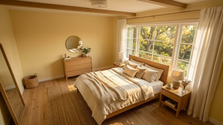
Lighting is the single most important factor in a pastel bedroom because it determines the “undertone” of the colors. Warm yellow bulbs can make a cool blue look green, while cool white bulbs can make a soft pink look gray. For the best result, use “Warm White” bulbs (around 2700K to 3000K) to maintain the true hue of your pastel walls.
I once saw a beautiful peach room turn into a muddy orange because the homeowner used “Daylight” bulbs. These bulbs are very blue and harsh. They are great for a garage but terrible for a bedroom. We swapped them for Philips Hue smart bulbs. This allowed the owner to change the warmth of the light from her phone. Suddenly, the peach walls looked like a soft sunset again. It was a sixty-dollar fix that saved a two-thousand-dollar paint job.
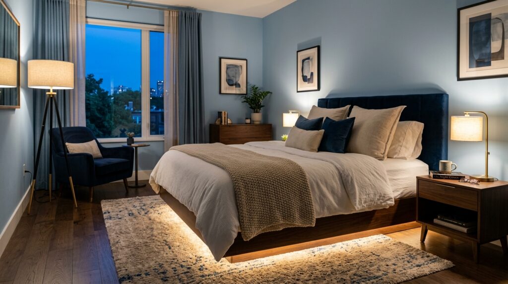
In my experience, “Layered Lighting” is the key to a professional look. You need three layers: Ambient (the main light), Task (for reading), and Accent (for mood). I’ve seen this work best with “hidden” sources. For example, a small lamp tucked inside a bookshelf. It creates a soft glow without the glare of a bare bulb. I’ve tried using “puck lights” under the bed frame to create a floating effect. It’s a cheap trick that looks incredibly high-end.
Beginners should start by replacing their bulbs. Look for “CRI” (Color Rendering Index) above ninety. This ensures the colors in your room look “real.” This costs about ten dollars. Intermediate projects involve “Sconce Installation.” You can buy battery-operated sconces that don’t require a guest to call an electrician. They stick to the wall and look like a permanent fixture. Advanced designers should look into “Architectural Lighting.” This means installing recessed lights or “cove lighting” along the ceiling. It’s expensive but changes the entire feel of the space.
A major failure point is ignoring the “shadows.” Pastels need shadows to have depth. If you light every corner of the room perfectly, it looks flat and boring. I’ve noticed that keeping some areas dim makes the lit areas feel more special. I’ve seen this in luxury hotels. They use very low-wattage bulbs in the lamps to create a “mood.” It makes the pastel bedroom feel like a secret escape. I always recommend adding a dimmer switch to the main overhead light. It’s a twenty-dollar part that gives you total control over the room’s energy.
8. Is A Pastel Bedroom Style Going To Last Past 2026?
The pastel bedroom style is a timeless choice because it is rooted in color psychology and the need for a restful environment. While specific shades like “Peach Fuzz” or “Millennial Pink” may drift in and out of style, the concept of using soft, light-reflective colors to create a peaceful sanctuary will always be relevant in interior design.
I’ve been watching design trends for fifteen years, and soft tones never truly go away. They just evolve. In the eighties, it was mint and mauve. In the two-thousands, it was “shabby chic” white and rose. Now, we are seeing “Earth Pastels” that look more natural. I saw a report last month that showed a forty percent increase in “calm home” searches. People are more stressed than ever. They want a bedroom that feels like a deep breath. A pastel bedroom provides exactly that.
In my experience, the longevity of a room depends on the quality of the “bones.” If you have a good bed backside design and high-quality floors, the color on the walls is easy to change. I’ve seen this work for a client who paints her room every two years. Because her furniture is neutral, the change is cheap and fast. She treats her walls like a seasonal coat. This is a great mindset for anyone worried about “trends.” Don’t be afraid to commit to a color for now. It’s just paint.
Beginners should stay with “safe” pastels like light gray-blues or soft creams. These are almost impossible to get wrong. Intermediate decorators can try “Trend Accents.” Use the “Color of the Year” for your pillows or art. This keeps the room feeling fresh without a full overhaul. Advanced designers should look into “Custom Finishes.” Try Venetian plaster or a textured wallpaper in a soft hue. These have a luxury feel that transcends any specific era or trend.
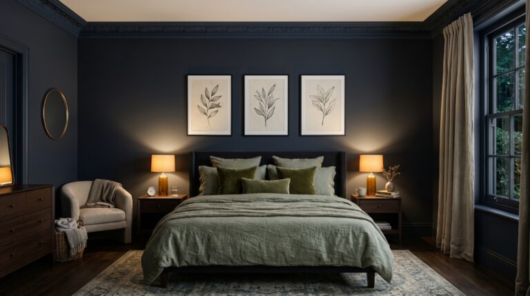
A common failure point is “Over-Coordination.” If the walls, the rug, and the trash can are all the exact same shade of mint, it will look dated very quickly. I’ve noticed that the most “timeless” rooms have a bit of variety. Mix your pastels with natural textures like leather, wood, and stone. I’ve seen this work in a mid-century modern home where soft pink walls were paired with dark walnut furniture. It looked classic, not trendy. As we move toward 2027, expect to see more “Warm Pastels” like butter yellow and soft terracotta. The “cool” pastels are taking a back seat for a while.
FAQ
How do I make a pastel bedroom not look like a nursery?
The secret is to add “adult” textures and dark accents. Avoid ruffles, teddy bears, or overly “cute” patterns. Instead, use velvet, brass hardware, and abstract art. In my experience, adding a single black or dark wood element provides the necessary contrast to ground the space. A matte black lamp or a dark picture frame can instantly make a pink room feel like a sophisticated lounge.
What is the best color for a small pastel bedroom?
Light blue or soft sage green are the winners for small spaces. For more calming blue palettes, these blue bedroom ideas can help you compare soft blue, slate, navy, and airy coastal shades. These colors are “receding,” which means they appear to move away from the eye. This trick makes the walls feel further apart. I’ve seen this work in tiny studio apartments where a light “ice blue” made the room feel significantly larger. Avoid dark or overly saturated colors, as they can make the walls feel like they are closing in on you.
Can I mix different pastel colors in one room?
Yes, but you should stick to a “Common Undertone.” For example, mix “dusty” pink with “dusty” blue. If you mix a very bright pastel with a very muted one, the bright one will make the muted one look “dirty.” I’ve seen this work beautifully when people use a “triadic” color scheme—like a very soft yellow, mint, and peach. Keep the proportions unequal: sixty percent one color, thirty percent another, and ten percent for the accent.
How much does it cost to redecorate a bedroom in pastels?
A basic “refresh” with paint and new pillows costs about two hundred to four hundred dollars. A mid-range project with a new headboard and rug is between eight hundred and fifteen hundred dollars. A full professional overhaul starts at three thousand dollars. In my experience, you get the most “bang for your buck” by focusing on the walls and the lighting first. These are the elements that define the mood of the room.
Are pastel bedrooms hard to keep clean?
The walls are not harder to clean, but light-colored bedding and rugs definitely are. I always suggest buying “performance fabrics” or washable rugs like Ruggable. If you have kids or pets, stay away from silk or delicate linens in a light color. I’ve tried using a “high-gloss” paint finish on the trim and doors. It’s much easier to wipe down than a flat finish, which tends to hold onto fingerprints and scuff marks.
What wood tone looks best with pastels?
Light oak, birch, and maple are the most common choices because they maintain the “airy” feel. However, I’ve seen some incredible modern rooms that use dark walnut for high contrast. Avoid wood with a red or orange undertone (like cherry or mahogany), as they often clash with the “cool” tones found in many pastel paints. In my experience, a light, natural oak is the safest and most timeless choice for any soft-colored space.
Do I need a professional designer for a pastel bedroom?
Not necessarily. With the right tools and a bit of patience, anyone can do this. The key is to research and plan before buying anything. Use a digital mood board to see how your colors look together. If you are doing a complex project like built-in shelving or electrical work, then yes, call a pro. For a standard paint-and-style job, you can save a lot of money by doing it yourself.
How do I choose a rug for a pastel room?
Look for a rug that has at least one of your pastel colors in the pattern, but also has a neutral base like cream or tan. This prevents the floor from feeling “overwhelming.” A textured rug, like a jute or a high-pile wool, adds the coziness that soft rooms often lack. I once saw a room with a plain white rug that looked great for a week, then got dirty immediately. Always choose something with a bit of “heathering” to hide daily wear.
Is sage green still popular in 2026?
Sage green has become the “new neutral.” It is incredibly popular because it feels connected to nature. It is more interesting than gray but just as easy to live with. I’ve seen this work in every room of the house, but it’s especially good for bedrooms because it’s known to lower the heart rate. It pairs perfectly with other pastels like blush pink or soft gold. It is a trend that has turned into a classic.
What are the best brands for pastel bedroom decor?
For paint, Benjamin Moore and Sherwin-Williams are the gold standard. For furniture, West Elm and Article offer great modern shapes. If you are on a budget, IKEA and Target have improved their quality significantly in the last few years. For bedding, I highly recommend Brooklinen or Parachute for that “hotel feel.” Always read reviews before buying, and look for “real life” photos from other customers to see the true color.
Can men have a pastel bedroom?
Absolutely. The “Gendered Color” era is over. A soft blue, sage green, or even a muted “clay” pastel looks great in any room. It’s all about how you style it. Pair a soft blue wall with leather furniture and industrial metal lamps for a very masculine, refined look. I’ve seen this work in high-end bachelor pads in New York. The goal isn’t “feminine”; the goal is “peaceful.” Everyone deserves a peaceful place to sleep.
How do I handle a room with no natural light?
This is the only time I suggest being careful with pastels. Without natural light, pastels can look “flat” or gray. To fix this, use colors with a warm base (like peach or warm cream) and invest heavily in high-quality artificial lighting. Use mirrors to bounce what little light you have around the room. I’ve seen this work in a basement bedroom where we used a very light “butter” yellow to fake a sunny vibe. A butter yellow bedroom is especially useful for low-light rooms because it adds warmth without relying on strong natural sunlight.
Conclusion
Creating a space that feels both soft and sophisticated is a journey of balance. You start with a simple desire for peace and end with a room that reflects your personal style. Remember Sarah’s room? We didn’t just repaint it; we changed the soul of the space. By adding texture, layering the light, and choosing “muddy” tones, we turned a “candy shop” into a “sanctuary.” My biggest piece of advice is to start small. Change your light bulbs tonight. Buy one sample pot of paint tomorrow. Don’t wait for a huge budget or a “perfect” time. The most beautiful rooms are built one small decision at a time. I predict that as we move deeper into the digital age, these “analog,” soft-colored spaces will become even more precious to us. We need a place for our eyes and minds to rest. Why shouldn’t that place be your own bed? What is the one thing in your room right now that stops you from feeling truly relaxed?
One Comment