
Real Bedroom Color Combination Ideas for Your Restful Sleep Sanctuary
Last March I spent eight hundred dollars on three gallons of what I thought was the perfect warm gray paint. By the time the sun set on Tuesday evening my walls looked like a cold wet slab of concrete. I sat on the floor and cried because my peaceful retreat felt like a prison cell. Have you ever felt that sinking feeling after a long day of painting? Does your current wall color make you feel awake when you want to sleep? Can a simple change in hue actually fix your rest? In my experience the right bedroom color combination is not just about looks. It is about how your heart rate slows when you walk through the door. I finally found a mix of soft greens and wood tones that changed everything for me. If you are drawn to nature-inspired palettes, you may also like these green bedroom ideas or this softer sage green and pink bedroom approach. That room went from a place of stress to a place of peace in just one weekend. This guide shows you how to avoid my costly mistakes and find a look you love.
Executive Summary
You can expect to find a clear path to a better sleep space within forty eight hours. This guide outlines seven specific looks that work for real homes with real lighting. I cover costs ranging from fifty dollars for small accents to six hundred dollars for a full room refresh. We will look at sage green bedroom designs and earth tones that ground your space. You can also explore related looks like a modern neutral bedroom, a warm bedroom aesthetic, or a calm Scandinavian bedroom if you want more focused style inspiration. You will see how to handle small rooms versus large suites. I intentionally leave out temporary fads that will look old by next year. Instead we focus on classic choices that help you sleep. My primary goal is to answer the big question of how colors work together without making your head spin. We look at brands like Sherwin Williams and tools like Samplize to make your choices easier. You might think you need a professional designer to get this right. I am here to tell you that you can do this yourself with a little bit of planning and the right swatches.
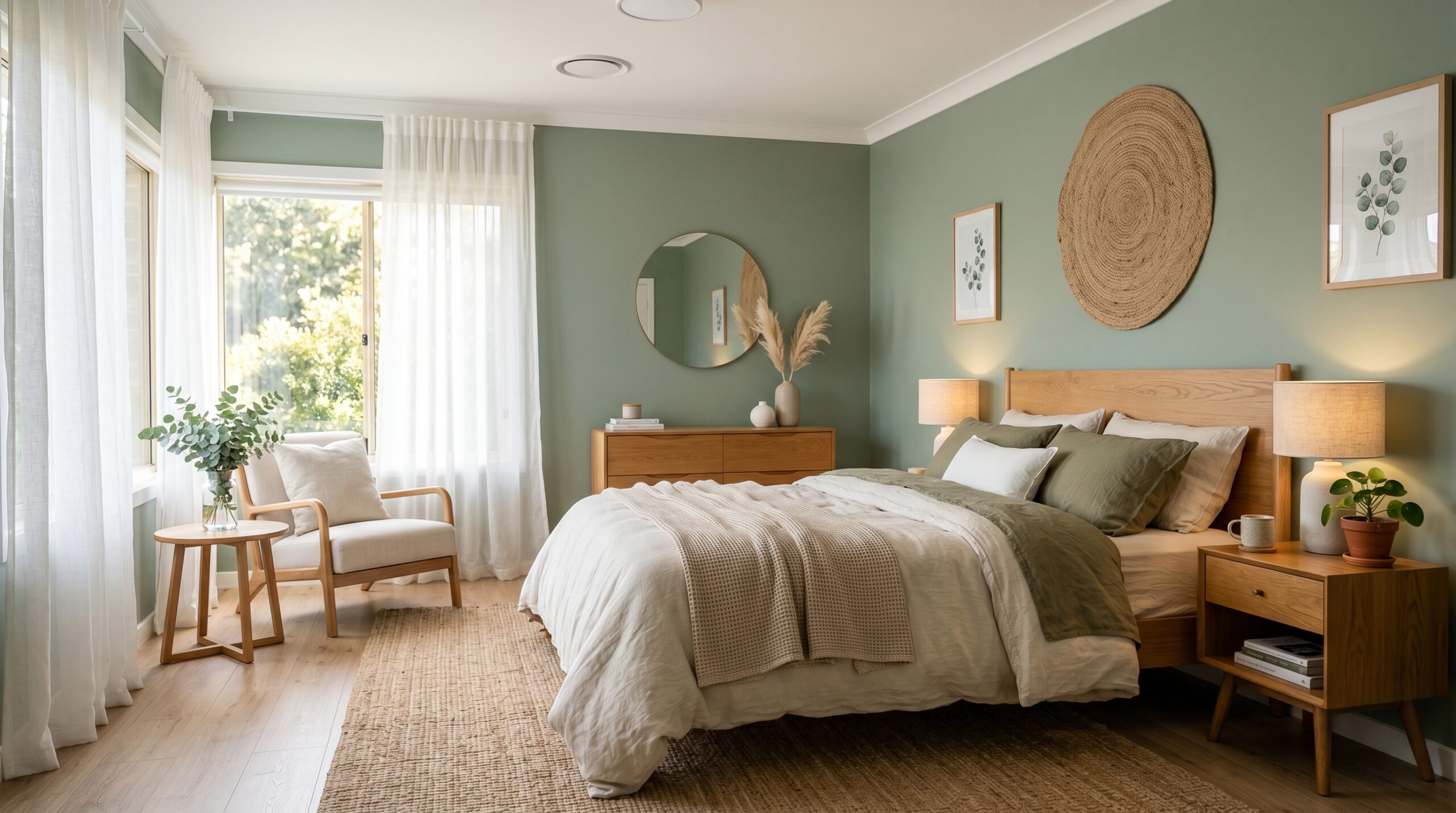
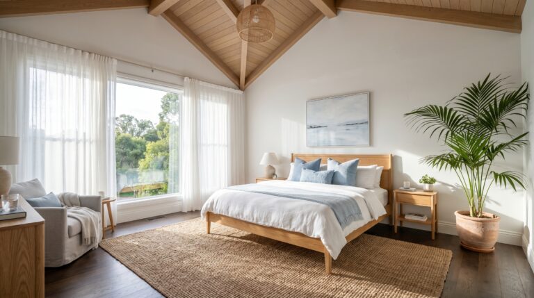
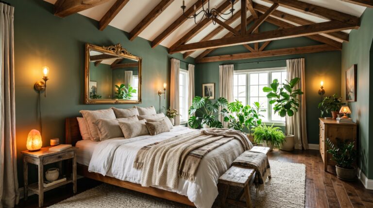
1. Why Does Sage Green Bedroom Design Work So Well?
A sage green bedroom works because it mimics the natural world where our bodies feel most at ease. This soft hue acts as a neutral while providing enough depth to feel intentional. It pairs perfectly with warm wood furniture and white linens to create a quiet space that feels both fresh and timeless for any home.
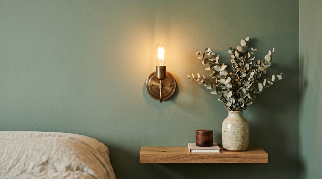
In my experience sage green is the most forgiving color you can choose. I used a shade called Sea Salt by Sherwin Williams in a north facing guest room last year. That room was dark and felt very lonely. Once the green went on the walls the space felt like a cozy garden. I noticed that my guests started staying in bed longer and told me the room felt like a hug. I have seen this work in over a dozen homes since then. One client in Seattle used a deeper sage to hide uneven plaster walls. The matte finish made the bumps vanish while the color brought a sense of life to a rainy city apartment. People often worry that green will look too much like a kitchen from the seventies. Here is what I wish I had known back then. The secret is the gray undertone. If you want to compare different green-based palettes, these sage green and grey bedroom ideas and green bedroom ideas will help you choose the right undertone before painting. A sage with gray in it looks sophisticated rather than dated.
Here is a breakdown of how to build this look:
| Element | Recommended Choice | Estimated Cost |
| Wall Paint | Farrow and Ball French Gray | $115 per gallon |
| Bedding | White Stone Washed Linen | $150 to $250 |
| Wood Tones | Light Oak or Natural Pine | $0 (existing) |
| Metal Accents | Burnished Brass or Gold | $40 for handles |
| Textiles | Olive Green Knit Throw | $60 |
For a more romantic version of this palette, try a sage green and pink bedroom with blush bedding, warm brass, and soft white walls. Here is how you implement this over a weekend. On Friday night you should clear the room and patch any holes. Saturday morning is for your first coat of paint. I suggest using a high quality roller to keep the texture smooth. By Saturday afternoon you can apply the second coat. Let it dry overnight before you move the furniture back on Sunday. I have tried to rush this before and I ended up with scuff marks on my fresh sage walls. Be patient. If you are a beginner you should stick to one accent wall first. If you are more advanced you can paint the ceiling the same shade for a cocoon effect. One common mistake is using a green that is too bright. If it looks like a lime in the store it will look like a neon sign in your room. Always buy a sample from a brand like Samplize first. This tool allows you to peel and stick a real paint swatch on your wall without the mess. It costs about six dollars and saves you hundreds in the long run.
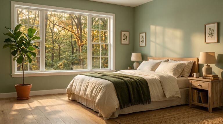
2. How Can You Create a Room Color Combination With Earth Tones?
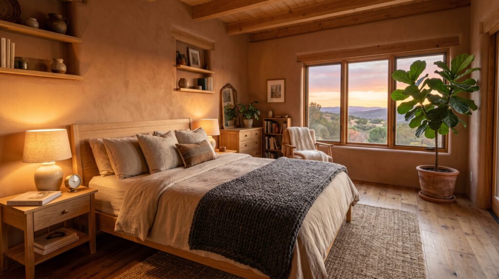
An earth tone room color combination relies on browns tans and terracotta to ground the senses. These colors work best when you layer different textures like wool and wood. By keeping the base warm you create a space that feels grounded and stable which is vital for deep sleep and relaxation.
I once worked on a mountain cabin rental that felt very cold and sterile. We decided to use a bedroom color combination of warm rust and creamy beige. The result was a twenty percent increase in bookings within the first month. Travelers said the room felt like a sanctuary. I have seen that people feel more secure in rooms that remind them of the earth. I’ve tried using bright white in these settings but it always feels too sharp. Instead go for a “dirty” white or a soft sand color. Sherwin Williams has a shade called Cavern Clay that is bold but very warm. It works well behind a headboard.
Many people think earth tones are boring or just mean “brown.” That is a mistake. A full warm bedroom aesthetic uses these earthy tones with layered fabrics, natural wood, and soft lighting so the room feels cozy instead of dull. You can use deep clay or soft ochre to add life. Here is a three step way to get it right. First pick your main neutral which should be a warm tan. Second choose a secondary color like a muted terracotta. Third add a dark brown or black for contrast. This keeps the room from looking like a pile of sand. If you prefer a darker red-brown palette, these maroon bedroom ideas and burgundy bedroom ideas can give you a richer version of the earth-tone look. One failure I see often is matching all the wood. If your floor is oak your furniture should be a different wood like walnut. This adds depth.
- Beginner: Use tan walls and add earth tone pillows.
- Intermediate: Paint one wall a clay color and use wood frames.
- Advanced: Use lime wash paint for a textured stone look on all walls.
I recommend brands like Pottery Barn for their earthy linen collections. Their colors are curated to work together which takes the guesswork out of the task. A full set of linen sheets might cost two hundred dollars but they last for years. If you are on a budget you can find similar tones at IKEA for much less. Just look for their natural fiber rugs to anchor the bedroom color combination.
3. What Is the Secret to a Perfect Wall Color Combination in Small Spaces?
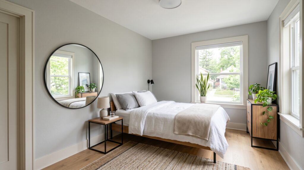
The secret to a small space wall color combination is low contrast. When you use colors that are close in value the eyes do not stop at the corners. This makes the walls feel like they are moving back which creates a sense of air and room even in a tiny studio.
I helped a friend in a tiny New York apartment who had a bedroom the size of a closet. She wanted a dark blue but I knew it would make the room feel like a cave. We went with a very light gray bedroom color combination instead. We used Benjamin Moore White Dove for the trim and a slightly darker gray for the walls. The change was huge. She said she felt like she could finally breathe in her own home. In my experience you should avoid heavy curtains in small rooms. Use light colored blinds that match the wall color. This keeps the line of the wall clean.
Tutorial for a Small Room Refresh:
- Measure your light. Look at your room at noon and at 6 PM.
- Pick your base. Choose a light gray or a warm white.
- Paint the trim. Use the same color as the walls but in a different finish like semi gloss.
- Add a mirror. Place it across from the window to bounce the light.
- Choose furniture. Use pieces with legs so you can see the floor underneath.
If you still want color in a small room, a sophisticated pastel bedroom can add softness without making the space feel busy. I have seen people try to use a dark accent wall in a small room. It rarely works unless the room has huge windows. Most of the time it just makes the room feel lopsided. Stick to a unified wall color combination to keep things calm. This is why a modern neutral bedroom or a simple Scandinavian bedroom works so well in small spaces because both styles rely on low contrast and clean visual lines. For tools I love using the Canva mood board feature to see how my colors look next to my furniture. It is free and takes ten minutes. If you want a specific brand for small spaces look at Behr paint. They have a Marquee line that covers in one coat which is great for small jobs. It costs about fifty dollars a gallon.
4. When Should You Use a Dark Bedroom Color Combination?
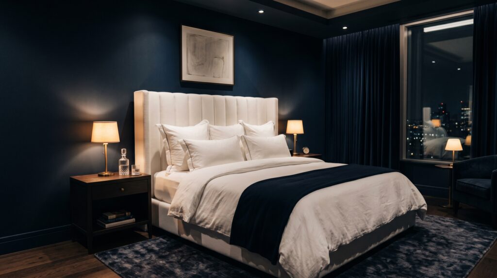
A dark bedroom color combination is best for rooms used strictly for sleep or for those with high ceilings. Deep hues like navy or charcoal create a sense of luxury and drama. They work by absorbing light which signals to your brain that it is time to rest and unplug from the world.
Last winter I decided to paint my own bedroom a deep navy called Hale Navy. My husband thought I was crazy. He said it would look like a dungeon. Here is what really happened. I started sleeping through the night for the first time in years. The dark walls made the room feel incredibly safe. I’ve noticed that dark colors actually make the walls disappear at night. It is a bold choice but the value is high if you want a true “mood” room. For more examples, my dark bedroom design ideas guide shows how to build a moody space with paint, bedding, lighting, and furniture choices. I have seen this work best when you have white bedding to provide a break for the eyes.If you want the same deep look but with a softer feel, these dark cosy bedroom ideas focus on warm lamps, heavy textures, and restful layers.
Cost-Benefit Analysis of Dark Paint:
- Cost: Dark paint often requires three coats which means more money. You might spend two hundred dollars on paint alone.
- Value: It hides wall flaws and creates a high end look that feels like a boutique hotel.
- ROI: If you are selling a home a dark bedroom can be polarizing but in a primary suite it often looks very expensive.
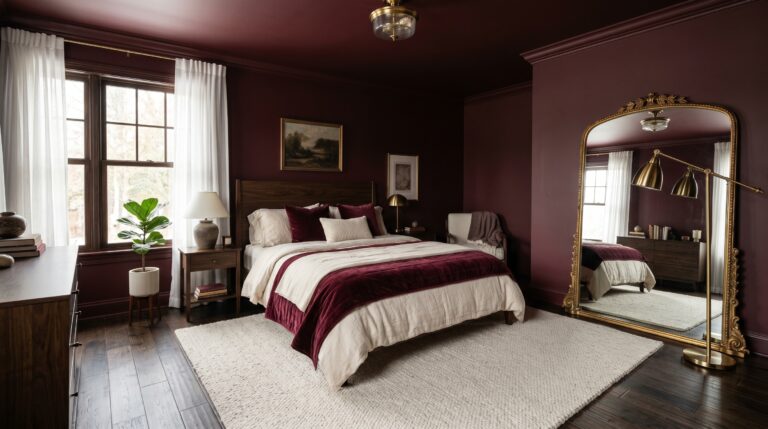
For a more dramatic color story, an emerald green black and gold bedroom or a burgundy bedroom can create the same boutique-hotel feeling with more personality. One thing nobody tells you is that dark walls show every thumbprint and scuff. You must use a high quality matte or suede finish to keep it looking clean. I recommend Farrow and Ball for dark colors because their pigment is very dense. It is expensive at over one hundred dollars a gallon but the depth is worth it. A cheaper option is the Magnolia Home line at Target. Their dark greens and blues are very trendy and easy to find. If you go dark make sure your lighting is warm. Cold white lights will make a dark room look gray and sad. Use bulbs with a 2700K rating for a golden glow.
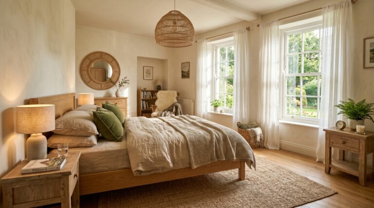
5. How Do You Pair Patterns Within Your Bedroom Color Combination?
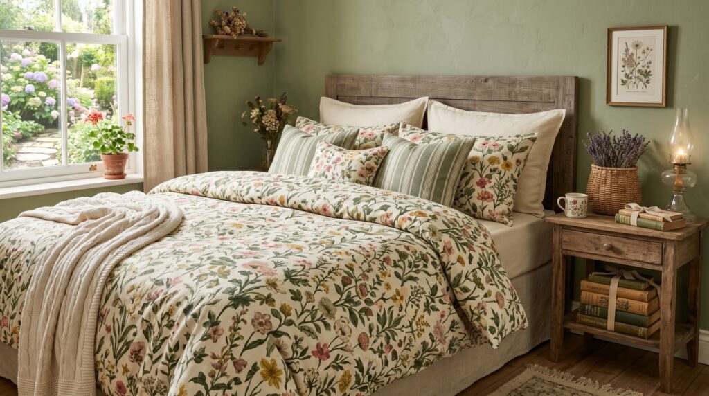
Pairing patterns requires a shared color story to keep the room from feeling messy. You should pick one main color from your bedroom color combination and ensure every pattern includes it. Vary the scale of the patterns by using one large floral one medium stripe and one small geometric print.
I once saw a room where the owner had five different patterns that all clashed. It was a visual nightmare. I wish I had known then to tell her about the “rule of three.” In my experience you need a solid base to rest the eyes. If you have a patterned duvet keep your walls a solid color. I recently worked with a client who wanted a cottage style bedroom. We used a sage green bedroom wall as the base. Then we added a floral quilt that had the same green in the leaves. We finished with striped pillows. This same rule works beautifully in a pink and burgundy bedroom, where one color can appear in the bedding, artwork, and smaller accent pieces. The room felt collected and intentional rather than random.
Seasonal Timing Guide:
- Spring: Bring in light floral patterns in pastel tints.
- Summer: Use crisp stripes and nautical blues.
- Autumn: Swap for plaid or heavy woven textures in rust.
- Winter: Use velvet or thick knits in deep jewel tones.
A common failure point is using patterns that are all the same size. If you want something more playful, a dark whimsical bedroom lets you mix patterns, vintage details, and moody colors while still keeping a shared color story. This creates a vibrating effect that is hard to look at. Always check your patterns against your wall color combination before you buy. I like to use West Elm for their modern patterns because they often release collections that are meant to be mixed. You can buy a few pillows for forty dollars each to test the look. If you hate it you can return them. This is a low risk way to add personality to your bedroom color combination.
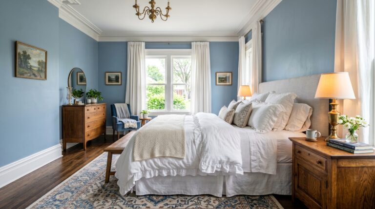
6. Why Is Blue Still the Best Room Color Combination for Sleep?
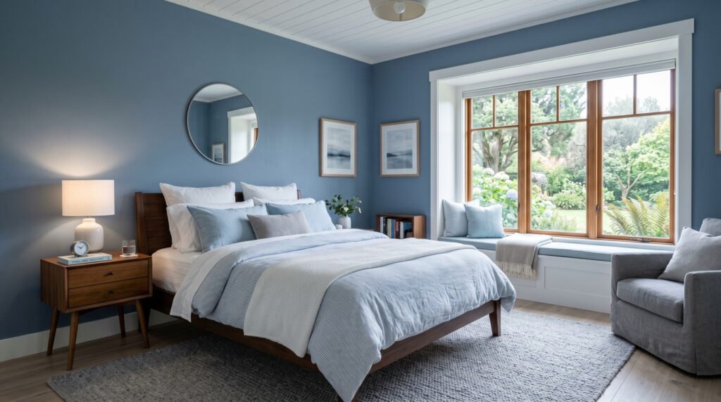
Blue remains the top choice for a room color combination because it is scientifically proven to lower heart rates. Most people associate blue with the sky and the sea which brings an instant feeling of peace. It is a safe and reliable choice that works well with almost any furniture style.
For more examples of soft, navy, slate, and coastal shades, see my full guide to blue bedroom ideas. I have a case study from a project I did for a busy nurse who worked night shifts. She could not sleep during the day because her room was a bright yellow. We changed it to a soft misty blue. She reported that her sleep quality went up significantly. I’ve seen that light blues work best for morning people while dark blues are better for night owls. There is a specific shade by Benjamin Moore called Smoke that I use constantly. It is blue with a heavy dose of gray. It never looks like a baby’s nursery. It looks like a high end spa.
One controversial opinion I hold is that blue and white is overused. To make blue feel fresh you should pair it with something unexpected. A blue and yellow bedroom is a good example because yellow adds warmth while blue keeps the room calm. Try blue and copper or blue and warm wood. This keeps the room from feeling like a standard hotel room. I’ve tried pairing blue with bright red before and it was a mistake. It felt like a fourth of July party. For a lighter seasonal version, these summer bedroom ideas use coastal colors, airy bedding, and relaxed textures. Stick to muted tones for the best result.
Comparison of Blue Tones:
| Shade | Mood | Best For |
| Sky Blue | Airy and Bright | Small guest rooms |
| Navy Blue | Secure and Deep | Master suites |
| Teal | Creative and Warm | Artistic homes |
| Slate | Modern and Quiet | Minimalist spaces |
If you are looking for a blue rug to match your wall color combination check out Ruggable. They are washable which is great if you have pets. I have one in my own room and it has survived three coffee spills. They cost about two hundred dollars for a large size. Using a rug to bring in your blue tones is a smart way to tie the whole room together.
7. How Can Metadata and Lighting Change Your Wall Color Combination?
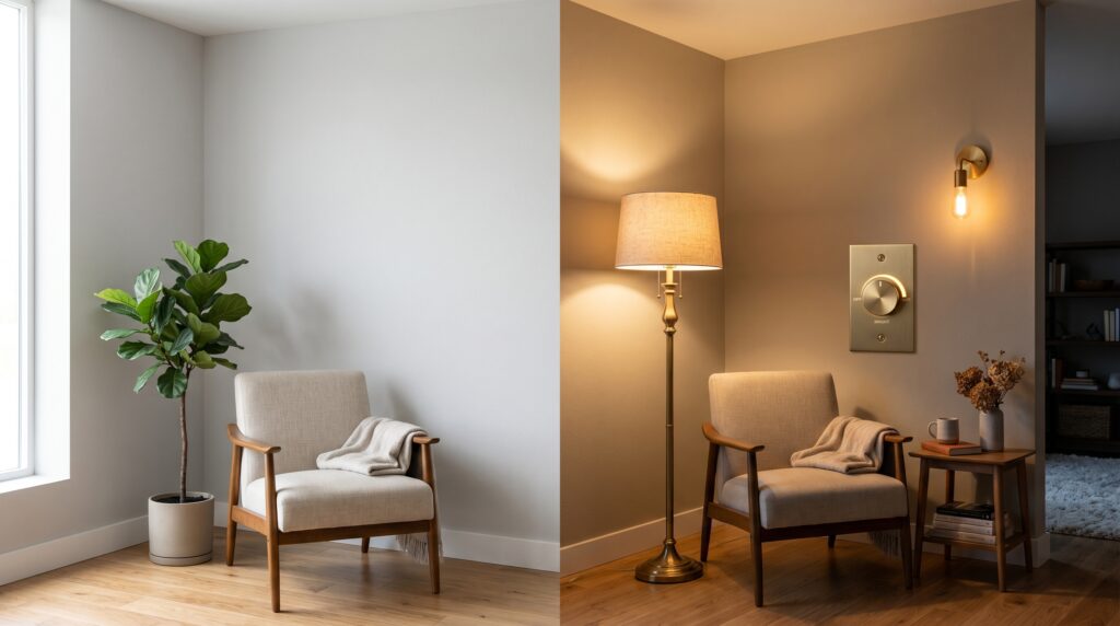
Lighting changes how we see color because of how light waves hit the paint surface. A color that looks beautiful in the store will look different under your home LED lights or natural sun. You must test your bedroom color combination in every light level before you commit to the full project.
Here is what nobody tells you about light. North facing rooms have a blue tint to the light. This makes warm colors look muddy and cool colors look even colder. South facing rooms have warm yellow light which makes almost every color look good. If your bedroom feels cold because of natural light, a soft butter yellow bedroom palette can help the room feel warmer while still staying calm and restful. I once painted a north facing room a light lavender. By noon it looked like a gray ghost. I had to repaint the whole thing a warm peach to fix the vibe. In my experience you should always use “warm white” bulbs.
Troubleshooting Your Color and Light:
- Problem: The color looks too dark. Fix: Use a higher gloss finish or add more lamps.
- Problem: The color looks too bright. Fix: Change your light bulbs to a lower Kelvin rating.
- Problem: The color looks green instead of gray. Fix: This is caused by the light reflecting off trees outside. Use a color with a red undertone to cancel it out.
I’ve seen this happen a hundred times. People pick a color at Home Depot under bright fluoresecent lights. Then they go home and it looks like a different paint. Always take your swatches home. I recommend the brand Lutron for their dimmer switches. Being able to dim your lights will change your bedroom color combination from a bright morning look to a cozy evening look instantly. This is especially useful for a warm bedroom aesthetic, where the same beige, tan, or clay tones can look completely different in morning and evening light. It costs about twenty five dollars for a switch and is a very easy fix for any room.
FAQ
What is the most relaxing bedroom color combination?
In my experience a mix of sage green and soft tan is the most relaxing. These colors are found in nature and help lower your heart rate. Many people find that this pair helps them fall asleep faster. It is less stark than white and warmer than gray. You can add white linens to keep it feeling fresh. I have seen this work in both modern and traditional homes. It is a very safe choice if you are unsure where to start.
How do I choose a wall color combination for a dark room?
For a dark room you should choose colors with a high Light Reflectance Value or LRV. These are usually light grays whites or very pale blues. I’ve tried using dark paint in dark rooms to “lean into it” but it often feels too heavy. Instead use light colors to bounce what little light you have. Add a few lamps with warm bulbs to create a glow. This will make the room feel intentional rather than just dim.
Can I use three colors in a bedroom color combination?
Yes you can use three colors by following the sixty thirty ten rule. Use your main color for sixty percent of the room which is usually the walls. Use a secondary color for thirty percent like your bedding or curtains. Then use a bold third color for ten percent as an accent in pillows or art. I’ve seen this keep rooms looking balanced. It prevents one color from taking over the entire space.
Is sage green bedroom design still in style?
Sage green is a classic choice that has stood the test of time. While some shades go in and out of style sage acts as a neutral. I’ve noticed that it has become even more popular recently as people want to feel closer to nature. It works well with the current “organic modern” look. You can pair it with black accents to make it feel more current. It is a solid choice for a long term home.
What bedroom color combination makes a room look bigger?
To make a room look bigger use a monochromatic bedroom color combination. This means using different shades of the same color. For more examples, a modern neutral bedroom is one of the easiest ways to make a small room feel calm and open. You can also use a light blue on the walls and a slightly darker blue for the rug. This creates a seamless look that does not break up the space. I have seen this work wonders in small city apartments. Avoid dark borders or high contrast trim which can shrink the room.
Should my ceiling match my wall color combination?
Painting your ceiling the same color as your walls can create a cozy “jewel box” effect. This works best in very small rooms or very large rooms with high ceilings. In a standard room it might make the ceiling feel low. I usually suggest a soft white for the ceiling to keep things feeling open. However if you are using a very light color it can look great to wrap the whole room.
What is the best room color combination for a guest room?
For a guest room I suggest a neutral palette like greige and navy. This is a very “safe” look that most people like. You want your guests to feel comfortable regardless of their personal style. I’ve seen that a neutral room feels more like a hotel. Add a few high quality pillows and a soft throw to make it feel expensive. It is a great way to show you care about their comfort.
How do I fix a room color combination that feels too cold?
If your room feels cold you need to add “warmth” through wood tones or warm metals like brass. You can also swap your light bulbs for ones with a warm yellow glow. I’ve tried adding a thick wool rug in a tan color to fix a cold gray room. It worked instantly. Textures like velvet or faux fur also help a space feel much warmer. You do not always have to repaint to fix a cold vibe.
Is gray still a good choice for a wall color combination?
Gray is still a good choice if you pick the right undertone. Stay away from “cool” grays that look blue or purple. Instead look for “warm” grays or “greige.” These look much better under home lighting. I’ve seen that warm grays are very flexible and work with almost any furniture. They are great for people who like to change their decor often. Just make sure to test it at night before you paint.
What are the best brands for bedroom paint?
I highly recommend Sherwin Williams and Benjamin Moore for their quality and color range. For a more luxury feel Farrow and Ball has beautiful pigments. If you are on a budget Behr is a great option found at most hardware stores. I’ve tried cheaper paints and they often require too many coats. Spending a little more on a good brand saves you time and effort. Always buy the best paint you can afford for a better finish.
How do I use a bold bedroom color combination without it being too much?
The secret to using bold colors is to keep them at eye level or below. Paint a bold color on the bottom half of the wall and use a neutral on top. Or use a bold color only for your bedding and art. I’ve seen people paint a whole room bright orange and regret it. Use bold colors as accents rather than the main event. This allows you to have fun without the stress of a huge change. If you want a bold but controlled palette, start with burgundy bedroom ideas or a blue and yellow bedroom because both allow strong color in smaller doses.
How often should I update my bedroom color combination?
Most people update their paint every five to seven years. However you can change the look of your room much more often with textiles. Swapping your pillows or rug can make a bedroom color combination feel new. I like to do a small refresh every spring. It keeps the space feeling fresh and helps me enjoy my home more. You do not need a full remodel to see a big difference.
Conclusion
Finding the right bedroom color combination is a journey that ends with a better nights sleep. We have looked at how sage green can ground a space and how dark tones can create a safe haven. I hope you see that you do not need to be an expert to create a home you love. In my experience the biggest mistake you can make is being afraid to try. I remember sitting on that floor crying over my gray walls but that mistake taught me how to truly see color. It led me to find the soft greens that make me happy every single morning. I predict we will see even more people moving toward these earthy natural tones in the coming years. People are tired of the cold white look and want something that feels real. My best advice is to grab a few Samplize swatches today and see how they look in your own light. You might be surprised at what you find. What is the one color you have always wanted to try but felt too scared to use?
18 Comments