
Styling a Blue and Yellow Bedroom for Better Rest and Morning Energy
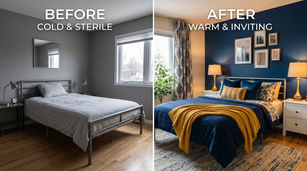
Last March I stood in a drafty bedroom with a $1,200 budget and a massive headache. The walls were a cold gray that felt like a rainy Tuesday in a basement. I wanted joy but I needed sleep. I spent six hours testing paint swatches until my eyes blurred. I finally settled on a deep navy and a soft butter hue. That night I couldn’t rest because I worried the colors would clash like a bad sports jersey. Have you ever felt that fear of picking a bold color and ruining your sanctuary? Why do we settle for boring beige when we crave a space that feels like a warm hug? Is it possible to mix these two primary colors without making your house look like a preschool? I found the answer after three failed rug choices and a very expensive lesson in lighting. This guide shows you exactly how to balance these tones. If you are still comparing bold, warm, cool, and neutral palettes, my full guide to bedroom color combination ideas can help you choose colors that work with your room’s light, size, and sleep mood. You will learn to create a space that feels fresh at 7 AM and cozy at 10 PM.
Executive Summary
This guide provides a blueprint for creating a blue and yellow bedroom that balances energy and rest. You can expect to finish a basic room refresh in about forty-eight hours for under $500 if you focus on textiles. A full room change with paint and new furniture usually takes two weeks and costs between $1,500 and $3,000. We look at how to use the color wheel to prevent visual clutter. I share my secret for choosing the right “temperature” for your blues so they do not feel too cold. We cover everything from velvet navy headboards to pale lemon throw blankets. This article leaves out structural renovations or electrical work. We focus strictly on the visual and sensory setup of your space. You will find specific brand reviews for paint and bedding that I have used in my own home. My goal is to help you avoid the “bright primary color” trap that makes rooms feel childish. By the end, you will have a clear plan for a mature, restful, and happy space.
Why does a blue and yellow room feel so balanced?
The mix of a blue and yellow bedroom works because it pairs the calm of the sky with the heat of the sun. Blue slows your heart rate and lowers blood pressure which helps you fall asleep faster. Yellow adds a spark of cheer that makes waking up easier. This duo creates a natural harmony that feels grounded yet hopeful in any light.
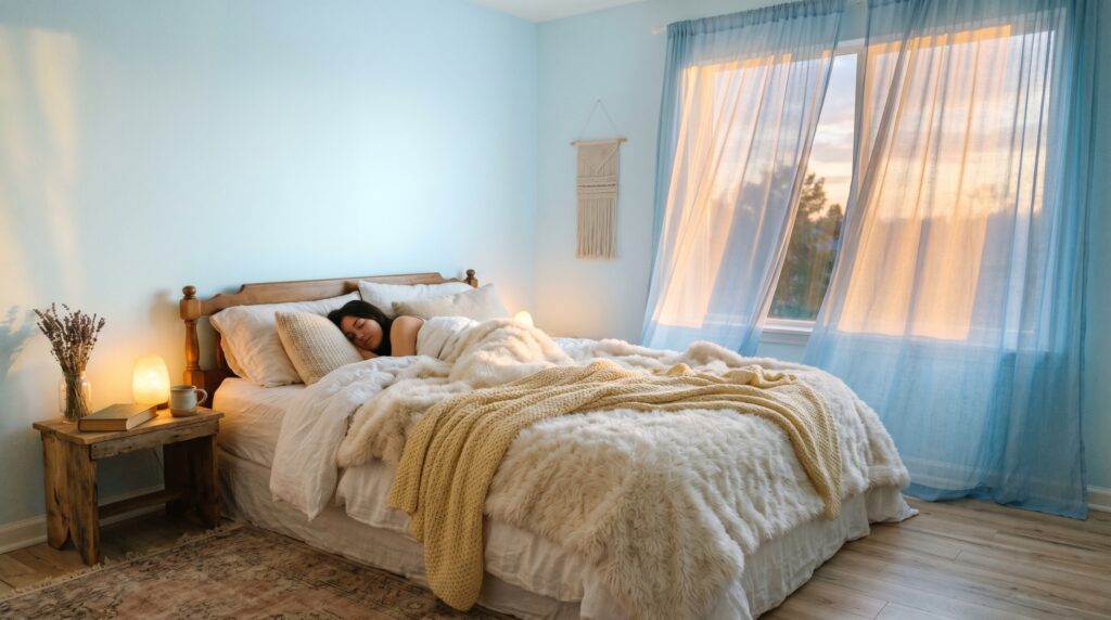
In my experience, the biggest win with this pairing is how it handles different times of day. Last summer, I stayed in a guest room with light blue walls and mustard pillows. At noon, the room felt like a beach house. For a breezier seasonal version of that look, these summer bedroom ideas show how to use light blues, linen, jute, and pale accents for a fresh sleep space. At night, under warm lamplight, the mustard turned into a rich gold that felt very expensive. I’ve noticed that people often fear yellow because they think it will be too loud. However, when you wrap it in blue, the yellow settles down. It stops being “loud” and starts being “warm.” I once tried a room with just yellow and I felt frantic within a week. Adding navy blue rug changed the whole mood instantly.
One thing nobody tells you is that these colors can actually change how you feel about the temperature of a room. Blue is a cool color. If your room faces north and gets little sun, a pure blue room will feel like an ice box. I’ve seen this work poorly in many homes. People paint their rooms “Sky Blue” and then wonder why they feel chilly. When you add a yellow chair or a lemon-colored duvet, you trick your brain into feeling warmer. If your room still feels cold, a warm bedroom aesthetic can help you layer amber lighting, wood tones, cream textiles, and cozy textures around the blue. It is a visual thermostat.
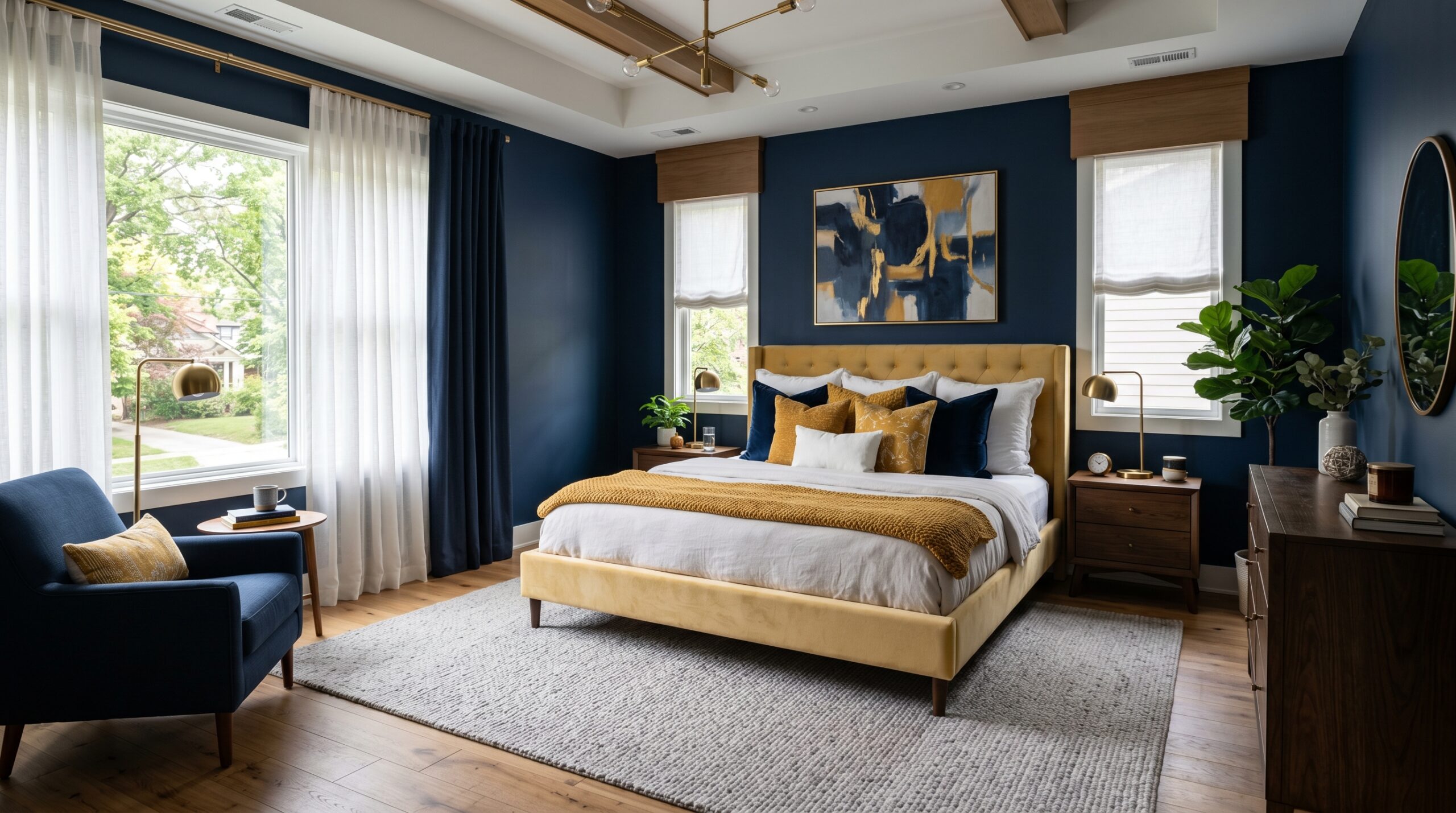
I suggest starting with a 70-20-10 rule. Use blue for 70 percent of the space, usually the walls or large rugs. Use yellow for 20 percent, like bedding or curtains. The last 10 percent should be a neutral like white or cream to give the eyes a place to rest. I’ve seen this ratio keep a Blue And Yellow Room from feeling overwhelming. Some designers say you should use equal parts of both colors. I disagree. Equal parts create a visual “fight” for your attention. You want one color to lead and the other to support.
| Color Strategy | Best For | Visual Result | Ease of Setup |
| Navy and Gold | Formal master suites | Moody and rich | Easy |
| Sky Blue and Butter | Small guest rooms | Airy and open | Medium |
| Teal and Ochre | Modern lofts | Bold and edgy | Hard |
| Pastel Blue and Lemon | Nurseries or cottages | Sweet and soft | Easy |
How do you choose the right light blue and yellow bedroom shades?
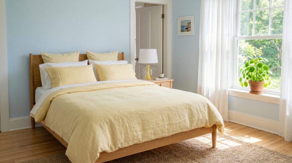
Choosing shades for a light blue and yellow bedroom requires looking at the undertones of your paint. Avoid “true” primary colors as they look like a classroom. Instead, look for blues with gray bases and yellows with brown or white bases. These muted versions look much more sophisticated and stay calming for a sleep environment.
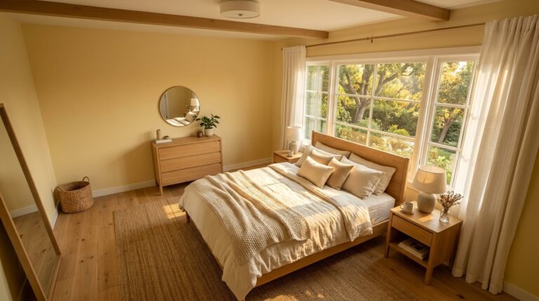
I once bought five gallons of “Sunbeam Yellow” because it looked great on a tiny paper swatch. Once it hit the four walls of my bedroom, I felt like I was trapped inside a giant lemon. It was a disaster. I had to spend another $200 on “Hale Navy” from Benjamin Moore to fix it. What I wish I’d known then is that yellow grows in strength as you cover more area. A soft yellow on a swatch becomes a neon sign on a wall. Now, I always tell people to pick a yellow that looks almost beige or cream on the card. If you want the yellow side to feel soft instead of loud, a butter yellow bedroom guide can help you choose creamy, muted yellows that stay restful.
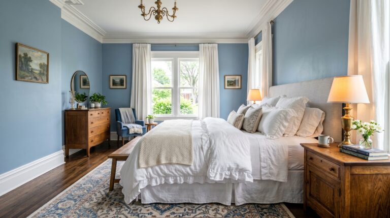
For the blue side, I’ve tried many options. If you want to compare navy, sky blue, teal, slate, and coastal tones before choosing, these blue bedroom ideas can help you find the right shade for your space. Sherwin-Williams has a shade called “Sea Salt” that is technically a green-blue. It works beautifully with a pale yellow because it has enough gray to keep things quiet. If you want a Light Blue And Yellow Bedroom, look at “Breath of Fresh Air” by Benjamin Moore. It is crisp but not cold. I’ve seen this work best when paired with white trim. It creates a frame for the colors so they don’t just bleed into each other.
Here are three tools I trust for picking colors:
- Samplize: These are peel-and-stick paint samples. They use real paint. I love them because you can move them around the room to see the light at different hours.
- Adobe Color: This is a free website. You can upload a photo of a rug you like and it will pull the exact blue and yellow hex codes for you.
- Sherwin-Williams ColorSnap App: You can take a photo of your room and “paint” it virtually. It isn’t perfect, but it prevents huge mistakes.
In my experience, the lighting in your room matters more than the paint name. If you have warm LED bulbs, your blue will look green. If you have cool “daylight” bulbs, your yellow will look like curdled milk. I always switch to “Warm White” bulbs (around 2700K) before I finalize my color choices. This keeps the yellow feeling like sunshine rather than a hospital hallway.
What are the best blue and yellow bedroom ideas for small spaces?
The best blue and yellow bedroom ideas for small spaces focus on light blue walls to push the boundaries out and yellow accents to draw the eye to specific points. Use a pale blue on the ceiling to make it feel higher. Add yellow through small items like books, a single pillow, or a lamp base to keep the room from feeling cramped.
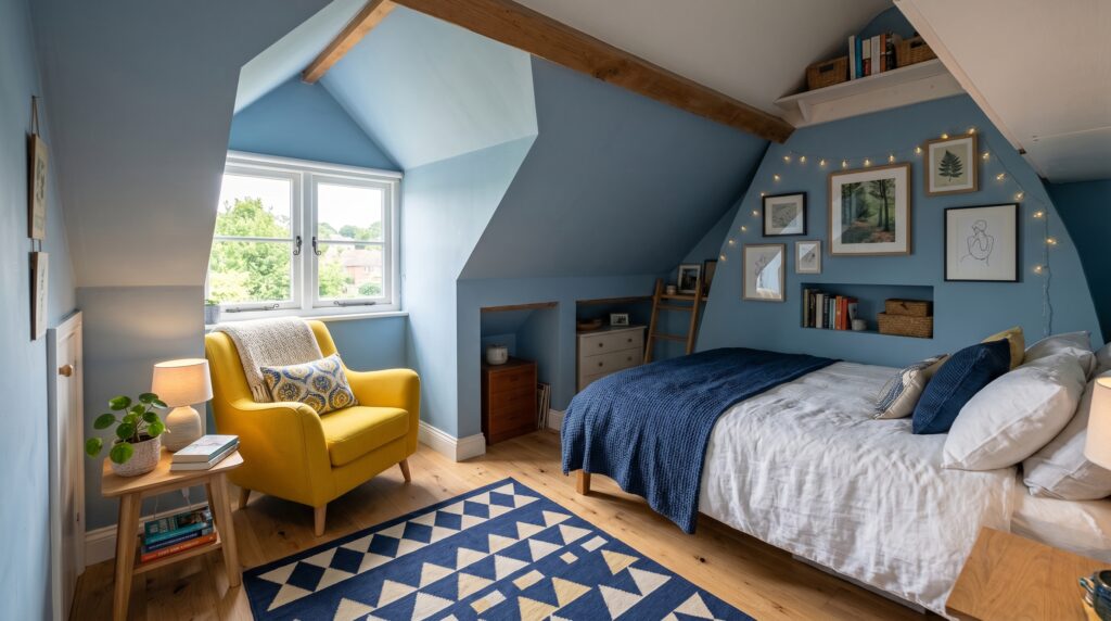
I once worked on a 10×10 bedroom that felt like a closet. The owner wanted it to be a Dream Core Room, which usually means very soft, surreal, and cozy. We used a very light dusty blue on all the walls. Then, we added a single, bright yellow velvet chair in the corner. That one pop of color made the room feel intentional rather than just small. I’ve noticed that in tiny rooms, dark blue can actually be your friend if you use it on the wall behind the bed. This is a “behind the curtain” trick designers use. A dark wall recedes, making the room feel deeper than it is.
One failure I see often is people using big, chunky yellow furniture in small rooms. It stops the eye and makes the floor feel cluttered. Instead, try using Blue And Yellow Stripes on a smaller scale. Maybe a striped throw blanket or a set of striped curtains. This adds pattern without taking up physical space. I’ve seen this work perfectly in attic bedrooms where the ceilings are low.
Case Study: The Studio Apartment Shift
- Location: 400 sq ft studio in Chicago
- Problem: The sleeping area felt dark and sad.
- Steps: We painted the “bed nook” a soft cornflower blue. We added a yellow rug from Ruggable (the “Kamran” pattern). We swapped the heavy wooden nightstand for a slim gold-toned one.
- Timeline: 6 hours of work.
- Cost: $310 total.
- Outcome: The area felt distinct from the living room. The owner reported feeling less “stuck” when working from home.
When you are short on space, think about your “vertical” yellow. I’ve tried hanging yellow-framed art above a blue headboard. It draws the eye up. I also love using brass or gold hardware on blue dressers. Brass is essentially a “metallic yellow.” It adds that warmth and sparkle without the weight of a solid yellow piece of furniture. If you are on a budget, IKEA has great navy blue dressers that look incredible with $20 gold handles from Amazon.
Should you try blue and yellow stripes for a focal wall?
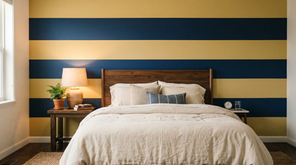
Using blue and yellow stripes on a focal wall is a bold move that works best when the stripes are wide. Narrow stripes can cause eye strain and make a bedroom feel busy. For a restful space, aim for stripes that are at least eight inches wide. Use a matte finish for the blue and a satin finish for the yellow to add subtle depth.
Here is what nobody tells you about painting stripes: it is a test of your soul. I tried this in my first apartment and it was a nightmare because I used cheap tape. The paint bled everywhere. If you want to do this, buy FrogTape. It has a powder that turns into a gel when it hits water-based paint, sealing the edge. I’ve seen this work best on the wall behind the headboard. It acts like a giant piece of art.
If you want a Blue And Yellow Bedroom that feels classic, go for horizontal stripes. They make the room feel wider. If you want it to feel taller, go vertical. I’ve noticed that a “ticking stripe” (very thin lines) works well for bedding but is too much for walls. I once saw a room where the owner used Blue And Yellow Stripes on the ceiling. It sounds crazy, but in a room with white walls, it looked like a vintage circus tent in the best way possible.
Step-by-Step Striped Wall Tutorial:
- Paint the whole wall yellow first. Yellow has less “hide” than blue. It is easier to cover yellow with blue than the other way around. Let it dry for 24 hours.
- Measure and mark. For a 10-foot wall, five 2-foot stripes look clean. Use a laser level. Do not trust your eyes.
- Apply the tape. Place the tape on the “yellow” side of your pencil line.
- Seal the edge. Paint a tiny bit of yellow over the tape edge. This fills any gaps.
- Paint the blue. Apply two thin coats of blue.
- Pull the tape while wet. Do not wait for the blue to dry or the tape might tear the paint.
This project usually takes a full weekend. In my experience, people give up halfway through the taping. Stay the course. The result is a high-end look that costs maybe $80 in paint but looks like $500 wallpaper. If you are renting and can’t paint, look for “peel and stick” striped wallpaper from brands like Tempaper. I’ve used their products in three different rentals and they never damage the drywall if you pull them off slowly.
How do you create a dream core room aesthetic with these colors?
A dream core room uses blue and yellow to create a soft, hazy, and nostalgic atmosphere. Focus on “cloud” textures, sheer fabrics, and glowing lights. Use a very light blue for the base and add yellow through “golden hour” lighting like sunset lamps or fairy lights rather than solid yellow paint.
I’ve seen this style take off on social media, and it’s all about the “glow.” To make a blue and yellow bedroom fit this vibe, you need to think about layers. I’ve tried using a sheer blue curtain over a window that gets direct sun. When the light hits it, the whole room turns a soft cerulean. Then, you add yellow through light. I bought a sunset lamp for $25 on Amazon. At night, I point it at the blue wall. The orange-yellow light against the blue creates a “dreamy” purple and gold mix that is very relaxing.
The Dream Core Room aesthetic often relies on “liminal” or “surreal” feelings. You can get this by using oversized elements. I’ve noticed that a giant, fluffy yellow faux-fur rug on a blue floor looks like a patch of sun in a clear sky. It feels playful and safe. I once worked with a client who wanted this “dream” feeling. We used a navy blue velvet bed frame from West Elm and paired it with a pale yellow “cloud” duvet from Brooklinen. The contrast between the heavy velvet and the light cotton felt amazing.
Avoid harsh lines if you want this look. Instead of a square yellow pillow, use a round one. Instead of a sharp blue desk, use a curved one. In my experience, curves feel more “dreamlike” than angles. I also suggest adding some white fluff. A white shaggy rug or white sheer bed canopy helps soften the transition between the blue and yellow. If you prefer a softer muted palette overall, a sophisticated pastel bedroom can show you how to use gentle colors without making the room feel childish. This prevents the room from looking like a flag. You want the colors to “melt” into each other.
Common failure points for this style:
- Too much clutter: Dreamy rooms need “negative space.” If every shelf is full, the magic dies.
- Static lighting: Use dimmable bulbs. The mood must change from morning to night.
- Synthetic fabrics: Cheap shiny polyester ruins the “soft” vibe. Stick to cotton, linen, and velvet.
What common mistakes ruin a blue and yellow bedroom setup?
The most frequent mistake is using “true” primary blue and yellow, which creates a high-contrast look that prevents the brain from resting. Another error is neglecting the floor and ceiling, leaving them white and disconnected from the color story. Finally, failing to include a neutral “buffer” color like gray or cream leads to visual exhaustion.
I’ve seen many people try to copy a Pinterest photo and fail because they forgot about the floor. If you have dark brown wood floors, your blue and yellow bedroom will look very different than it would with light oak or gray carpet. I once saw a room with beautiful navy walls and yellow accents that looked “muddy.” The culprit was the orange-toned wood floor. We fixed it by adding a large light gray rug that separated the blue walls from the orange floor. It was a $200 fix that saved the whole design.
Another “confession booth” moment: I once tried to use yellow curtains in a room with blue walls. I didn’t realize that when the sun shines through yellow fabric, it turns the light in the room a weird, sickly green. My client hated it. Now, I always recommend “blackout” yellow curtains that are lined with white. This keeps the yellow looking vibrant from the inside without changing the color of the light entering the room.
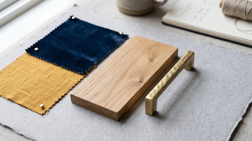
Check your “temperature” balance. If your blue is a “warm” navy (it has a bit of red in it) and your yellow is a “cool” lemon (it has a bit of green in it), they will fight. I’ve noticed that staying on one side of the temperature scale is safer.
- Warm Palette: Navy blue, mustard yellow, and gold hardware.
- Cool Palette: Sky blue, lemon yellow, and silver hardware.
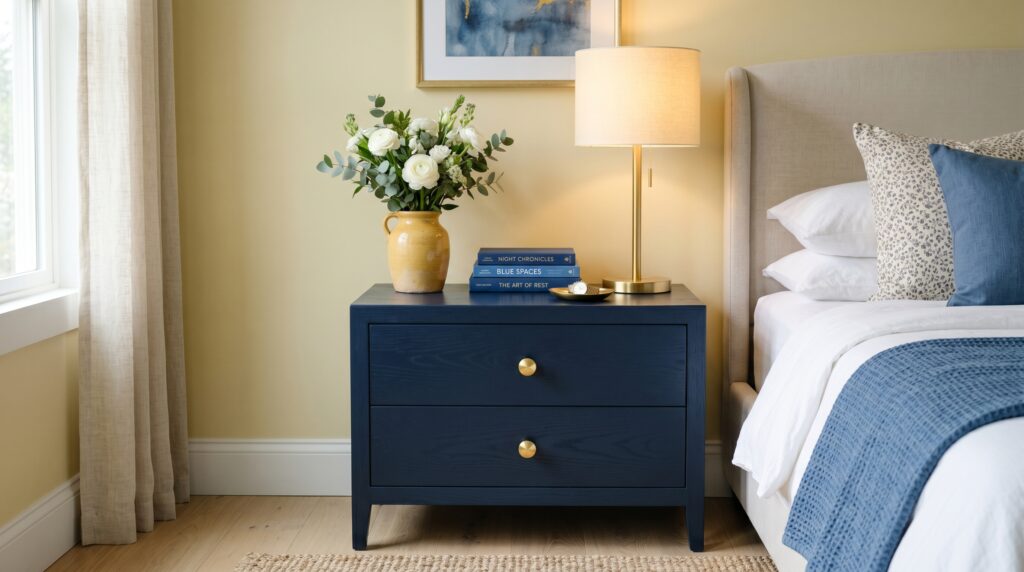
Do not forget the “third color.” A room with only two colors feels flat. I’ve tried adding a third, “secret” color to every Blue And Yellow Room I design. A small green plant or a single orange book can make the blue and yellow feel more “real” and less like a theme. I’ve seen this work in professional showrooms. They never just use two colors. They use two main colors and a “surprise” color to keep your brain engaged.
Which brands offer the best blue and yellow bedroom decor?
For high-quality blue and yellow bedroom items, Sherwin-Williams and Benjamin Moore are the top choices for paint due to their pigment depth. For textiles, Brooklinen offers excellent blue linens, while West Elm provides the best velvet accents in mustard and ochre. Target’s “Threshold” line is the most reliable budget option for smaller yellow decor pieces.
I’ve spent a lot of money testing different brands so you don’t have to. For bedding, I’ve tried the “Luxe Core” set from Brooklinen in navy. It stays crisp after twenty washes. I paired it with a yellow throw from Anthropologie. Anthropologie is expensive, but their “texture game” is unmatched. Their yellow throws have weight and fringe that feel handmade. In my experience, cheap yellow blankets look “pilled” and old within a month.
When it comes to rugs, I always look at Ruggable. I’ve seen their “Blue And Yellow Room” designs work well because you can wash them. If you have kids or pets, a yellow rug is a nightmare unless it’s washable. I’ve noticed that yellow shows every bit of dirt. Ruggable’s “Jonathan Adler” collection has some amazing blue and yellow geometric patterns that feel very high-end but are totally practical.
Tool and Brand Assessment:
- Pottery Barn: Best for “Traditional” blue and yellow. Think floral quilts and heavy wooden furniture. Pros: Very durable. Cons: High price point.
- IKEA: Best for “Modern” blue. Their “Malm” and “Hemnes” lines come in great dark blues. Pros: Affordable. Cons: Assembly is a chore.
- West Elm: Best for “Mid-Century” mustard tones. Their velvet chairs are iconic. Pros: High style. Cons: Shipping can take months.
- Target (Threshold): Best for pillows and lamps. Pros: You can see them in person easily. Cons: Everyone else will have the same lamp.
I’ve tried “Bed Bath & Beyond” for basic blue sheets, but I found they faded quickly. If you want a Blue And Yellow Bedroom that lasts for years, invest in the paint and the rug first. These are the “bones” of the room. You can swap out a $20 yellow pillow from Target every season, but you don’t want to repaint every year. I’ve seen this “high-low” mix work best for most people’s budgets. Spend on the things you touch (sheets and rugs) and save on the things you just look at (lamps and art).
FAQ
How do I make a blue and yellow room feel grown-up?
To keep the space mature, use muted or “dusty” versions of these colors. Instead of bright royal blue and bright sunshine yellow, try navy blue and ochre or mustard. Add textures like velvet, linen, and brass hardware. These materials feel expensive and sophisticated. Avoid using too many small, plastic yellow items. Stick to one or two “hero” pieces of yellow furniture or art. This creates a focused, intentional look rather than a cluttered one.
Does blue and yellow go with gray walls?
Yes, blue and yellow are excellent accent colors for gray walls. Gray acts as a neutral bridge that keeps the high-contrast colors from feeling too sharp. In my experience, a light gray wall with a navy bed and yellow pillows looks very modern. It is a safe way to try these colors without committing to a full blue or yellow wall. Just ensure the “temperature” of the gray matches your blue. A cool gray works best with a cool blue.
What is the best way to use yellow in a dark bedroom?
In a dark room, do not use a pale yellow. It will look like a muddy cream. Instead, use a saturated, bright yellow like marigold or citron. These colors have enough pigment to “glow” even in low light. Pair them with a medium-toned blue like denim or slate. I’ve noticed that adding a large mirror opposite your yellow pieces helps bounce the color around the room, making the whole space feel brighter.
Are blue and yellow bedrooms out of style?
No, this is a classic “complementary” color scheme that never truly leaves. However, the shades change. In the 90s, it was royal blue and bright yellow. Today, it is more about “Navy and Gold” or “Sky Blue and Mustard.” The Dream Core Room style has also brought back pastel blue and pale lemon. It is a versatile duo that adapts to whatever the current aesthetic might be.
Can I mix different shades of blue in one room?
I’ve seen this work beautifully. Mixing navy, teal, and sky blue creates “depth.” The key is to keep your yellow consistent. If you have three different blues, stick to one shade of yellow (like mustard) to anchor the room. This prevents the space from looking like a box of crayons. Layers of blue make a room feel like the ocean or the sky, which is very restful for a bedroom.
What wood tones look best with blue and yellow?
Light woods like white oak, ash, or maple look best with light blue and lemon. They keep the room feeling airy. For navy and mustard, I prefer dark woods like walnut or mahogany. Avoid “cherry” or “honey” woods that have a lot of orange or red. These can clash with the blue and make the yellow look “off.” If you have orange wood floors, use a neutral rug to separate the wood from the wall colors.
Is a blue and yellow bedroom good for kids?
It is a fantastic choice because it is gender-neutral and can grow with the child. For a baby, use soft pastels. As they get older, you can swap the pastel pillows for brighter navy and primary yellow. By the time they are teens, you can shift to a more “Navy and Gold” mature look. It is one of the most cost-effective color palettes for a growing family because the “bones” of the room never have to change.
How do I use blue and yellow without it looking like a sports team?
This happens when you use two saturated primary colors in equal amounts. To avoid the “team” look, vary the shades and the “coverage.” Use a dark navy (almost black) and a very pale, buttery yellow. Or use a bright turquoise and a deep, earthy ochre. Also, include a third color like white, cream, or light gray. This breaks up the connection between the blue and yellow so they don’t look like a uniform.
Should my curtains be blue or yellow?
If your walls are blue, go with yellow curtains to create a “frame” for your windows. This makes the window a focal point. If your walls are neutral (like white or gray), I suggest blue curtains. Blue curtains are better for blocking light, which helps with sleep quality. Yellow curtains can sometimes “glow” too much in the morning, which might wake you up earlier than you want.
What kind of art works in a blue and yellow room?
Abstract art that uses both colors is a safe bet. I also love black and white photography in blue and yellow rooms. The black and white breaks up the color and adds a sophisticated touch. If you want a Dream Core Room feel, look for art featuring clouds, water, or sunrises. Gold or brass frames are the perfect way to tie in a “yellow” element to your wall decor.
How much does it cost to redecorate a bedroom in these colors?
A “mini-refresh” (paint, pillows, and a throw) usually costs around $200-$300. A “mid-range” update (new bedding, a rug, and art) costs $500-$1,000. A “full-scale” redo (new bed frame, dresser, lighting, and all textiles) can cost $2,000-$5,000 depending on the brands you choose. I’ve seen great results at every price point as long as the color balance is correct.
Can I use blue and yellow in a very large master bedroom?
Yes, but you need to “ground” the space. In a large room, light colors can feel “lost.” I suggest using a darker navy on the walls or a very large patterned rug to fill the visual space. Use yellow in “clusters.” For example, a yellow chair next to a yellow lamp. This creates “zones” in a large room, making it feel more cozy and less like an empty hall.
Conclusion
The dream of a blue and yellow bedroom often starts with a single image of a sun-drenched coastal retreat. When you bring that dream home, it requires a bit of math and a lot of testing. I’ve found that the most successful rooms are the ones where the owner wasn’t afraid to go a little darker with the blue or a little more “muddy” with the yellow. Remember that a bedroom is a private space. It should make you feel safe when you close your eyes and happy when you open them. My best advice is to start with the rug. It is the largest piece of “art” in the room and will tell you exactly which blue and yellow shades will work. I predict we will see more “earthy” versions of this duo in the coming years, like terracotta-yellow and deep teal. These colors feel more connected to nature and help us unplug from our screens. What is the one thing stopping you from painting that first blue wall?
One Comment