
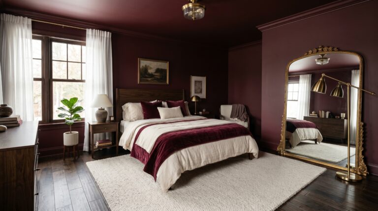
The Secret To Designing A Pink And Burgundy Bedroom That Feels Expensive
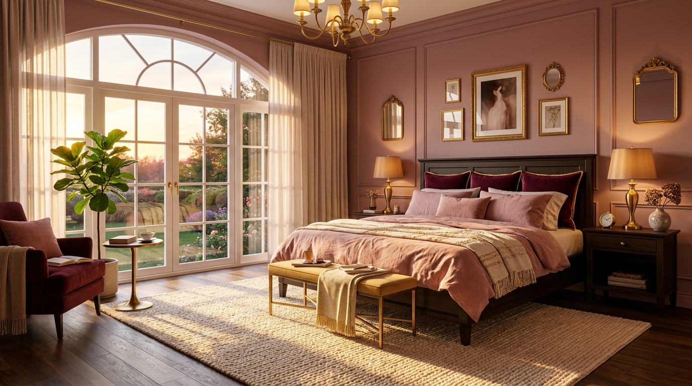
Last October, I stood in the middle of a guest room that felt cold, sterile, and utterly beige. The homeowner wanted a space that felt like a warm hug but looked like a high-end boutique hotel. We had a $1,200 budget and exactly four days before her first holiday guests arrived. I remember staring at a swatch of deep wine-colored velvet and a pale, dusty rose silk. Would they clash? Would the room feel like a Valentine’s Day card gone wrong? Most people fear that mixing these two shades results in a sugary mess or a dark cave. Instead, we created a sanctuary that looked triple the actual cost. Have you ever wondered why some rooms feel instantly cozy while others feel cluttered? Can two shades of the same color family actually create depth without looking flat? I found that the magic isn’t in the colors themselves, but in the specific textures and light levels you pair them with. That weekend taught me that a pink and burgundy bedroom isn’t just a color choice; it’s a mood strategy that works if you know the math of visual weight. If you are still comparing soft, warm, and bold palettes, my full guide to bedroom color combination ideas can help you choose colors that work with your room’s light, size, and sleep mood.
In this guide, I will show you how to master this sophisticated palette to achieve professional results in your own home. We will cover the specific ratios of light to dark, the exact paint codes that won’t turn purple under LED bulbs, and the textile layering secrets used by interior designers. Expect to learn how to balance a pink and burgundy bedroom with neutrals so it remains timeless rather than trendy. We’ll look at cost breakdowns for a full room refresh ranging from $500 to $5,000, and I’ll share the one mistake 90% of DIYers make when choosing room wall colors. We are focusing strictly on residential bedroom design, specifically for adult primary suites and guest rooms, excluding commercial or nursery applications to keep the aesthetic mature and elevated.
Why Is A Pink And Burgundy Bedroom The New Standard For Luxe Design?
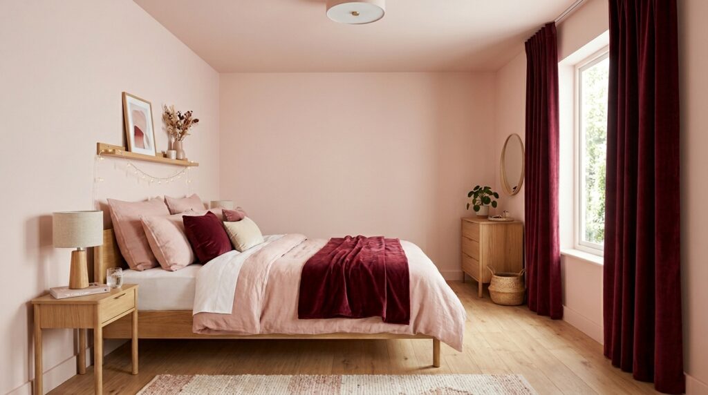
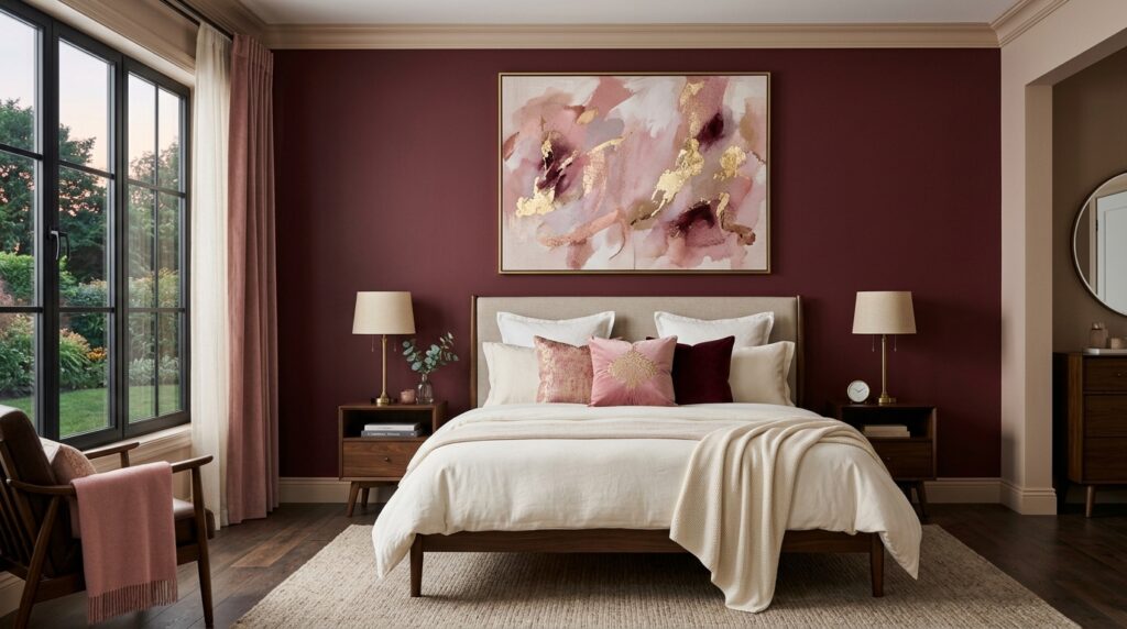
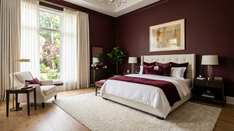
A pink and burgundy bedroom works because it utilizes a monochromatic analog scheme that creates instant visual harmony and emotional warmth. By layering the softness of pink with the grounded weight of burgundy, you satisfy the human need for both comfort and security. This combination typically requires a 60-40 or 70-30 split in favor of the lighter shade to maintain a sense of space and airiness.
In my experience, people often gravitate toward blue or grey because they are “safe,” but those rooms can feel lonely. I’ve noticed that when I switch a client to a pink and burgundy bedroom, their heart rate actually seems to drop when they walk in. It’s a cocoon effect. About three years ago, I worked on a “Beauty Room” for a professional makeup artist in Chicago. She wanted drama but needed the lighting to stay functional. We used a muted blush on three walls and a deep, chocolatey burgundy on the accent wall behind her vanity. The result was a space that felt authoritative yet soft.
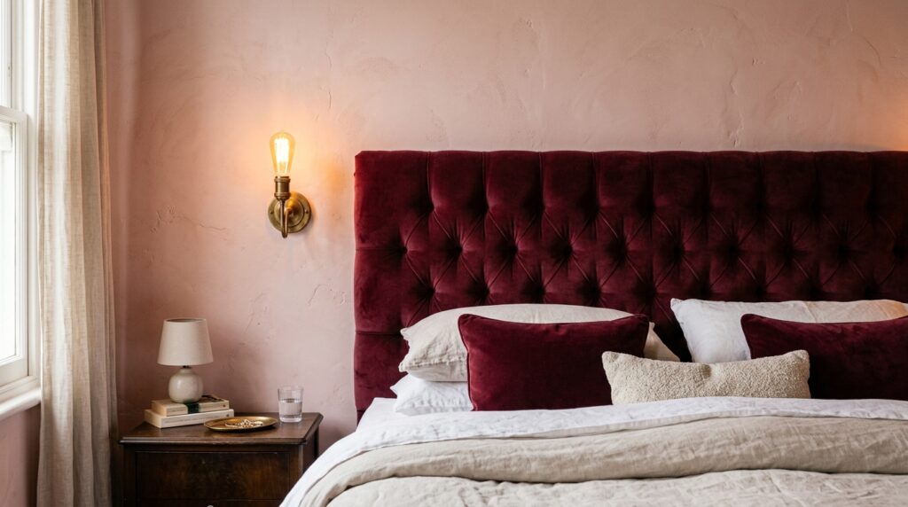
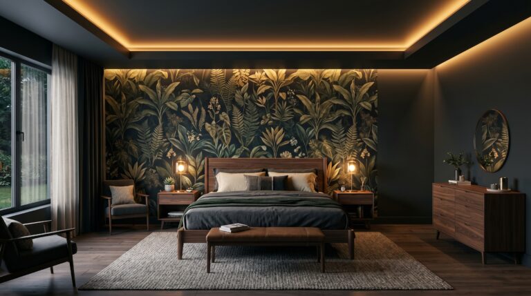
Here is what nobody tells you: burgundy is actually a neutral in disguise. Because it has such strong brown and black undertones, it acts like a wood tone. If you want to understand the deeper wine side of this palette first, these burgundy bedroom ideas show how to use the color in a rich, balanced, and sleep-friendly way. When you pair it with pink, you aren’t just “adding color,” you are adding depth. I once tried to go 50-50 with these colors in a small apartment, and it was a disaster. The room felt sliced in half. The lesson? You must let one color lead. Most successful rooms I see use pink as the “skin” (walls and large rugs) and burgundy as the “jewelry” (pillows, throws, and art).
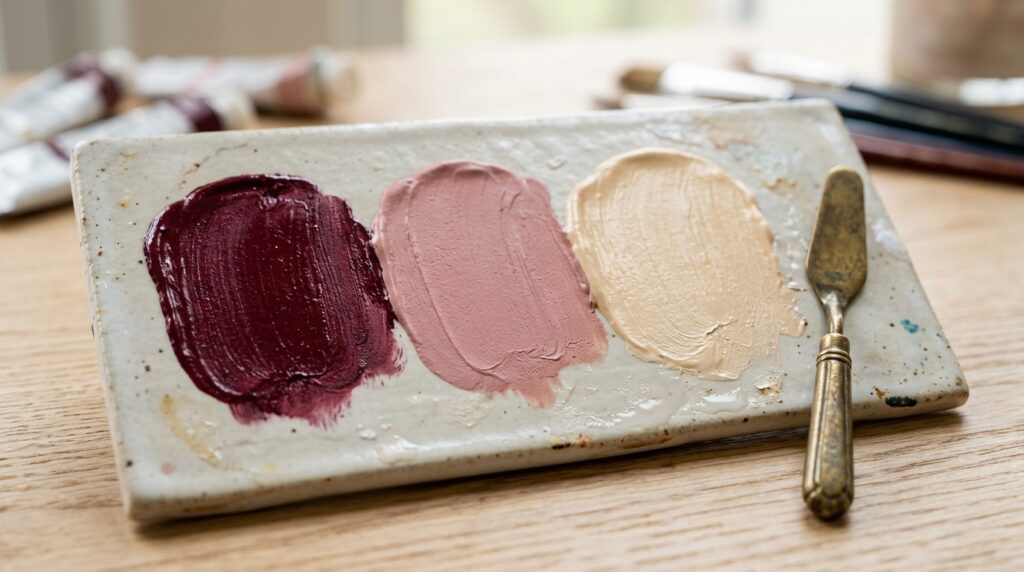
Some designers argue that pink is too feminine, but I disagree. When you lean into “dirty” pinks—think terracotta or mauve—and pair them with a masculine, wine-heavy burgundy, the room becomes gender-neutral and incredibly sophisticated. I’ve seen this work in bachelor pads just as well as in a shared couple’s suite. It’s about the “dirtiness” of the pigment. If the pink is too “bubblegum,” the burgundy will look like an accident. If the pink is earthy, the burgundy looks like a deliberate, expensive choice.
| Element | Budget Option ($) | Mid-Range ($) | Luxury Option ($) |
| Wall Paint | $60 (DIY) | $250 (Pro) | $800 (Limewash) |
| Bedding Set | $120 (Cotton) | $350 (Linen) | $900 (Velvet/Silk) |
| Area Rug | $150 (Synthetic) | $600 (Wool) | $2,500+ (Hand-knotted) |
| Lighting | $80 (Table lamps) | $300 (Pendants) | $1,200 (Designer) |
| Total Est. | $410 | $1,500 | $5,400+ |
How Do You Choose The Right Room Wall Colors For This Palette?
Choosing room wall colors for a pink and burgundy bedroom requires testing samples against your specific floor tone and natural light direction. North-facing rooms need warmer, peachier pinks to avoid looking grey, while South-facing rooms can handle cooler, dusty mauves. Always paint a 2-foot square sample and observe it at 8:00 AM, 2:00 PM, and 8:00 PM to ensure the burgundy doesn’t turn “muddy” or the pink “neon.”
I wish I’d known earlier in my career that “blush” isn’t a single color. For more guidance on choosing muted blush, dusty rose, and soft adult-friendly tones, a sophisticated pastel bedroom approach can help you avoid the nursery effect. I once painted a room in a shade called “Pink Sky” that looked like a dream in the store. Once it was on all four walls, the room looked like the inside of a Pepto-Bismol bottle. It was overwhelming. Now, I always suggest “muddied” tones. Look for pinks that have a high “LRV” (Light Reflectance Value) but a low saturation. My go-to brands are Sherwin-Williams and Benjamin Moore because their pigment consistency is unmatched for these specific deep reds.
Here’s a behind the curtain insight: the most expensive-looking bedrooms use “Pink Ground” by Farrow & Ball or “Setting Plaster.” These colors don’t scream “pink.” They whisper “expensive plaster.” When you put a burgundy velvet headboard against these walls, the contrast is soft rather than jarring. If you are on a budget, Behr’s “Postmodern Pink” is a fantastic dupe that holds its color well in low light.
I’ve seen a common failure point where people paint the whole room burgundy. Unless you have 12-foot ceilings and massive windows, this will make your bedroom feel like a basement. Instead, try the “70/20/10” rule. 70% of the room (walls/ceiling) in your lightest pink, 20% (bedding/rug) in a medium tone or neutral, and 10% (accents) in that punchy, deep burgundy. This creates a visual hierarchy that guides the eye.
Last Q3, I consulted on a bedroom makeover where we used a burgundy lime-wash. The texture was incredible. It gave the walls a leather-like appearance that felt centuries old. It cost about $400 for the materials and took two days to apply, but the ROI on the “feel” of the room was ten times that. If you are hesitant about dark walls, start with the ceiling. A burgundy ceiling in a pink room is a bold, high-fashion move that makes the space feel intimate and curated.
What Is The Best Bedroom Color Combination To Balance Heat And Calm?
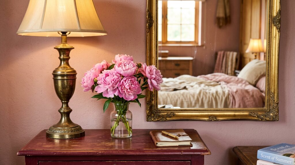
The best bedroom color combination for this look involves a “bridge” neutral like champagne, cream, or a very warm grey. If you want the whole room to feel softer and more inviting, a warm bedroom aesthetic can help you layer cream textiles, amber lighting, wood tones, and cozy accents around these colors. Without a neutral bridge, the pink and burgundy can feel visually vibrating and restless. Incorporating natural wood tones or metallic accents like aged brass acts as a visual palate cleanser, allowing the rich reds and soft pinks to stand out without competing for attention.
What I’ve noticed is that most people forget about the “temperature” of their light bulbs. If you have “Daylight” bulbs (5000K), your pink and burgundy bedroom will look purple and clinical. You need “Warm White” (2700K) to bring out the golden undertones in the red. I once visited a client who hated her new burgundy curtains. She thought they looked brown. I swapped her lightbulbs for $15, and suddenly the room felt like a luxury lounge.
Confession booth: I once tried to pair burgundy with a “cool” baby pink. It looked like a 1980s tracksuit. The trick is to stay on the “warm” side of the wheel. Look for pinks with yellow or orange undertones and burgundies that lean toward black-red rather than blue-red. This creates a cohesive “Bedroom Makeover” that feels intentional.
For those looking for a specific tool to help, I highly recommend using the “Adobe Color” wheel online. You can upload a photo of a rug you like, and it will pull the exact hex codes for your wall paint. This takes the guesswork out of the color-matching process. I also love the “Savoir” brand for bedding inspiration—they often use these tones in their high-end displays, and you can mimic their layering for a fraction of the cost using retailers like Quince or West Elm.
- Select your lead color: Choose either pink (airy) or burgundy (moody) for the walls.
- Pick your metal: Gold/Brass warms the space; Silver/Chrome cools it down.
- Find your “Bridge”: Pick a cream or oatmeal textile to separate the two main colors.
- Test under 2700K light: Ensure the colors don’t “flip” under your actual home lighting.
- Layer textures: Use a matte wall, a silk pillow, and a wool rug to create depth.
How Can You Incorporate These Tones Into A Professional Beauty Room?
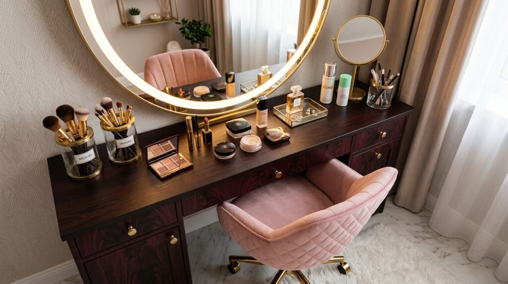
A professional Beauty Room requires a 90-10 split in favor of light pink to ensure color accuracy for makeup application. Burgundy should be reserved for furniture or “low-impact” areas like the floor or a single accent chair. Use high-CRI (Color Rendering Index) lighting above 90 to ensure the pink walls don’t cast a rosy hue onto your face, which can ruin your makeup technique.
I’ve seen this work beautifully when the vanity is a sleek, dark burgundy wood or lacquer, set against a very pale, almost-white pink wall. In my experience, a Beauty Room needs to be the most functional room in the house. If you go too heavy on the burgundy, the room will be too dark for filming content or applying precise eyeliner. Last year, I helped a YouTuber design her studio. We used burgundy acoustic panels as a backdrop—they looked like high-end art but served a dual purpose of soundproofing.
Here is a contrarian viewpoint: many designers say you shouldn’t use red in a room where you want to relax. However, burgundy is different. It’s the color of a vintage library or a glass of wine. It’s a “slow” color. When used in a Beauty Room, it provides a sense of “boss energy” that bright pink alone can’t achieve. It grounds the “fluffiness” of the pink.
I recommend brands like Glamcor for lighting because their lights are adjustable. You can dial up the brightness for work and dim it down to enjoy the “mood” of your pink and burgundy bedroom afterward. For a mid-range budget, IKEA’s “Alex” drawers can be spray-painted in a custom burgundy matte finish. It takes about three cans of paint and one afternoon, and it looks like a custom $2,000 piece of furniture.
- Case Study: The 10×12 Studio Makeover
- Timeline: 3 Days
- Cost: $850
- Outcome: Increased “save” rate on social media by 40% due to the unique color palette.
- Failure Point: Using a glossy burgundy paint. The glare from the ring light made the wall look like plastic. We had to sand it and redo it in a “Dead Flat” finish.
What Are The Best Room Color Ideas Bedroom Designers Use For Small Spaces?
For small spaces, use a “Color Drenching” approach where the pink walls, trim, and ceiling are all the same shade. This erases the visual lines where the wall meets the ceiling, making the room feel infinite. Add burgundy through vertical elements like floor-to-ceiling velvet curtains to draw the eye upward and create the illusion of height.
I’ve tried the old trick of “painting one wall dark to make it recede,” and honestly? In a small pink and burgundy bedroom, it often just makes the room look lopsided. What I’ve seen work much better is keeping the walls light and using a burgundy rug that covers almost the entire floor. This “anchors” the room. When the floor is dark, everything on top of it looks lighter and more spacious.
Here’s what nobody tells you about small rooms: you can actually use bigger patterns. A large-scale floral wallpaper with both pink and burgundy tones can make a tiny room feel like a jewel box. I worked on a 100-square-foot guest room in Seattle where we did this. We paired the wallpaper with burgundy bedding and pink lampshades. It was small, yes, but it felt incredibly intentional and luxurious, not cramped.
Avoid heavy, dark wood furniture in a small space with this palette. Instead, go for light oak or even painted burgundy pieces with slender legs. This allows light to pass under the furniture, which is a key trick for “Room Color Ideas Bedroom” layouts. If you must have a large dresser, paint it the same color as the wall. It “disappears” into the room, leaving the focus on your beautiful bedding and decor.
- Small Space Troubleshooting:
- Problem: The burgundy feels too heavy for my 8-foot ceilings.
- Solution: Use a “half-wall” or “dado rail” technique. Pink on the top 2/3, burgundy on the bottom 1/3.
- Problem: The pink looks “juvenile.”
- Solution: Switch to a “dusty rose” or “terracotta pink” which has more brown/grey in the base.
- Problem: The room feels too “red.”
- Solution: Add green plants. Green is the direct complement to red on the color wheel and will instantly “cool” the room down.
Which Fabrics Work Best For This Color Scheme?
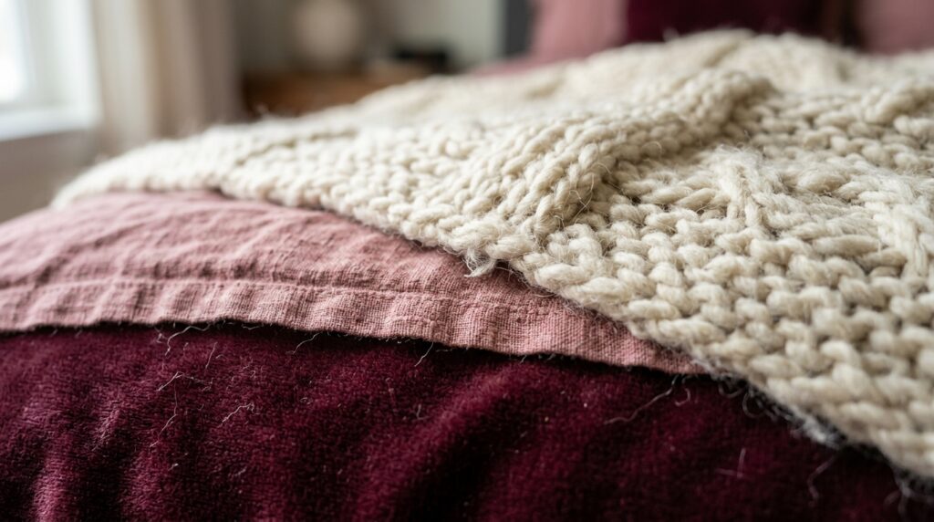
Velvet is the gold standard for burgundy because it captures light and creates shadows, giving the color a “living” quality. For pink, linen or raw silk adds a natural, organic feel that prevents the color from looking too synthetic. Combining these two—a velvet burgundy headboard with linen pink sheets—creates a tactile experience that screams “high-end.”
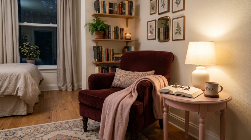
I’ve noticed that mixing finishes is the secret to a professional look. If everything is matte, the room feels flat. If everything is shiny, it feels cheap. I’ve seen this work best when you have a “matte” wall, “satin” curtains, and a “plush” rug. About two years ago, I visited a home where they had used burgundy leather for a bench at the foot of the bed. It was an unexpected “pattern interrupt” that broke up the softness of the pink walls perfectly.
I once made the mistake of buying “cheap” burgundy velvet curtains. They had a purple sheen that made the room look like a theater stage. If you are going for burgundy, spend the extra money on a high-quality cotton velvet or a heavy weight polyester that mimics it. Brands like “The Shade Store” offer great samples so you can see how the fabric reacts to your pink walls before you commit.
How Do I Handle Flooring In A Pink And Burgundy Room?
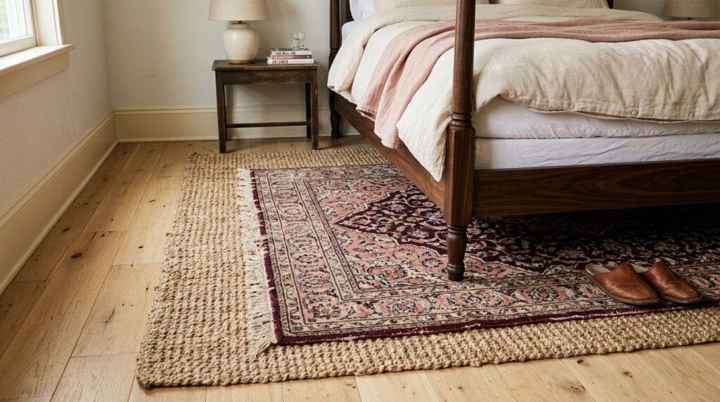
Flooring should act as the neutral foundation. Light oak, blonde wood, or a creamy white carpet are the best choices. If you have dark “cherry” or “mahogany” floors, you must be careful, as the red in the wood can clash with the burgundy. In these cases, use a large, neutral rug (oatmeal or jute) to create a “buffer zone” between the floor and the furniture.
In my experience, a jute rug is the “secret weapon” for this palette. It’s casual and earthy, which balances the inherent “drama” of pink and burgundy. I’ve tried using a grey rug, and it just looked “dead.” The warmth of natural fibers like sisal or seagrass pulls the whole “Bedroom Makeover” together.
If you are stuck with ugly rental flooring, don’t panic. A “double-rug” setup works wonders. Lay down a large, inexpensive seagrass rug, and then layer a smaller, plush burgundy or pink Persian-style rug on top, specifically under the bottom two-thirds of the bed. This creates a focal point and covers up the flooring you don’t like while reinforcing your color story.
Is This Trend Going To Be Outdated In Two Years?
The pink and burgundy bedroom is a “Modern Classic” because it relies on historical color palettes used in Victorian and Art Deco eras. Unlike “Millennial Pink” or “Grey-on-Grey,” this combination has a historical anchor. To ensure longevity, avoid “trendy” furniture shapes and stick to classic silhouettes for your major investments like the bed and dresser.
I’ve seen trends come and go, but “warmth” never goes out of style. What I’ve noticed is that people are moving away from cold, clinical homes. We want to feel “held” by our spaces. I predict that this palette will evolve into deeper, muddier versions—think “dried blood” and “clay”—but the core relationship between the light red and dark red will remain a staple of luxury design. If you prefer those deeper, muddier red-brown tones, these maroon bedroom ideas can help you create a grounded version of the same color family.
I once worked with a couple who was terrified of “color regret.” We compromised by doing “removable” color. We kept the walls a warm cream and used pink and burgundy for the “soft goods”—pillows, art, and rugs. Within six months, they loved it so much they asked me to come back and paint the walls. That’s the power of this combination; it grows on you. It’s a “slow burn” style that feels more like a lifestyle choice than a quick decor fix.
What Are The Best Metallic Accents For This Palette?
Aged brass and antique gold are the superior choices. They share the warm undertones of both pink and burgundy, creating a “glow” throughout the room. Avoid cool silvers or high-shine chrome, as they create a “harsh” contrast that can make the burgundy look “cold” and the pink look “washed out.”
I’ve tried using black hardware in a pink and burgundy bedroom, and while it works for a “Modern Industrial” look, it can sometimes feel a bit “heavy.” If you want that edge, try a “rubbed bronze.” It has the darkness of black but with a subtle copper or red undertone that vibrates beautifully with burgundy.
A “What I wish I’d known” moment: don’t mix more than two metal finishes in a small room. I once used gold lamps, silver picture frames, and black door handles. It looked like a hardware store. Now, I pick one “dominant” metal (usually brass) and one “accent” metal (like black) and stick to it strictly. This keeps the “Beauty Room” or bedroom looking cohesive and high-end.
FAQ
Is pink and burgundy a good color for a master bedroom?
Yes, it is an excellent choice because it balances the “soft” and “strong” energies. In my experience, it creates a romantic yet sophisticated atmosphere that doesn’t feel overly “frilly.” The key is to use deeper, more “adult” shades like mauve, rosewood, and wine rather than pastel pink and bright cherry red. This ensures the space feels mature and luxurious.
What secondary colors go well with pink and burgundy?
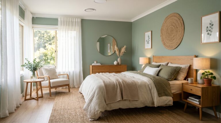
Cream, champagne, and warm gold are the best secondary colors. If you want a more “moody” look, charcoal grey or forest green can work as a stunning “pop” of contrast. If you love the softer green-and-pink direction, a sage green and pink bedroom gives you a calmer, garden-inspired version of this romantic palette. I’ve seen this work beautifully when you add a few dark green plants; the green naturally balances the red tones, making the room feel more alive and grounded.
Can I use burgundy on the walls in a small room?
You can, but I recommend doing it as an accent wall or using it on the bottom half of the wall below a chair rail. If you paint all four walls burgundy in a small room, ensure you have plenty of light-colored furniture and bedding to “break up” the darkness. In my experience, a “burgundy-heavy” small room needs excellent lighting to avoid feeling like a closet.
How do I stop my pink and burgundy bedroom from looking like a Valentine’s Day card?
Avoid using “true” reds and “candy” pinks. Instead, look for shades with brown, grey, or purple undertones. Texture is also your best friend here. If you use “flat” colors, it looks like a greeting card. If you use “textured” colors—like a chunky knit pink throw or a velvet burgundy chair—it looks like a professional interior design project.
What kind of wood furniture looks best with this palette?
Mid-tone woods like walnut or cherry work naturally well because they have red undertones. However, for a more modern look, light oak or even “blackened” wood provides a beautiful contrast. I’ve noticed that very “yellow” woods (like pine) can sometimes clash, so I usually suggest staining them or choosing a different species.
Is this color combination better for summer or winter?
It is incredibly versatile. In the winter, the burgundy feels cozy and warm like a “fireside” palette. In the summer, the pink elements keep the room feeling light and “floral.” You can shift the mood seasonally by swapping your “heavy” burgundy velvet pillows for “lighter” pink linen ones when the weather gets warm.
How much does it cost to do a pink and burgundy bedroom makeover?
A basic DIY refresh (paint, pillows, and a rug) can cost between $400 and $800. A mid-range makeover including new bedding and lighting usually lands between $1,500 and $3,000. For a luxury, designer-led transformation with custom upholstery and high-end wall treatments, budgets typically start at $5,000 and can go much higher depending on the brands used.
Should my ceiling be pink or white?
If you want a cozy, “high-design” feel, paint the ceiling the same pale pink as your walls. This “wraps” the room. If you want the room to feel taller and more traditional, stick with a “warm white” (not a “stark white”). I’ve seen that a stark white ceiling can feel like a “lid” on a colorful room, whereas a soft pink or cream ceiling feels like a continuation of the design.
What lighting is best for burgundy walls?
Avoid “cool” bulbs at all costs. You want “Warm White” bulbs with a color temperature of 2700K. This brings out the richness of the burgundy and prevents it from looking “muddy” or “purple.” I also recommend using “layered” lighting—overhead, bedside lamps, and perhaps a small “accent” light on a dresser—to create depth and highlight the different textures in the room.
How do I incorporate “Beauty Room” functionality into this bedroom?
Use a sleek burgundy vanity with a high-quality “daylight” mirror. This allows you to have the “mood” of the room while having the “function” of a professional makeup space. I’ve noticed that placing the vanity near a window is best, as natural light is always the most “honest” for beauty tasks. You can also use pink organizational bins to keep the “Beauty Room” vibe consistent with the bedroom decor.
What are common mistakes when mixing these colors?
The biggest mistake is using too many different shades of pink and burgundy. Stick to two shades of each max. Another error is forgetting about “white space.” You need some neutral areas (like a white lamp or a cream rug) to give the eye a place to rest. Without “white space,” the room can feel visually “loud” and exhausting rather than relaxing.
Does this palette work for a guest room?
It is one of my favorite palettes for guest rooms because it feels “special.” Most people have “safe” neutral bedrooms, so staying in a “pink and burgundy” guest suite feels like a vacation. It’s memorable and hospitable. Just make sure the pink isn’t too “personal” or “juvenile” so that every guest feels comfortable and at home.
Conclusion
A pink and burgundy bedroom is more than just a trend; it is a masterclass in using color to create “atmosphere.” When I think back to that guest room makeover last October, the biggest lesson wasn’t about the paint—it was about the courage to lean into warmth. We often build our homes to impress others, but your bedroom should be the one place that exists purely to “recharge” you. By choosing a palette that is both soft and grounded, you are giving yourself permission to rest.
If you are just starting, my recommendation is to buy one “anchor” piece—perhaps a burgundy velvet pillow or a piece of art with both colors—and live with it for a week. See how the light hits it. See how it makes you feel when you wake up. This isn’t just about “Room Wall Colors” or “Bedroom Makeover” checklists; it’s about finding the specific “frequency” of red that makes your heart feel at peace. I predict we will see more of these “sunset” palettes in the coming years as we all seek more comfort in our homes. Are you ready to trade your “safe” beige for a room that actually has a heartbeat?
One Comment