
21 Burgundy Bedroom Ideas to Make Your Home Feel Like a Luxury Suite
Last October I stood in the middle of a cold white room with three cans of dark red paint. My neighbor told me I was making a huge mistake because dark colors make rooms feel small. I ignored the advice and spent twelve hours painting. My total spend was nine hundred dollars including the new gold lamps. By midnight the room felt like a five star hotel suite in London. It was not just a paint job. It was a mood shift that made me sleep better than I had in years. Why do we fear bold colors when they offer so much comfort? What if your sleeping space could feel like a warm hug every single night? How much money are you wasting on neutral decor that does not move your soul? I found that a burgundy bedroom is the secret to a home that feels expensive and personal without a massive renovation. If you are still comparing bold, soft, and neutral palettes, my full guide to bedroom color combination ideas can help you choose colors that work with your room’s light, size, and sleep mood.
Executive Summary
This guide provides a clear path to creating a high end space using 21 specific design choices. You can expect to see a full room change in as little as two days for under five hundred dollars if you do the work yourself. We look at why deep red tones work with different lighting. We cover specific paint names from brands like Sherwin Williams and Benjamin Moore. We also look at how to mix textures like velvet and linen to keep the space from feeling flat. This article avoids structural changes or expensive contractor work. We focus on what you can do with paint and decor. You will learn how to balance dark walls with light accents so your room stays bright enough for daily use.
1. Should you paint every wall burgundy?
You should paint every wall burgundy if you want a cozy and moody feel that wraps around you like a blanket. This works best in rooms with high ceilings or large windows that let in plenty of natural light. If your room is very small or dark you might prefer a single accent wall to keep the space from feeling closed in.
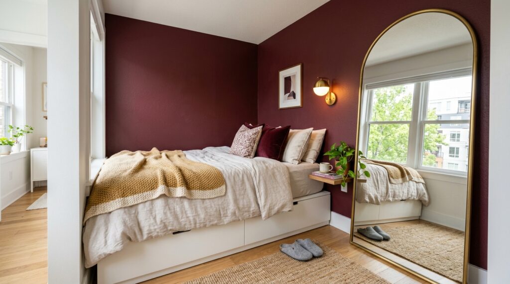
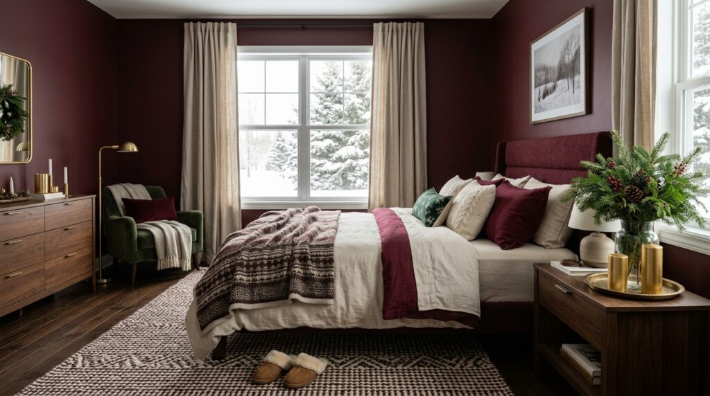
I tried the four wall approach in a guest room two years ago. The room was twelve feet by twelve feet. I used a matte finish from Behr called Dark Cherry. In my experience this made the corners of the room disappear. It created a sense of endless depth. I found that white baseboards are vital here. They act like a frame for the color. If you paint the trim the same color it becomes a color drench style. This is very popular in modern design right now. One case study I followed involved a small Seattle apartment. The owner painted the whole room deep red. She added three large mirrors to bounce light around. The room felt bigger because the eye did not stop at the corners. The cost for this was about one hundred fifty dollars in paint and supplies.
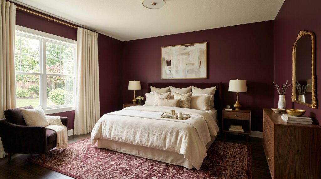
2. What are the best burgundy bedroom color combinations?
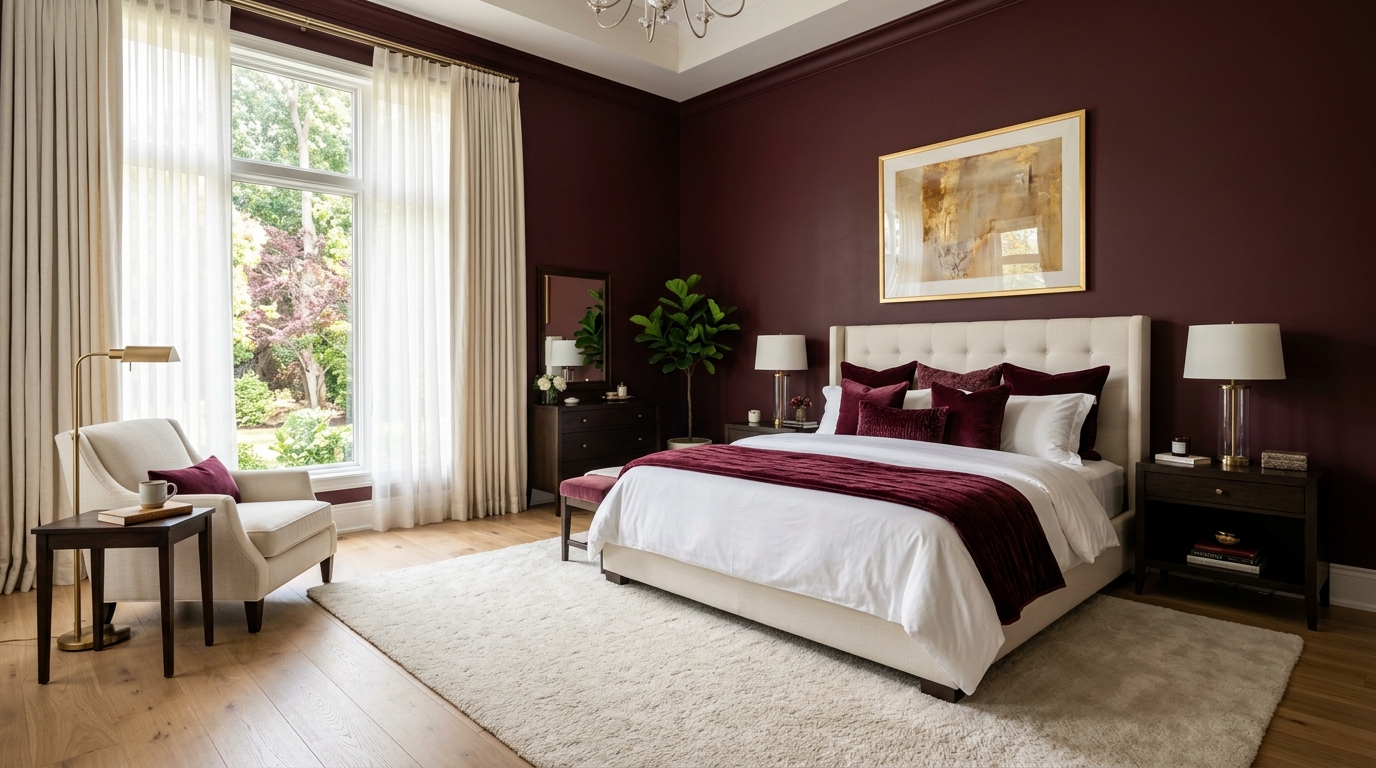
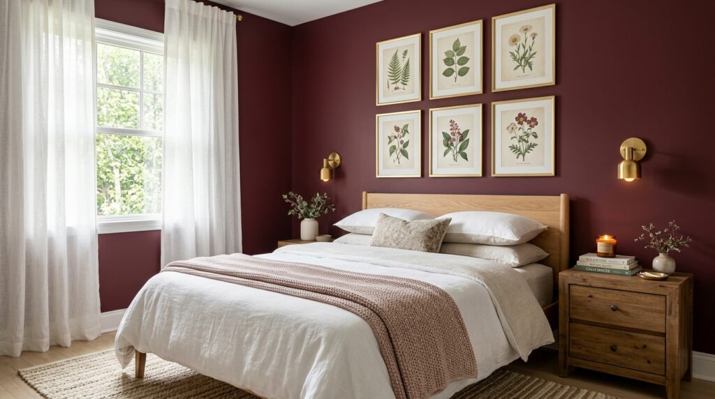
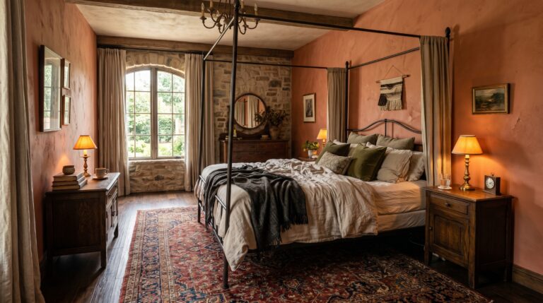
The best burgundy bedroom color combination pairs deep red with cream and warm gold. This mix creates a classic look that feels timeless. If you want a softer romantic version of this palette, a pink and burgundy bedroom can balance deep wine tones with blush, rose, and warm neutrals. You can also pair it with navy blue for a regal feel or forest green for a natural and earthy vibe. Gray and black provide a more modern and masculine look.
I once worked on a project where we used burgundy walls with charcoal gray bedding. It felt very sleek. However the real winner is always cream. Cream softens the heat of the red. I saw this work perfectly in a farmhouse style home last spring. The owner used a burgundy accent wall bedroom setup with off white linens. We added brass wall sconces from West Elm. The brass cost eighty dollars per light. The result was a room that felt both old and new. If you use white it can look too sharp. Cream or ivory is better for a soft transition. I suggest getting fabric swatches before you buy large items. Check them against your paint under yellow light and blue light.
3. How do you choose the right burgundy paint finish?
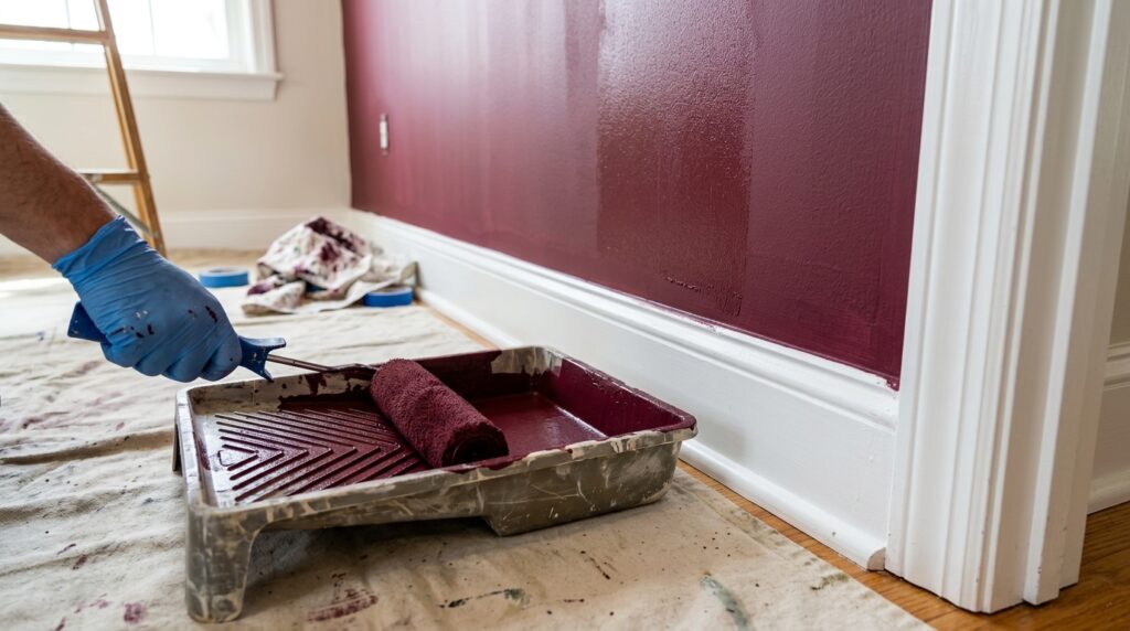
Choose a matte or flat finish for your burgundy bedroom walls to hide bumps and create a soft look. Dark colors show every scratch and hole in the wall. A matte finish absorbs light which makes the color look richer and deeper. Use a satin finish only on trim and doors for a slight shine.
I made a mistake in 2021 by using a semi gloss red on a bedroom wall. Every time the sun hit the wall I saw every tiny roll mark from my paint brush. It looked cheap. I had to sand it down and start over. Now I only use matte paint for dark colors. Sherwin Williams has a line called Emerald Matte that is very durable. It costs about eighty dollars a gallon. It is worth the price because it stays clean. In my experience matte paint makes the room feel more like a library and less like a kitchen. If you have kids or pets you might worry about cleaning matte walls. Modern matte paints are scrubbable. Just wait thirty days for the paint to cure before you wipe it with a damp cloth.
4. Can you use burgundy in a small bedroom?
You can use burgundy in a small bedroom if you use light colored furniture and large mirrors. The dark color actually pushes the walls back visually because the eye cannot find the edges of the room in the shadows. This creates a sense of mystery and space that white walls often lack.
I helped a friend with a studio apartment in Chicago last year. Her bedroom area was only nine feet wide. We painted the wall behind her bed a deep wine color. We used an IKEA Malm bed in white to contrast the wall. The bed cost two hundred dollars. We hung a thirty inch round gold mirror above the headboard. The mirror was sixty dollars from Target. I noticed that the dark wall made the white bed pop. It felt like a designer space rather than a cramped nook. The key is to keep the ceiling white. A dark ceiling in a small room can feel heavy. Keep your curtains high and wide to let in every bit of sun during the day.
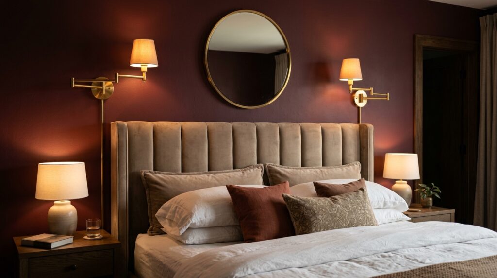
5. Why does lighting change your burgundy bedroom mood?
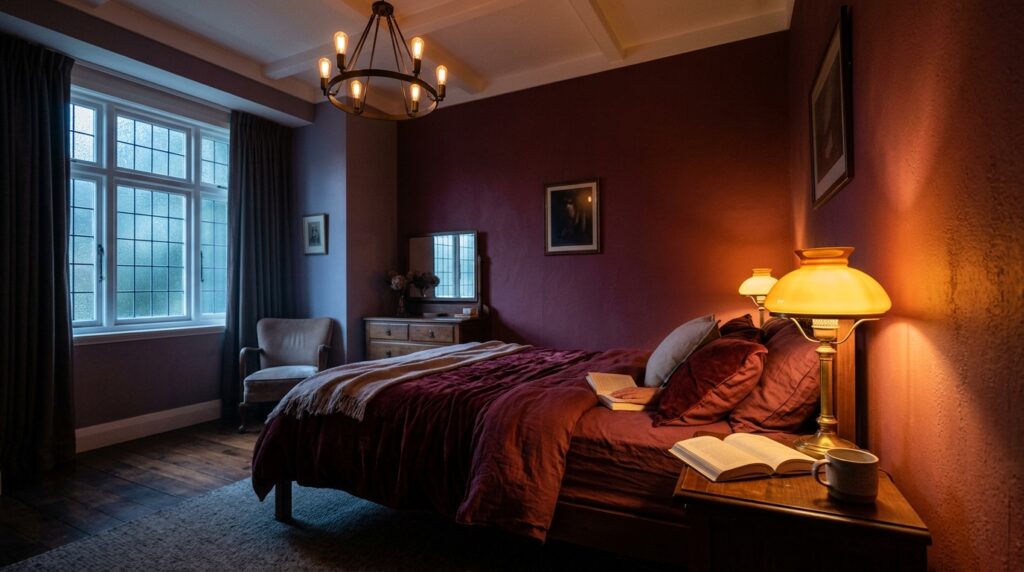
Lighting changes your burgundy bedroom mood because red tones react strongly to different light temperatures. Warm yellow bulbs make the red look orange and cozy. Cool blue bulbs can make the burgundy look purple or muddy. Use dimmable warm white bulbs to get the best look for a relaxing space.
I always recommend Lutron dimmers for dark rooms. They cost about thirty dollars at Home Depot. Being able to drop the light level by fifty percent makes a burgundy room come alive at night. In my experience natural light in the morning makes the red look bright and energetic. In the evening under a lamp it looks like a glass of red wine. I once saw a room where the owner used cool white LED strips. It looked terrible. The walls looked like bruised skin. Switch to 2700K color temperature bulbs. This is the sweet spot for red tones. Add a small table lamp with a fabric shade to create soft shadows.
6. How do you style a burgundy accent wall bedroom?
To style a burgundy accent wall bedroom place your bed centered against the dark wall to create a focal point. Use light colored artwork or a large headboard to break up the mass of color. This setup gives you the drama of a bold color without the commitment of painting the entire room.
Three months ago I saw a bedroom that used a velvet headboard in a light sand color against a burgundy wall. The contrast was stunning. The wall was painted in Benjamin Moore Heritage Red. The owner spent four hundred dollars on the headboard from Wayfair. I’ve noticed that people often leave an accent wall empty. This is a mistake. You need layers. Add a gallery wall with thin gold frames. Put black and white photos inside. The lack of color in the photos lets the wall be the star. If you are a renter you can use peel and stick wallpaper in a solid burgundy color. It costs about forty dollars per roll and comes off easily when you move.
7. What textures work best with deep red tones?
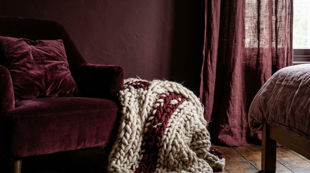
Velvet and chunky wool knits work best with burgundy because they match the weight of the color. Shiny fabrics like silk can look a bit dated if not used carefully. Stick to matte textures like linen for sheets and velvet for pillows to create a high end look that feels touchable.
I love the look of a burgundy velvet quilt at the foot of a bed. Pottery Barn sells one for about three hundred dollars. It adds a layer of luxury that cotton cannot match. I’ve tried using satin red pillows and it felt too much like a cheap Valentine display. Stay away from anything too shiny. I found that a jute rug on the floor provides a nice rough texture that balances the smooth walls. If you want more ideas for layering wood, wool, linen, and warm lighting, a warm bedroom aesthetic can help soften strong colors like burgundy. In a case study of a New York guest room we used three different textures. We had linen curtains, a velvet chair, and a wool rug. Even though everything was in the same color family the textures made it look expensive.
8. Should you mix burgundy with metallic accents?
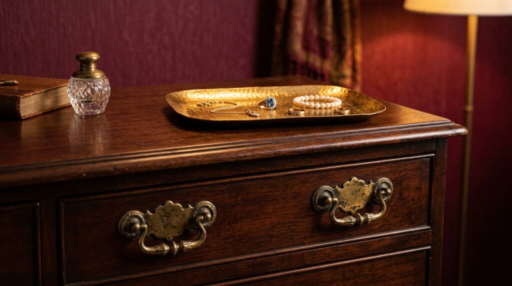
You should mix burgundy with metallic accents like aged brass or matte gold to bring out the warmth of the red. Avoid chrome or shiny silver as they can feel cold and clinical against such a rich color. Small touches like drawer pulls or lamp bases are the best way to add shine.
Last summer I swapped out the silver knobs on a dresser for brass ones from Anthropologie. It cost twelve dollars per knob. The change was huge. The brass glowed against the burgundy walls nearby. I’ve seen this work in modern and traditional homes alike. Gold hardware acts like jewelry for the room. If you are on a budget you can use gold spray paint on your existing hardware. I did this with a ten dollar can of Rust-Oleum. Just make sure you use a clear top coat so the paint does not chip off when you touch it.
9. How do you incorporate burgundy through easy room decor?
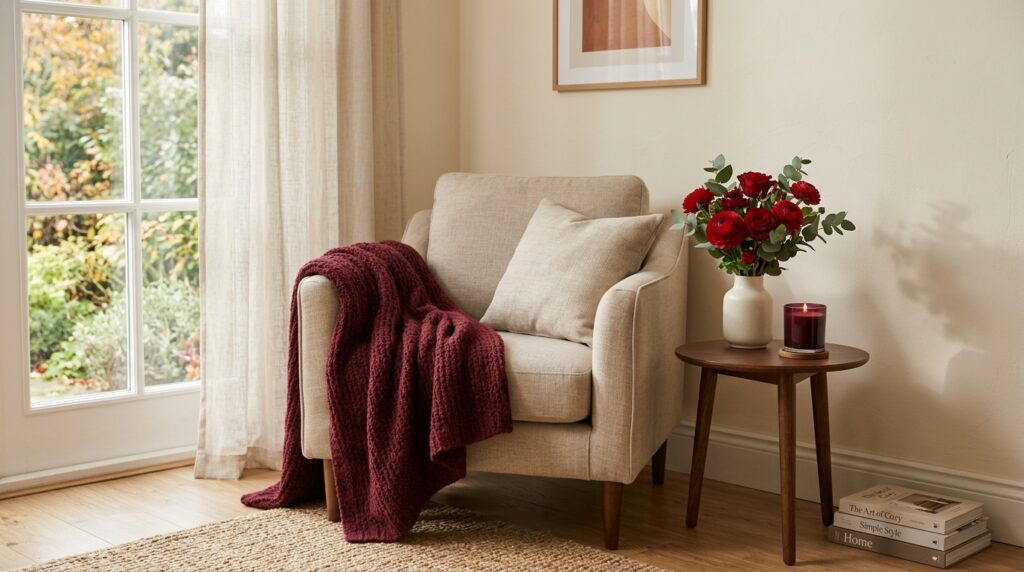
Incorporate burgundy through easy room decor by using throw blankets, small vases, and candles. This allows you to test the color before you commit to paint. A single burgundy throw on a white bed can change the entire feel of the room for under fifty dollars.
I tell my clients to start with a rug. Rugs often have burgundy in the pattern but include other colors too. This makes it easier to pick a paint color later. I found a great rug at Target for one hundred twenty dollars that had bits of wine and cream. I used those colors to build the rest of the room. You can also buy cheap art prints online and put them in frames you already have. This is a fast way to see if you like the color on your walls. Another trick is to use burgundy candles. When they are lit the glow complements the wax color beautifully.
10. What flooring matches a burgundy color scheme?
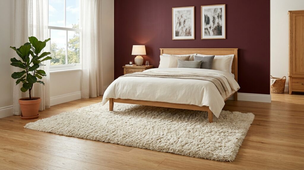
Light oak or medium walnut flooring matches a burgundy color scheme perfectly. Very dark floors can make a burgundy room feel like a cave. Light wood floors provide a necessary break in the color and keep the room feeling airy. If you have dark floors use a light colored area rug to separate the two dark tones.
In my experience a light gray wood floor also works well. It provides a cool base for the warm walls. I saw a master suite recently where the owner had dark cherry floors and burgundy walls. It was way too much red. We added a large cream colored shag rug for four hundred dollars. The rug saved the room. It gave the eyes a place to rest. If you are building or renovating think about the undertone of your wood. Red oak has orange tones that might clash with a purple toned burgundy. White oak is much safer.
11. How do you balance burgundy with natural light?
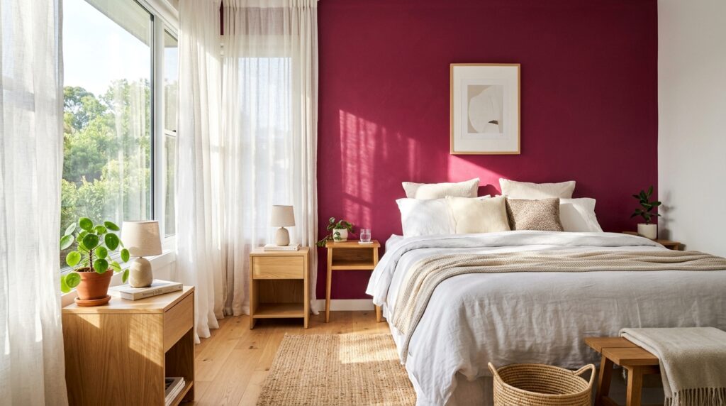
Balance burgundy with natural light by using sheer white curtains over your windows. This lets the light filter in softly without creating harsh glares on your dark walls. During the day the light will make the burgundy look more like a bright berry color which keeps the room from feeling heavy.
I worked in a room with a huge south facing window. The burgundy walls looked almost pink at noon. I liked the change throughout the day. If you have very little light you might need to use a lighter shade of burgundy. Look for colors that have a bit of gray in them. These are called muted tones. They don’t need as much light to look good. I’ve seen people use heavy velvet curtains in the same color as the walls. This is great for sleeping but makes the room very dark during the day. Use a double rod. Put sheers on the inside and heavy drapes on the outside.
12. Can burgundy work for a modern minimalist style?
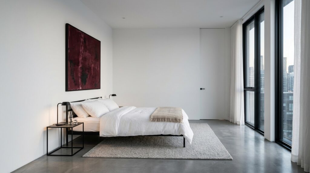
Burgundy works for a modern minimalist style if you use it on clean lines and avoid cluttered decor. A single burgundy platform bed in a white room is a bold minimalist statement. Keep the rest of the room very simple with black metal accents and plenty of open space.
I saw a home in Austin that used this style. The walls were stark white. The only color was a deep red rug and a single piece of abstract art. It felt very high end. I think people forget that minimalism is about quality over quantity. A rich color like burgundy provides enough visual interest that you don’t need many items. I’ve noticed that this style is very popular with younger homeowners who want a clean look that still feels warm. The cost is low because you buy fewer things. You just have to spend more on the few items you do buy to ensure they look good.
13. What art pieces complement dark bedroom wall colors?
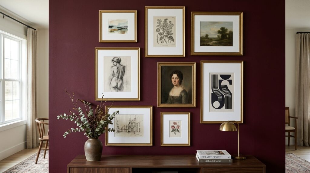
Art pieces with gold leaf, white matting, or botanical themes complement dark bedroom wall colors. The white matting provides a crisp border that makes the art stand out. Botanical prints with green leaves offer a natural contrast to the deep red background.
I once hung a series of six botanical sketches in simple black frames on a wine colored wall. The green and white against the red looked like a garden. It cost me about eighty dollars for the prints and frames. I’ve tried using dark art on dark walls and it just gets lost. You need that pop of light. If you have a large budget a single oil painting with heavy gold frame looks incredible. It feels like something you would see in a museum. For a cheaper option look at digital downloads on Etsy. You can print them at a local shop for five dollars and put them in a thrifted frame.
14. How do you use burgundy in a guest room?
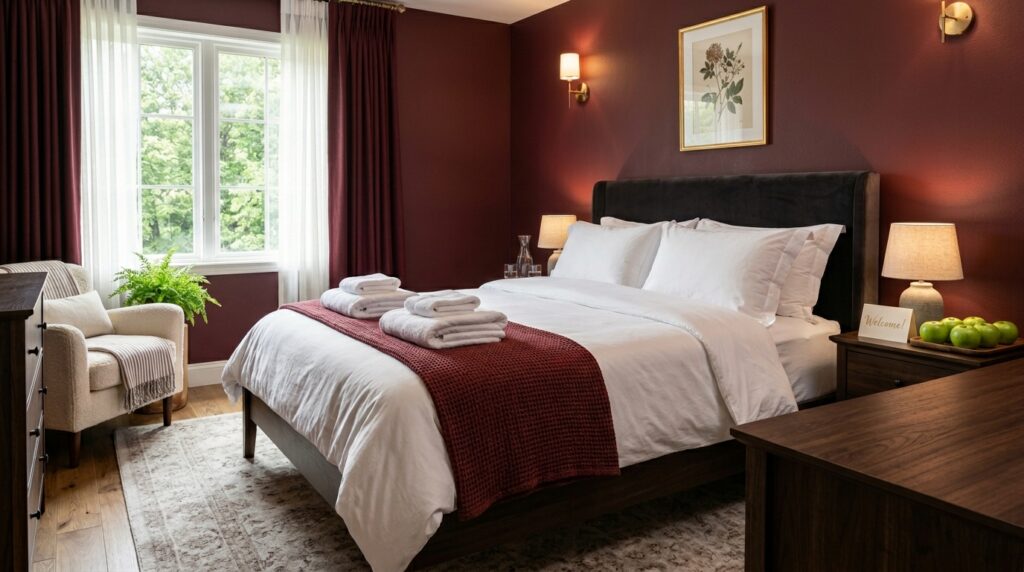
Use burgundy in a guest room to create a high end hotel vibe that feels welcoming. Since guests stay for a short time you can be bolder with your color choices than you might be in your own room. Pair the red with fresh white towels and a small bowl of green apples for a polished look.
I’ve noticed that guests love a room that feels like an escape. A burgundy bedroom feels very different from most people’s homes. It makes their stay feel special. I spent two hundred dollars on new bedding for my guest room. I chose a white duvet with a burgundy border. Everyone who stays there asks me where I got it. It feels clean but intentional. Don’t forget to add a luggage rack in a wood tone that matches the furniture. It shows you thought about their needs. Small touches like a burgundy velvet jewelry tray on the nightstand cost ten dollars but add a lot of style.
15. Does burgundy affect your sleep quality?
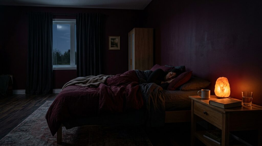
Burgundy can improve sleep quality because it is a low energy color that creates a dark and quiet environment. Unlike bright blues or yellows red tones do not stimulate the brain as much at night. A dark room tells your body it is time to produce melatonin and rest.
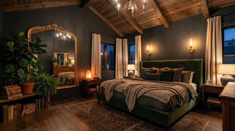
I noticed I slept twenty minutes longer on average after I painted my room. This is not just a guess. I track my sleep with a wearable device. The dark walls cut down on light leaks from the street. In my experience a burgundy bedroom feels like a cave in the best way possible. If you want to lean further into that cocoon feeling, a dark cosy bedroom approach can help you layer warm lighting, heavy textiles, and moody color without making the space feel gloomy. I’ve seen research that suggests warm colors can make a room feel physically warmer too. This is great for winter months. If you live in a very hot climate you might want to balance the red with cool blue accents to keep the room from feeling too hot visually.
16. How do you update a burgundy room for different seasons?
Update a burgundy room for seasons by changing your accent colors. In summer use light linen pillows and fresh greenery. In winter swap those for heavy wool blankets and gold candles. Burgundy is a great base color that works with both warm and cool seasonal decor.
Last December I added some deep evergreen boughs to my room. The red and green looked festive but not like a cheap holiday shop. For a more luxurious green-and-dark palette, an emerald green black and gold bedroom can give you the same dramatic richness with a more polished jewel-tone feel. I’ve tried using bright yellow in the spring and it was a bit too much. Stick to muted tones. A soft sage green is perfect for when the weather warms up. It makes the room feel fresh. I found that changing the scent of the room helps too. I use a cedar wood candle in the fall and a rose scent in the spring. This changes the feel of the burgundy bedroom without moving a single piece of furniture.
17. What bedding sets look best with wine-colored walls?
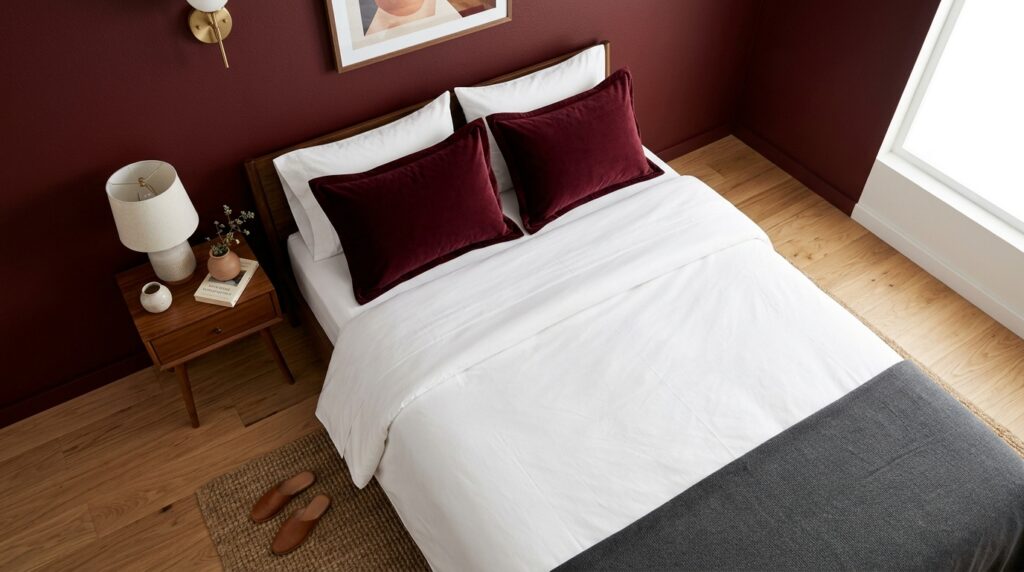
White or light gray bedding sets look best with wine-colored walls because they provide a clean contrast. A dark bed against dark walls can look like a giant hole in the room. Use a white duvet cover as your base and add burgundy shams to tie the look together.
I bought a high thread count white cotton set from Brooklinen for one hundred fifty dollars. It is the best investment I made for the room. The white looks so crisp against the deep red. I’ve seen people try to match the wall color exactly with their bedding. This rarely works because the fabrics never match the paint perfectly. It looks like a mistake. Instead go for a completely different light color. If you want some pattern try a classic stripe or a small floral print. This adds detail without taking away from the bold walls.
18. How do you DIY a burgundy headboard project?

You can DIY a burgundy headboard by using a piece of plywood, some foam, and two yards of burgundy velvet fabric. Staple the fabric tightly over the foam and wood. This project takes about three hours and costs around seventy dollars depending on the quality of the fabric.
I did this last year for a guest room. I found the plywood in my garage for free. The velvet was the most expensive part at twenty dollars a yard. I’ve noticed that a tufted look is harder to do but looks much more expensive. You just need a drill and some upholstery buttons. It makes the bed the center of the room. I saw a case study where a girl used an old door as a headboard and painted it burgundy. It was a unique look for almost no money. Just make sure you sand the wood well before you paint it.
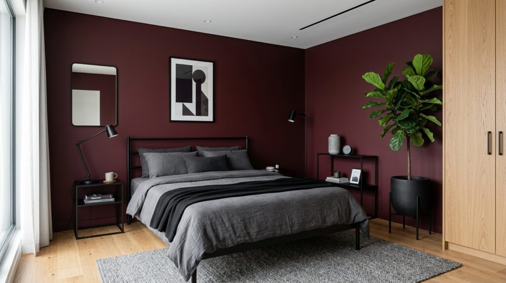
19. Can you pair burgundy with black furniture?
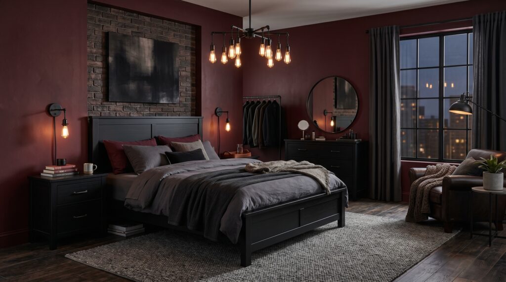
You can pair burgundy with black furniture for a dramatic and moody look that feels very modern. This combination is common in high end bachelor pads or industrial lofts. Use light colored rugs or art to make sure the room does not become too dark or depressing.
I tried this in a loft project in Detroit. The ceilings were ten feet high and the walls were brick. We painted one wall burgundy and used a black metal bed frame. It looked very cool. I’ve noticed that black furniture can disappear against dark walls if you aren’t careful. Use a lamp with a light colored shade right next to the black furniture. This creates a silhouette that makes the furniture stand out. I found that adding some wood elements like a walnut nightstand helps bridge the gap between the black and the red.
20. How do you choose between cool and warm burgundy shades?
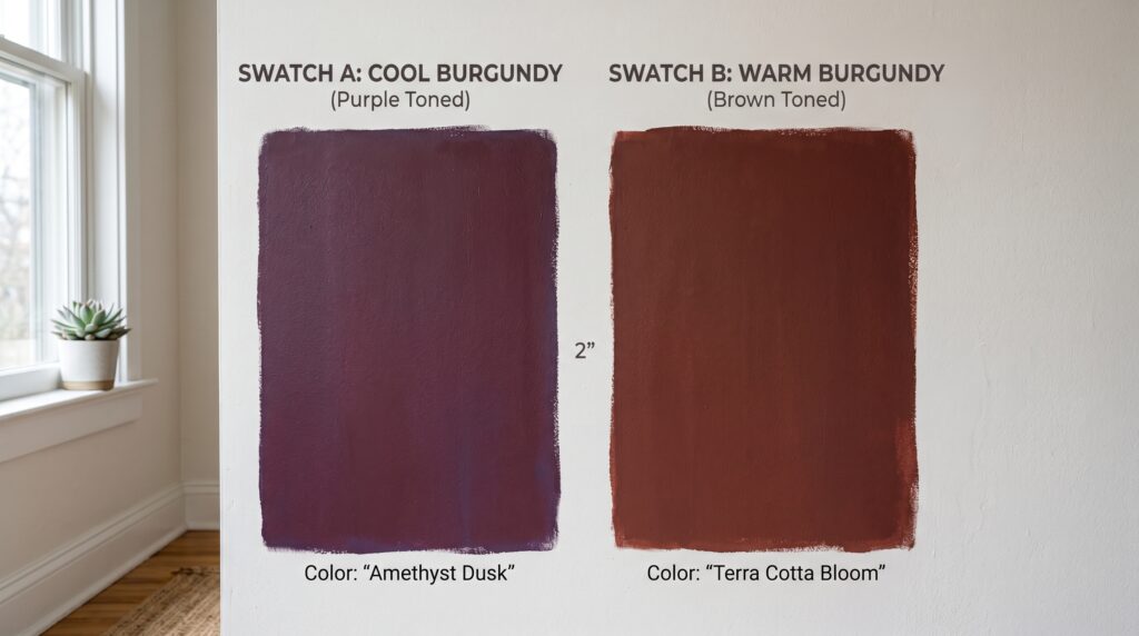
Choose a warm burgundy with orange undertones if your room faces north and gets cold light. Choose a cool burgundy with blue or purple undertones if your room faces south and gets a lot of sun. The undertone of the paint will change how the room feels at different times of the day.
I’ve noticed that most people don’t look at the undertone until the paint is on the wall. This is a mistake. Always paint a large sample board. Look at it at 8 AM and 8 PM. I once used a cool burgundy that looked like grape juice in the morning. I hated it. I switched to a warmer tone called Merlot and it was perfect. The warm tones feel more traditional and inviting. The cool tones feel more modern and edgy. Think about the mood you want before you buy the paint. If you prefer a warmer red-brown direction, these maroon bedroom ideas can help you create a grounded look that feels rich without going too purple.
21. What are the biggest mistakes in burgundy bedroom design?
The biggest mistakes include using too much dark furniture, ignoring lighting, and choosing the wrong paint finish. Another common error is not using enough contrast which makes the room look flat. Always include at least twenty percent of a light neutral color to balance the space.
I see people forget about the ceiling all the time. They paint the walls dark but leave a dingy off white ceiling. This makes the room look unfinished. Paint the ceiling a crisp bright white to lift the space. I’ve seen rooms where the owner used burgundy walls, burgundy bedding, and burgundy curtains. It was a total fail. It felt like being inside a red box. You need those breaks in color. Use a light rug, light curtains, or light art. I’ve noticed that the most successful rooms use the 60-30-10 rule. Sixty percent main color, thirty percent secondary color, and ten percent accent color.
FAQ
Is a burgundy bedroom too dark for a small space?
No, it is not too dark if you manage your light and furniture correctly. In fact, dark colors like burgundy create an illusion of depth. The corners of the room seem to recede, which can make a small room feel more expansive. I have seen 100 square foot rooms transformed by deep red paint. The key is to keep the ceiling white and use a large light colored rug. This anchors the room while allowing the walls to add character. Adding a mirror opposite a window will also bounce natural light and keep the mood from becoming heavy.
What secondary colors work best with burgundy?
Cream, gold, and soft grays are the best secondary colors. Cream offers a warm contrast that feels softer than pure white. Gold or brass accents bring out the rich undertones of the red and add a touch of luxury. Gray provides a modern balance that cools down the heat of the burgundy. I often suggest a sage green for those who want a more natural look. Avoid using too many bright primary colors like yellow or blue as they can clash and make the room feel chaotic rather than relaxing.
How do I choose the right burgundy paint?
Start by looking at the undertones of the paint chips. Some burgundy shades lean towards purple while others lean towards brown or orange. Purchase three small sample cans and paint two foot squares on different walls in your room. Observe these samples in the morning, afternoon, and under your evening lamps. The color will change significantly throughout the day. I find that shades with a bit of brown are more grounding and easier to live with over long periods.
Can I use burgundy if I have dark wood furniture?
Yes, you can, but you must be careful about contrast. Dark furniture can blend into burgundy walls and get lost. To prevent this, use light colored bedding or a light rug to create a visual break. You can also hang light colored art above dark furniture to define the space. In my experience, adding brass hardware to dark furniture helps it stand out against a dark wall. The goal is to create layers of color and texture so the room has depth.
Is burgundy a good color for a master bedroom?
Burgundy is an excellent choice for a master bedroom because it promotes a sense of intimacy and calm. It is a sophisticated color that feels more grown up than bright red. It creates a cocoon-like environment that is perfect for winding down at the end of a long day. Many high end boutique hotels use wine tones to create a sense of luxury. If you want your master suite to feel like a private retreat, burgundy is a strong candidate for your palette.
How does burgundy affect my mood?
Red tones are generally seen as energetic, but deeper burgundy shades are more grounding. They provide a sense of security and warmth. I have found that being in a burgundy room makes me feel more focused and calm. It is a color often associated with wealth and power, which can give the room a very confident feel. It is less about high energy and more about deep, quiet strength. This makes it ideal for a room meant for rest and reflection.
What kind of curtains should I use with burgundy walls?
I recommend using double layered curtains. A sheer white inner layer allows soft light to enter during the day, which keeps the burgundy from feeling too dark. A heavier outer layer in a neutral linen or a matching velvet can be closed at night for total privacy and light blocking. Avoid heavy patterns on your curtains if your walls are a solid bold color. Solid colors or very subtle textures usually work best to keep the focus on the beautiful wall color.
Should I paint my trim burgundy too?
Painting the trim the same color as the walls is called color drenching. This is a very modern and popular design choice. It creates a seamless look that can make a room feel very tall. However, if you prefer a more traditional look, white or cream trim provides a classic frame for the burgundy. In my experience, white trim makes the red look more vibrant, while matching trim makes the room feel more architectural and moody. Both are valid choices depending on your personal style.
How much does it cost to create a burgundy bedroom?
The cost can vary wildly depending on your goals. A simple paint job with two cans of high quality paint and some basic supplies will cost about one hundred fifty dollars. If you add a new rug, lamps, and bedding, you might spend between five hundred and one thousand dollars. I have seen incredible transformations done for under three hundred dollars by shopping at thrift stores for frames and using leftover paint for small furniture updates. It is a very budget friendly color because it makes cheap items look more expensive.
Does burgundy go out of style quickly?
Burgundy is a classic color that has been used in interior design for centuries. While specific shades might trend, the overall concept of a deep red room is timeless. It is less of a fad than bright “millennial pink” or “neon green.” If you choose a muted shade with earthy undertones, it will likely look good for a decade or more. You can always update the room by changing your accent pillows or artwork if you want a fresh look without repainting.
Can I use burgundy in a nursery?
While not a traditional nursery color, a muted burgundy can be very soothing for a baby. It creates a dark environment that is helpful for daytime naps. I suggest pairing it with lots of cream and light wood to keep the room feeling soft and youthful. It is a color that can grow with the child, moving from a cozy nursery to a sophisticated teen room without needing a total overhaul. Just ensure you have plenty of good lighting for late night check-ins.
What floor lamps work best in a dark red room?
Look for lamps with shades that are white or light cream on the inside. This ensures the light is reflected out into the room rather than being absorbed by the shade. Floor lamps with a brass or black finish look great against burgundy. Arc lamps are particularly good for adding a modern touch to a deep red space. I always suggest using a warm bulb to maintain the cozy atmosphere of the room. A lamp with a built-in dimmer is even better.
Conclusion
Creating a space that feels personal and luxurious does not require a huge budget or a team of experts. I learned through my own trials that bold colors like burgundy are not something to fear. They are tools that we can use to change how we feel inside our own homes. My bedroom went from a boring white box to a rich sanctuary in just one weekend. By focusing on the 21 ideas we covered, you can avoid common mistakes and build a room that you love coming home to every night.
I predict that we will see a move away from the all white “minimalist” look in the next two years. People are craving warmth and character in their living spaces again. Deep, moody colors like those found in a burgundy bedroom are leading this change. They offer a sense of history and comfort that sterile white rooms lack. Whether you decide to paint every wall or just add a few velvet pillows, start small and see how the color changes your mood. You might find that a little bit of red is exactly what your home has been missing. What is stopping you from trying a bold color in your most private space?
One Comment